Dragon Anywhere is a speech-to-text dictation app for iOS that can transform how you work. It’s a version of Nuance’s Dragon speech recognition software.
It needs to deliver: an annual subscription costs a NZ$240.
At that price, Dragon Anywhere is not a buy, try, forget app store experiment. It’s a significant investment. It needs to earn its keep.
Worth the money?
For some people, Dragon Anywhere will be worth every penny. Accurate speech-to-text software can unpack new levels of productivity. Yet not everyone will see a return on the investment.
If you already use desktop dictation software, you’ll have an idea of what Dragon Anywhere can do.
Being able to dictate text to an iPhone is a bigger deal than it might sound at first hearing.
The designers made the iPhone for dictation. Writing on a tiny glass keyboard is a challenge if you want to do anything more than send a text or a tweet.
It also means you can replace desktop dictation with your iPhone. Given that your phone goes everywhere you do, it means you can produce text almost anywhere. This explains the product name.
You could, for example, write while in the back of a car or lounging in bed. In practice using the iPhone for dictation feels more natural than using a desktop or laptop Mac.
Anywhere
Mobility is important, because ideas do not work nine-to-five in an office. Your writing muse can turn up unannounced at any time. With Dragon Anywhere you can jot down your ideas as they appear. There’s no need to hunt around for a computer or a pen and paper.
Your phone is already your most important computer. Dragon Anywhere takes that further. Depending on how you work, you may be able to ditch the desktop altogether. Although if you don’t want to, Anywhere integrates with Nuance’s desktop dictation applications.
If Dragon Anywhere save you buying a new computer, the subscription starts to look like a bargain. Even if you don’t go that far, your typewriter keyboard may gather dust.
Dragon Anywhere works where there’s a connection
The software doesn’t quite work anywhere. Dragon Anywhere calls on Nuance’s cloud resourced to work its magic. That means you can only use it when you have a live internet connection.
It sips data. You might run through a megabyte or so dictating thousands of words. After an hour’s use, my data consumption was still measured in hundreds of kilobytes.
The phone to cloud round trip is fast. Speak a sentence or two, pause and the text is there on screen. It takes seconds. I found I couldn’t dictate fast enough to get ahead of the cloud connection.
In other words, you can use Dragon Anywhere while you’re on the move. If you have anything but a minimal data plan you can use it without counting the bytes or hunting for WiFi.
Nuance says it encryopts connections, so criminals can’t listen in on your dictations.
How well does Dragon Anywhere perform?
The performance is impressive. I used it to write a first draft of this review. From the first words I uttered it was catching almost everything without error.
The software stumbled over the word iOS in the first sentence. To be fair, it’s a specialist word. If you think of how you say the name: eye-oh-ess, not picking it up it understandable.
User error
It wasn’t the software that stumbled in the second paragraph. I can take the blame for not figuring out how to say NZ$240 in a way that made my meaning clear. Put this down to user error.
The third sentence was perfect.
Out of the first hundred words, Dragon Anywhere got everything except iOS right. That’s impressive. Remember this was my first try of the software. The software had not encountered my voice or accent before.
In practice it learns as it goes along. To see how this worked I read the words again and this time Dragon Anywhere scored a perfect 100 percent. It understood iOS. The software understood my speech far better than Apple’s Siri.
If you make an error, fixing your text is easy. The only barrier is that you have to memorise instructions. In most cases the words are obvious, you don’t need to guess them. Some take a little practice.
I ran into a problem with some New Zealand place names. That’s understandable. Dragon Anywhere allows you to add custom words to the system which gets around the problem after some training.
The productivity question
If you notice, I hedged my words when I said the software could be worth the money. Likewise when I said it may transform how you work or make you more productive.
That’s because, good as it is, speech recognition is not for everyone. In my experience it takes longer to dictate stories than to type them. I also find I struggle to compose while speaking. This could be down to 40 years of touch typing. With practice my dictation speed might improve.
There are also times where I need to write and dictation isn’t the best tool. Writing on a train, an airplane or somewhere public would be too much for everyone else.
If you find typing is difficult or run into overuse problems, then it’s a godsend. If you think by speaking, you’ll love it.
Battery Monitor was previously called Battery Diag. There was a review of the app on my main site that was posted in May 2014. This is an updated version. The photo shows the 2014 version of the app. It has barely changed its look in the past 11 years and most of the changes since 2014 are either bug fixes or necessary updates to keep up with operating system changes. Here’s an updated look at the software.
Still useful in the age of all-day batteries
Ironically, because the modern Apple MacBook Air has a longer battery life than earlier laptops, there’s a greater need to know how much juice is still in the tank.
That may not make sense at first until you realise that in the old days you were always at the point where there was no much power left. You were never that many minutes away from needing a top-up. Range anxiety was permanent.
When the original version of this review was posted in 2014, a MacBook Air battery gave about ten hours of use. That was a huge leap, previously you might have managed four or five hours. Today, an M4 MacBook Air can go all day on a single charge.
With so many hours of computing from a single charge, it’s easier to lose track of how much is left.
Compact and lightweight
Battery Monitor from the Mac App Store is free and visually attractive. It has a design that echoes earlier versions of the iOS design found on iPads, iPhones and, surprisingly, Westpac bank’s web site in the years around 2014. That said, it still looks modern and not remotely out of place on a 2025 MacBook.
The app runs in the menu bar, so you can get at it quickly, it sips resources and stays out-of-the-way until needed.
Having Battery Monitor and the MacOS Battery icon on the menu bar at the same time is odd. You can turn the official Apple icon off from System Settings.
Readouts and reporting
Click on the menu bar icon to get a report on the amount of power left both as a percentage and as a time estimate. There’s also an indicator showing the state of battery health and number of charge cycles. Further information, including battery temperature and power usage is hidden behind an I icon.
The time remaining estimate can be misleading. The number is based on your recent use and current environmental conditions. If you change what you are doing, the actual amount of time left can change significantly. Think of it as a suggestion, not a hard and fast limit.
The clever bit is that if you’re running out of juice, you can tinker with your open apps and usage to trim the power drain and extend the time remaining.
This simple iPhone mount gives your MacBook a far better webcam.
Belkin’s NZ$50 iPhone Mount with MagSafe for Mac Notebooks isn’t much to look at. One side has a hinged clip that attaches to the top of a MacBook. On the other side there is a magnet that clamps to the back of an iPhone.
Apart from the hinged ring grip on the same side as the clip, that’s it.
Apple’s recent MacOS Ventura and iOS 16 operating systems include a feature called Continuity Camera. This lets you use the high resolution camera on your iPhone instead of the MacBook’s webcam.
The software works beautifully. The Mac automatically detects your iPhone and adjusts. You have an option to move your image centre stage, to transmit a portrait-only image and there is Studio Light to brighten your face.
Continuity Camera is one of those Apple features that can feel like magic the first time you see it.
Belkin’s mount marries the MacBook and iPhone in an elegant, easy-to-use way. It takes seconds to set up - you can do it even if you take an incoming call at short notice.
You can rotate the mount, which means you can use the iPhone camera in portrait or landscape mode.
iPhone Mount with MagSafe for Mac Notebooks close up.
Why bother? Almost every laptop on the market comes with a low resolution built-in webcam. Laptop webcams are rarely good. MacBooks are better than many rivals, but still well off the pace.
When you take part in a Zoom, FaceTime or any other video call with a normal webcam, the people you talk to will see a poor quality image. This wasn’t an issue when we had low bandwidth connections, in 2023 it isn’t necessary. You might have reasons to prefer to send a low-resolution video image.
I tested the mount with a 2021 M1 MacBook Air and an iPhone 12. In practice the mount works best when you are seated at a table or desk. The arrangement is stable, but it quickly becomes unstable if you want to work with your MacBook on your lap.
You can use the grip ring on the clip side of the mount to hold onto your phone, it doubles as a kickstand for the phone. No-one is going to buy the mount for this reason, but it is a handy bonus.
Belkin makes a similar mount for desktop Macs and displays.
This story was originally posted in September 2018
A mechanical pop-up camera means the front of the Oppo Find X is almost entirely given over to the display. It has the thinnest bezels of any phone on the market today.
According to Oppo, the Android phone has a screen to body ratio of ‘93.8 percent’.
That number is way more precise than we needs. It says a lot about how Oppo can have interesting ideas, such as a pop-up camera, yet still miss the point about what makes a phone great.
If anyone cares about the screen to body ratio to the nearest 0.1 percent, no amount of technology is going to fix their problems.
While the notchless all-screen front is an achievement, Oppo should would do better to focus more on the user experience, less on meaningless mathematical precision.
There’s something else about that number. The 93.8 percent only applies when the camera is retracted. When it’s in the shooting position there’s a huge bezel across the top of the phone. Because the camera pops up when you use the phone, it’s there a lot of the time. In other words, you only get that small-bezel effect some of the time.
Value proposition?
Another thing Oppo needs to think more about is a product’s perceived value. The Find X sells in New Zealand for $1500. That’s a lot of money by any standard. It puts the phone is the ultra-premium category.
Aiming for this space is fair enough, after all, that’s where phone makers make profits. Yet for the last 18 months Oppo has pitched itself to New Zealand buyers as a low-cost alternative to Samsung or Apple. This scraps that strategy.
Find X’s price matches best-selling phones from the market leaders. That’s a brave move by Oppo.
Let’s put this price in context. The Oppo Find X costs NZ$100 more than the Apple iPhone XR or Samsung Galaxy S9. If you spend NZ$300 more than Oppo wants for the Find X and you can have an iPhone XS. Samsung’s Galaxy Note 9 costs NZ$200 more than the Find X.
Top tier?
So is the Find X in the same ultra-premium class as this year’s iPhone and Galaxy models?
The simple answer is no. While it is close, it doesn’t match the world’s best.
This is clear the moment you pick the phone up. The review model is in a purple-red colour Oppo calls Bordeaux Red. It looks good, but so does every other phone costing more than around $700. Oppo has achieved the minimalist goal of a smooth case fronted by a sheet of glass and with three buttons on the side.
The phone does not feel as well-engineered as the latest Apple or Samsung models. There’s a distinct ridge where the screen meets the case and another between the back of the phone and the case. OK, that’s not a huge deal, but Oppo’s rivals are better machined.
Likewise the phone doesn’t feel as good in the hand. Admittedly not everyone will agree.
What else is different?
Away from the pop-up camera, there are two other important features: fast charging and three-dimensional face scanning.
The face scanning is similar to the technology used on Apple’s iPhone X. Although it doesn’t work as seamlessly as Apple’s face scanning, the difference in performance is minimal. Let’s not quibble about this. Chalk one up for Oppo. When you unlock the phone the camera pops-up.
Oppo uses something called Super VOOC charging. It is fast, but not linear. Oppo says it is the fastest charging technology on the market at the moment. Super VOOC will charge a phone in 35 minutes. This is good as it means you don’t need to carefully plan charging before you leave your home or workplace for any length of time.
You will want to get it all the way to 100 percent. This gives about 18 hours use. More if you don’t spend all your time on the phone, less if you’re an intensive user.
Pop-up camera
The pop-up camera is clever. It’s not clear if it will capture people’s imaginations or if most consumer will be happy living with screen notches.
Anything mechanical that can wear and tear is less reliable and more trouble than solid state electronics. That’s not an opinion, it’s an immutable law of the universe.
Oppo says the camera can handle 300,000 pop-ups. If you look at your phone 40 times a day it should last 20 years. We’ll see.
Away from the pop-up camera and fast charging the Oppo Find X is good, but not outstanding compared with rival NZ$1500 phones.
It is fast. So is every other expensive phone. The screen is nice. That’s also standard fare. While Oppo’s cameras and photography software belongs in a lower division than Apple, Samsung or Huawei, it is still outstanding.
Earlier Oppo phones featured the company’s ColorOS, a software overlay that makes Android look and feel a lot more like Apple’s iOS. That’s not the case here.
Oppo Find X verdict
Android fans may feel otherwise, but the Find X has nothing like Apple’s ease of use. If I’m going to use Android I prefer the purer version you find in Android One phones like the Nokia range. These are less than half the price of the Find X.
Should you choose the Oppo Find X? It’s not a bad choice. You won’t be disappointed. None of the expensive phones on the market are sub-par.
I can’t help think that the pop-up camera is a novelty more than a helpful feature. It’s fun the first few times, but that wears off fast. Of course it might strike a chord with buyers, but I have doubts about that.
A fast processor, nice screen and outstanding photography are table stakes in ultra-premium phones. If the pop-up camera appeals and you like a notch-less all-screen phone front, then this is for you. Otherwise you’d do better looking elsewhere. That doesn’t have to mean another brand: Oppo’s NZ$800 R15 Pro offers far better value for money.
Many recent phone launch presentations have been all about the camera. Most of the rest spend more time talking about their phone cameras than anything else. I can’t think of a single phone presentation I’ve seen in the last three years where the camera was relegated to a footnote.
Apple, Samsung and Huawei all want you to know their phone cameras are better than before. It is always true.
They’d also like you to think their cameras are better than their rivals. That’s a losing game. They are all excellent. But each excels in different ways.
You wouldn’t be disappointed with the camera in any premium phone. You might find one phone misses a camera feature you’d like, or is a touch weaker in some department. You might find one suits your style, works the same way you do or has a user interface that’s easier to understand. Either way, they are all good.
Phone camera close up.
Phone cameras good, getting better
Indeed, phone cameras are now exceptionally good. So good that the stand alone camera market looks doomed for everyone except professionals and serious amateurs willing to part with lots of money.
Forget whinging about a NZ$2800 phone, the starting price for a full frame mirrorless camera from Sony, Nikon or Canon is about twice that. And then you buy extra lenses.
The low-end camera market is already dead. The mid-range is struggling. There is almost no casual stand-alone camera market these days.
It’s still worth buying a standalone camera if you want consistent great pictures
There are good reasons to buy a high-quality standalone camera if you want to take great pictures.
The physics of camera optics means that, in general, you get better images with a bigger and better lens along with a big sensor array. You also need some distance between the lens and the focal plane where light hits photosensors.
None of this is possible in a phone which is often less than 10mm thick. Phone cameras have small lenses. There is almost no distance between the lens and the sensor array. Sensor arrays are also small, usually smaller than a fingernail while a more traditional digital camera might have an array the size of a matchbox.
Phones have plastic lenses, which, on the whole, are not as good as the glass lenses in cameras. Plastic can distort images. Phone makers spend millions developing better materials and techniques to reduce this, but glass still beats plastic.
Phone cameras get around physical shortcoming with heavy duty computer processing. Upmarket phones have two or even three lenses. They combine their images to create better pictures. Most of the time this gets around the distortion.
Software does the heavy lifting
They do a hell of a lot of this in software. Which brings up an interesting philosophical point: Are they capturing reality or are they making it up?
You may wonder why phone makers keep putting faster and faster processors in their phones. After all, none of the last three or four generations of flagship phones have been slouches when it comes to handling most computing tasks.
The main reason for the extra grunt is to handle image processing. It’s a data-intensive task and phones have to do it in microseconds.
Phone makers love to tell you their models use artificial intelligence. Most of the time phones use the results of earlier AI work to inform their brute-force image processing. They don’t do on-the-fly artificial intelligence to process your pictures.
The results are impressive. When Apple gave me a demonstration of the iPhone XS Max, I was struck by how much like a digital SLR the results can be, in the right hands.
As much as I try, my iPhone or Huawei shots are never as good. I still get far better results from my ageing but trusty digital SLR. The pictures are often good enough to use in print.
Mirrorless
If I was to buy a new camera, I’d go for a modern mirrorless design. Until recently this would have meant a Sony Alpha, but Nikon and Canon now have tempting alternatives. I can’t put my finger on it, but to my eyes Canon images look better, so the Canon EOS R would be my probable choice.
Mirrorless means the camera doesn’t have a traditional optical viewfinder like an SLR or digital SLR. Instead you see the same image that the sensors see. This makes the cameras simpler, smaller and lighter.
For consumers stand alone cameras are on a path to becoming a retro-tech thing like vinyl records or analogue music synthesisers. Professionals will go on using standalone cameras. But the market is slowing.
I still take a camera along when I travel overseas or cover a conference as a journalist. The more traditional controls easier to use, even if I spend most of the time on automatic setttings. When I need to fiddle, it’s easy to tweak dials and press buttons than hunt for controls on a phone screen.
Having said that, often I find myself on a reporting job where the only camera to hand is my phone. If I take a little time, I can get good pictures with that too. I’ve already noticed I’m less likely to pack the standalone camera when heading out to cover a story. I no longer keep it handy, charged and ready to go. That’s not the case with my phone.
You don’t need to be told there is something different about the BlackBerry Passport.
For a start there’s a retro qwerty keyboard. Then there’s the shape. It’s different to any other phone. It is also big — as big as an Apple iPhone 6 Plus.
Passport is BlackBerry’s business class phone. BlackBerry built the Passport with productivity in mind. Although BlackBerry tailored the Passport for enterprise customers, it can work for smaller organisations operating in the corporate world.
The Passport is an impressive piece of engineering, but it arrives in a market that has fundamentally shifted. It is the literal embodiment of why enterprise hardware has become such a tough sell; business users now prioritise the flexibility and price of consumer products over specialised corporate tools.
Like the iPhone 6 Plus, the Passport is as much tablet as phone. Phablet is an ugly term, but it applies to the BlackBerry Passport more than any other device. You can work in ways that would seem strange on other phones.
When square is cool
The Passport’s 4.5 inch square screen — 80mm by 80mm — lends itself to applications that don’t work well on conventional phones.
If the Passport fails and BlackBerry exits the phone market some observers may blame the square screen. That would be a pity, because it’s a great idea.
Reading .PDFs is easier on the Passport than on an iPhone 6 Plus. It works well with eBooks and is terrific for maps. The screen is a plus point. Although you can turn a normal phone on its side to read documents, the Passport format feels better.
Spreadsheets are us
Passport does spreadsheets better than any other phone. The wide-screen helps when composing written documents if you need to check the way readers will see the finished product.
The screen is not the only difference when it comes to writing on the Passport.
Qwerty keyboards were BlackBerry’s phone signature before anyone saw an iPhone. Using the physical keyboard on the Passport feels almost nostalgic. Those of you who miss those days will feel instantly at home.
BlackBerry Passport keyboard, touchpad
BlackBerry has updated the keyboard. It now doubles as a touch pad, you control the cursor and screen by sweeping up and down or across the keys. This is hard work at first, yet it quickly becomes a natural action.
The BlackBerry 10 operating system learns how you type, so over time it anticipates where you are heading. This improves accuracy and increases your typing efficiency.
In practice the Passport keyboard is not great. It is only slightly larger than a smartphone on-screen keyboard. Like an on-screen keyboard it seems to cope with pudgy fingers almost by magic. Make that thumbs. I found myself hitting the keys with just my thumbs.
Thumbing it
The Passport has tiny, sculpted keys. The ones on the left lean one way. Those on the right lean in the other direction. They have a positive action, you know when you’ve pushed one down enough.
You need to reach your thumb up to the screen to type numbers. There’s nothing unusual about this, it feels as natural as typing ever does. Reaching up to the screen space to find the capitals key feels strange. Often the software guesses when you want to type a capital and does this for you.
When the operating system thinks it knows what you’re attempting to type, it offers the word as a guess for you to flick up in the text screen. I never mastered that.
We can put my failure down to practice — reviewers only get these devices for a short time. I’m sure with time I could speed up.
Docs to Go
BlackBerry now owns Docs to Go — the app has been around since the Palm Pilot. Docs to Go is a mobile office suite with a word processor, spreadsheet and presentation manager.
Docs to Go is compatible with Microsoft Office so you can move documents easily between the Passport and a personal computer. It works with cloud services to make that easier.
I attempted to write this review on the Passport using Docs to Go. After a short time I gave up, returning to a full-size keyboard. To be fair to BlackBerry, that’s partly because I’m a touch typist — my fingers do the thinking on a full size keyboard in ways they don’t on a phone.
Writing on a Passport
Writing on the Passport was slow, but not painfully slow. Nor was it hard work. It is roughly comparable with writing on any phone, although I suspect with time and practice, I could speed up.
BlackBerry is weak when it comes to apps. Things have improved since a deal to put Amazon’s Android apps store on BlackBerry 10 devices, but it is far from perfect.
The Passport comes with 38 apps as standard including Docs to Go and BlackBerry’s own BBM. Most of the standard fare is included. The quality of BlackBerry’s own apps is solid, you won’t find a better set of communications tools and the BlackBerry Hub pulls it all together.
Standard apps
There’s a great Maps app, Facebook, Twitter and Linkedin are all there from the moment you start the phone. The list also includes a YouTube app, Adobe Reader, Evernote and links to Box and Dropbox.
Life gets messy beyond the built-in apps. Amazon’s Android apps run in an emulator. The Passport’s processor is fast enough to do the grunt work, but emulators are rarely as smooth as native apps.
And Amazon’s Android app store is not as complete as Google Play or iTunes. You won’t find everything here. Nor will you find the best experience when it comes to Google’s apps.
Verdict
So where does that leave the Passport? Blackberry could make the best phone in history and most of the world would take no notice. You probably won’t pick up many geek credibility or hipster points if you whip one of these out in your local craft beer outlet.
There’s more to technology than fashion. Blackberry deserves kudos for, er, thinking outside the square.
I like the BlackBerry Passport more than I expected. It’s a good choice for companies that need BlackBerry’s security and can use the great communications apps. It works well as a writing tool — the square screen is anything but a gimmick and the keyboard is better in use than most on-screen alternatives.
The main market for the Passport will be people who already live in BlackBerry’s world. It should be enough to stop some of them exiting for Android-land or Apple-ville.
I suspect many Passport users will carry other phones. Maybe they’ll use the BlackBerry for work and an alternative for personal use. That’s not a bad idea, the Passport is clearly there for serious business, not fun. Think of it as a phone for people working in places where the men still wear ties.
Showing the BlackBerry Passport on TV3 Firstline.
I went on TV3 Firstline to talk about the BlackBerry Passport with Sacha McNeil and Michael Wilson.
Even though the segment is short, TV is a great way of quickly letting people see what’s different about a phone like this. The BlackBerry Passport is big, but as you can see from the clip it fits comfortably in a jacket pocket. I get to show the size of the phone alongside the better known Apple iPhone 6 — the size comparison is useful. And I get to show how you can thumb type on the QWERTY keyboard.
Acronis True Image 2021 promises to keep your data safe for around A$100 a year. It protects PCs and Macs from disasters, accidents, criminal attacks and ransomware.
What is True Image?
True Image started life as a back-up application. The name refers to the way it creates a copy or an image of your computer data on an external hard drive or cloud server.
Two years ago Acronis added security features adding ransomware protection to back-up. The most expensive version of the software included blockchain certification. I’m not convinced that is necessary. Yet there are those who find it useful.
The 2021 version of the software adds more protection. Acronis says it deals with malware, malicious websites and code injection. There’s a new antivirus scan.
All this means the security software has to work in real-time.
There’s the timely addition of protection from videoconferencing interference. This is a threat that emerged during the Covid-19 lockdown. The feature is not included in the MacOS version.
In effect, Acronis repackaged its enterprise security technology for individuals and small businesses.
One user interface
Having back-up and security controlled by a single user interface simplifies the two processes. That’s important. Many small business buy back up and security then fail to make the most of them because it’s difficult.
True Image 2021 has a clean, straightforward interface. This hasn’t changed since the True Image 2019 review written more than two years ago.
It’s not immediately obvious how everything works, but it is easy to learn. The trick is to mouse your way around the user interface and try all the options.
Once you’re done, you can leave True Image to work without day-to-day intervention, although it is likely you will need to revisit the app.
Testing True Image
I tested it on an iMac. Here it adds an icon to the menu bar. Unlike other MacOS apps, this is not a menu, instead it shows notifications. There is an option to open the app’s main screen from here.
Back-up remains the focus. You can create images of entire drives, partitions, folders or even individual files. True Image can back-up your network drives and add back-ups for your mobile phone or tablet.
There are options to do a full back-up, this can take a long time, or to do a differential back-up. This means backing up everything that changed since the last back-up.
Back-up options
You control the back-up frequency. Options range from monthly, which I’d regard as “why bother”? all the way to hourly.
The default is daily. There’s a twice daily option which I’ve set to back-up about half way through my working day and then late at night. That way I’m never going to lose more than a few hours work.
More frequent back-ups are possible, but this can tie up resources.
There are options to remove older back-ups when you are running out of space on your target disc. You can do this manually or leave it to the software. You can also set up validations.
Pricing
There’s a basic A$70 subscription that doesn’t include cloud back-up. You’ll need a local or network drive. Acronis does not appear to allow you to use alternative cloud storage.
The A$98 Advanced plan includes 500GB of cloud back-up storage. There is a A$140 plan with a terabyte of storage. These prices are for one computer.
Acronis’ per computer price drops if you add more, but you don’t get more cloud storage.
This complex price structure is strange given that everything else about True Image 2021 works to hide complexity. I’m concerned that buyers can end up buying more than they need, or not enough.
Back-up updates
There are updates to the way True Image handles back-ups. It no longer duplicates data if a back-up is interrupted, say if you lose your connection. Instead of restarting and doing the whole back-up again, it picks up from where it left off.
While testing I ran into a couple of interesting observations. First, there may be times when you want to turn off protection. I did this when bittorrenting a copy of LibreOffice 7 for review.
True Image’s security stopped my bit torrent client from working. Fair enough. To allow it through I paused the software, then forgot to restart. The next morning an email arrived telling me the scheduled back-up failed.
This is excellent. It’s easy to forget to switch back on and leave yourself without back-ups or protection. Getting a non-intrusive reminder is the best way of fixing this.
Safe replication
Likewise, after first installing the application, I chose to make a replica of my Mac hard drive using the Acronis Cloud. All good. Then I swapped out my home WiFi router for a D-Link WiFi 6 router.
The router remained installed. When I went to update the drive replica, True Image responded with a message saying replication would restart after I connected to an approved Wi-fi network.
This protection would stop True Image from automatic drive replication when, say, a laptop connects to public WiFi. It takes a couple of clicks to resume replication with a new router.
True Image’s replication will wait until the everyday back-up is complete. It handles tasks one-by-one, not in parallel. This is useful on slower connection.
Fast, if your network is fast
Cloud back-ups are fast. I have a gigabit fibre connection, my WiFi 6 router is the bottleneck. It can clock speeds of over 500mbps. On my set-up, when True Image connects to the Acronis Cloud the reported speed fluctuates from around 100 mbps up to over 200 mbps.
Back-up times vary. The time indicator on the user interface gives a rough guide, but don’t take it seriously. It warned me a full drive back-up of 340 GB would take 52 minutes. I left it running and checked 30 minutes after starting to find it had finished.
Incremental back-ups of around 200 MB take a couple of minutes. Again, the times reported on the user interface can be misleading. The ‘less than one minute’ turned out to be a few seconds over two minutes.
Early back-up software, including earlier versions of True Image, could hurt system and network performance. I found this year’s edition of Norton LifeLock ties up all system resources when in full flight and then some. That is another story for another time.
True Image 2021 has no noticeable impact on performance. Automated back-ups can happen while I’m on a Zoom call and I’d never know. I haven’t seen a spinning Mac beachball while using True Image. This is in part down to plenty of headroom on a fibre connection and Wi-fi 6 local network, but, as mentioned, Norton struggles with the same resources.
Acronis True Image 2021 verdict
I can’t think of any other application that combines back-up and security in the way True Image does. The price is on a par with buying separate applications to do the two jobs.
You won’t need to pay for Acronis back-up and a separate security suite. You won’t need to learn two user interfaces. This is important if you don’t have full time IT professionals to call on for help.
Getting both back-up and security in a single integrated package from one source simplifies both.
Today, True Image is comprehensive to the point of providing more protection than everyday users or small businesses need.
It could be overkill for your needs.
If your data is precious or your work makes you a security target you should consider True Image.
If you handle other people’s data it could be essential. It makes sense if you work for a company or agency that requires high levels of security. Choose it if losing your data for more than a few minutes will cost you money.
On January 9, 2007, Steve Jobs stood on a stage and showed the world the iPhone. It seemed important at the time. Nobody knew just how important.
Thanks to the iPhone, Apple became the world’s most valuable company. It isn’t hyperbole to divide the history of personal technology into before and after.
End of the consumer PC
The iPhone also killed the consumer PC market. This didn’t happen overnight, and it hasn’t fully played out yet — but it happened.
PC sales didn’t slow immediately. It took four years after the first iPhone for them to peak. In 2011, the world bought 380 million personal computers; consumers accounted for roughly 54 percent, or about 200 million units.
Since then the market has dropped off a cliff. By 2015, total sales had fallen to around 275 million, with consumers accounting for just 49 percent, meaning consumer PC sales had collapsed by roughly a third, from 200 million to 130 million, in four years.
Analysts at IDC and Gartner expect the decline to continue, with business sales eventually stabilising. Nobody is making a similar forecast for consumers. There is no happy ending in sight.
From desktop to pocket
IDC’s ConsumerScape 360 programme tracks how people use technology. In 2012, about 90 percent of PC owners checked email on their computers daily. By 2015 that had fallen to 65 percent. If you need to check email, a phone or tablet is faster, lighter, and works on the bus, the train or in a pub.
IDC found the same pattern across news reading, web browsing and social media. The PC is simply too much trouble for most of these tasks when a better option is always in your pocket.
Today, most people go to their phone first for almost anything online. It’s not only Apple’s iPhone, Samsung, Huawei, Sony and others run Android. Every one of these devices traces its roots to the moment Jobs walked out on that stage.
A global shift
In developed countries this represents a major change in how people use technology. In much of the developing world it’s a bigger revolution still: phones are the only computers most people there have ever known.
Modern phones outsell personal computers four to one. About half the global adult population owns one; by the end of this decade that figure is expected to reach 80 percent.
There are still tasks that don’t work well on phones and tablets, PC gaming remains a clear example, but that list gets shorter every year.
Some consumer PC replacements will be hybrid devices like the Microsoft Surface Pro or the 2015 MacBook, products that sit squarely between laptop and tablet. After years of ignoring the trend, and writing off $7.6 billion on its Nokia acquisition, Microsoft moved sharply: building tightly integrated hardware and software, and releasing strong versions of Office for phones and tablets. Samsung and Huawei now make Surface-like devices of their own.
A vicious circle
The consumer PC is now in a death spiral. As sales fall, demand for apps and services falls with them, developers invest less in the platform. This in turn drives more users away. The virtuous circle that fuelled three decades of PC growth has reversed.
Consumer PCs are not dead yet, but they are in irreversible decline. Expect further consolidation among manufacturers, and more pain for PC-dependent companies like Intel. Customers have moved on.
Acronis says True Image 2019 provides set and forget protection. Going by my experience with the 2018 version, I can verify this. The last time I checked the older edition of the software was in May. I know this date is correct because that’s when I swapped to a new iMac.
It has backed up my iMac to the cloud for four months without any attention.
Now I’m using the 2019 version. It’s installed and it’s working. Every evening it updates some 200 GB plus sending it to Acronis’ cloud for safe keeping.
The process is so unobtrusive and the upgrade from True Image 2018 was so seamless that it’s hard to see any difference between the two versions.
True Image 2019 differences
That doesn’t mean there isn’t a difference. The main new feature in the Mac version is Active disc cloning. You can use it to move data from one computer to another, or to make a bootable image on an external hard drive.
The external drive needs to connect directly to the computer being cloned. I couldn’t clone my Mac drive to the home network drive. You can only copy the entire drive. There’s no way to select directories for cloning.
Acronis’ other new 2019 feature is a Survival Kit. This is like Active disc cloning, you can use it to make a bootable back up of your start-up partition.
In truth these are both variations on Acronis True Image’s main theme, although they give you more back-up options.
Auto-start on connect
Another clever, helpful update is that you can set the software to start backing-up when a new external USB drive is plugged-in. It’s another step towards simplifying backing-up. Let’s face it, the easier it is to make back-ups, the more likely you are to keep everything up-to-date.
The last interesting update in True Image 2019 is that you can now make snapshots of Parallels Desktop virtual machines. It’s a niche feature for sure, but a welcome one.
My year with Acronis True Image 2018 passed without incident. During that time I switched computers twice and carried on backing up. I did a single restore from the Acronis Cloud to a computer, but it was a test, not a real panic recovery.
It’s a solid alternative offering both a secure cloud backup and the ability to make local backups at the same time.
Prices
Acronis may seem expensive when compared with other apps, but it costs are on a par with other cloud backup services. You can pay US$50 to buy the software for a single computer. It’s a one time payment and lasts forever, but it doesn’t include cloud storage.
A single year licence with 250GB of cloud storage is also US$50. This rises to US$100 if you want to connect five computers. A three computer option is US$80.
The full monty premium version comes with a terabyte of cloud storage. This is the only version that includes blockchain certification. Acronis fingerprints your files to show no-one else has altered them. This is a way to protect against ransomware. The premium version costs US$100 a year for one machine and US$150 for five.
This post, written in 2018, examines why phone makers devote at least half the time to talking about cameras when they show new handsets to journalists.
Every recent high-end phone launch has focused, sorry about that, on the device’s camera. Likewise, promotion and marketing always push the phone camera to the fore.
When Samsung launched the Galaxy S9 in Auckland, the company invited journalists to an open plan restaurant. There, Samsung invited journalists to photograph the chef preparing food.
The menu included a dish with a viscous pour-on sauce. This was a clever way of highlighting the S9’s very slow motion video function. The results were impressive.
Samsung hired a video professional to take slow motion footage of bees entering a hive. Shown on a giant TV screen, the pictures were crystal clear and, at times, had stunning clarity.
When phone makers show journalists new devices, they devote at least half the time to cameras.
Apple and Huawei have the same emphasis on photography.
Phone makers with smaller budgets push camera features to the top of their press releases.
Camera talk
During technical presentations company insiders talk at great length about phone features. At least a third of allotted time is camera talk. You can come away with the impression that’s all they want to talk about.
Every phone maker mentioned so far and some others will tell you they have the best phone camera. In a limited sense most of them are right, although it depends on your terms of reference. No phone costing, say, $800 or more has a bad camera.
In the last year or so, every phone maker used the word ‘bokeh’ at least once in their launch presentation. It would not be hard to think up a cliché bingo card for phone launch attendees.
If this sounds like ‘me too’ market, well, it can be at times. Everyone seems to think a fashion parade is original.
Yet there are important difference. Each company’s best camera excels at something else. Samsung’s Galaxy S9 does well in low light and can do very slow motion video. Huawei’s Mate 10 is best for black and white photography.
Most phone makers can point at unique camera hardware features. They can all point at unique software.
The quality of still and moving pictures from high-end phones is remarkable. If you know what you’re doing — we’ll come back to that point — you can achieve wonderful things. This is even more impressive when you consider how small the lenses are. Phone lenses are prone to finger smudges and camera shake is a given.
A point of difference
So why do phone makers put so much emphasis on cameras? An obvious reason is cameras differentiate what can otherwise be me-too products.
Telephony and connectivity are much the same on all phones including cheap ones. Screen resolution is higher than the human eye can perceive. Few high-end phones struggle with processing power. These days they all look alike.
While there is a huge and obvious software difference between Apple’s iPhone range and Android handsets, you couldn’t say the same for Android models. Phone makers add their own software skins to stock Android. In almost every case this detracts value, at least from the customer’s perspective.
This leaves cameras and camera software as a playground for creativity and innovation. Which, in turn, brings us to the second reason phone makers place so much emphasis on photography.
Phone hardware designs and specifications have stabilised. With the move to remove bezels, that is the borders around screens, there’s little left to tinker with. Samsung struggles deciding where to put its fingerprint scanner. Otherwise, physical phone design has reached a cul-de-sac, at least for now.
The Galaxy S9 looks so much like the S8. Samsung had to come up with a new case colour for people wanting to show off their new phone.
Room for phone camera improvement
Over the last few years phone makers found room for improvement in their camera hardware and software. It’s likely this will soon reach another dead end. The laws of physics mean there’s only so much you can do with a tiny lens and sensor array.
The last big innovation was the move to dual lens cameras. This hasn’t played out yet. Meanwhile, at least one phone maker, Huawei, is talking of a triple lens camera.
There’s a danger this could become like the disposable razor business. There, for a time, adding an extra blade gave the appearance of innovation to an otherwise evolved product. It could be like tail fins on 1950s American cars. In effect we’re talking innovation for the sake of having an innovation talking point.
Another danger is that customers are loosing interest in phone cameras. Or, more likely, customer interest in phone cameras is not in alignment with phone maker hype.
Take, again, the Samsung Galaxy S9 slow-motion video feature. As mentioned early, the results are impressive, but how many Galaxy S9 buyers will use it?
Or, more to the point, how many will continue to use it beyond playing around with it when they first get their phone?
You can ask the same question about many of the camera innovations phone makers promote. Is the beauty mode, which attempts to make people look better, anything more than passing fad. How many phone owners have taken more than a handful of bokeh shots with blurred backgrounds?
Are people buying cameras or phones?
Slow-motion video is nice-to-have, but it’s unlikely more than one phone buyer in 20 will use it often. Similar reasoning goes for all fancy high-end phone camera features.
The flip side of this logic is worth considering. High-end phones with fancy camera features sell at a considerable premium. You may pay NZ$500 extra to get that super camera in your hands. If you only use it a dozen or so times, that feature has cost you $40 a shot.
Skeptical readers might see the industry’s obsession with camera phones as a way of forcing up handset prices. It also repairs margins in a business where only Apple and Samsung make decent money.
Of course, you can use phone cameras for serious work. If you need to take pictures in your job, the extra cost can be a smart investment.
Yet, in general you can’t take pictures of the quality you’d get from a SLR or any decent camera with a much bigger lens and sensor array. Phone cameras are handy, we carry them with us all the time. And the quality is so good that at times it is hard to tell if an iPhone or a Canon camera took the shot.
There’s still a place for dedicated cameras, particularly for professionals and serious photographers who value consistent quality over convenience.
When the phone camera is hard to use
One phone camera drawback is they are hard to use in a hurry. Sure, all the phone makers tell us how easy their products are to use. Even so, the software can be confusing.
Phone camera interfaces are often tiny and you need to hunt around to find controls. Almost everyone uses the default mode for every shot. What’s more, stabbing at controls on a phone screen is not the best way to steady your hand to take pictures. Adjusting and using a digital SLR is easy in comparison.
There is still some room for improvement with phone cameras. Among other things Huawei’s third lens could do the trick. There is scope for yet more innovation in the software and, yes, a better user interface.
No doubt other improvements are in the works. At best we may see one or two more cycles. In the meantime some phone makers are switching their marketing attention to what they call AI or artificial intelligence.
It’s questionable whether this is real AI in the sense that the software learns things from use. There’s also a big question over whether phone buyers give a toss for this approach. We’ll see.
End of the golden age
Phone makers face a far bigger problem than competition with each other. It appears phone sales have faltered and now may be about to end the same kind of fall that has plagued the PC sector.
People are hanging on to their phone longer. Research companies like IDC and Gartner put this down to consumers not being so enchanted with new feature that they feel a need to upgrade.
Given the marketing emphasis phone makers put on cameras, that can be evidence they are out of sync with what customers want. Whatever that is, it’s unlikely to be a way of taking better photographs or videos.
Editor’s Note:This review was originally published in April 2022 on billbennett.co.nz. While the hardware remains in use by many, the software, particularly Windows 11 and its AI integration, has evolved significantly since this was written. This post has been moved here as part of a site archive.
For:
Great touch screen, keyboard, trackpad. Versatile design.
Against:
Expensive, lacks top end models for toughest workloads
Maybe:
Windows 11. Battery life good compared with other Windows devices.
Verdict:
Great desktop or mobile choice for on the move creative professionals. Innovative thinking.
Rating:
4.5 out of 5
Price:
From NZ$2700
Closed, the Surface Laptop Studio resembles other Surface devices. It’s larger, but otherwise familiar.
Microsoft etched its shiny four squares logo on the brushed metallic top of the laptop. That way everyone watching knows you are using a Surface.
A hinge across the top looks similar to the kickstand you’ll find on Surface Pro tablets.
Elegant, minimal
Open the lid and the keyboard and touchpad will remind Apple users of an old school MacBook Pro. It is all about elegance and minimalism. There are no annoying, embarrassing stickers boasting about what is inside.
The LCD touch screen looks great from the moment it lights up. At 14.1 inches with a few mm of bezels, it is a generous size for working or playing on the move. A high 120Hz refresh rate adds to the classy look and feel.
It’s hard to find a bad display on any device that aspires to be more than a basic bargain basement workhorse. Yet, this is good. You may not always be conscious of the high refresh rate, but you’ll notice it immediately if you look at a similar size screen with a slower rate.
Transformer
Fiddle around with the open laptop for a moment and you will find that the screen swings away from the laptop lid along that hinge line we mentioned earlier.
This hinge may be a simple innovation, but it is what puts the Surface Laptop Studio in a class of its own. It turns the Laptop Studio into a more modern, upmarket take on the hybrid device idea.
Magnets in the lid and elsewhere on the case help you position the screen in a range of positions. That way, the laptop transforms into other Windows 11 devices.
Stage mode
There’s what Microsoft calls the stage mode. You could use this to watch videos. It works well for Zoom or Teams calls.
There’s a reverse position which has the screen pointing away from you. This may be useful for giving presentations to a small audience
You can fold the screen all the way down. This, in effect, reverses the lid position and turns the laptop into a thick and heavy large screen Windows tablet.
At 1.8 kg and 20mm deep, the Surface Laptop Studio makes a hefty, thick tablet. Your arms will tire if you hold this for a long time. Mind you, the 14 inch screen is larger than you’ll find on other tablets. This makes direct comparison with, say, a ten-inch iPad, meaningless.
Studio
There’s a variation on this known as studio mode. You might use studio mode to sketch or write on the screen with Microsoft’s optional Slim Pen 2 stylus. In effect it turns the computer into a giant drawing tablet.
Artists and designers will find this handy. Whether you find these screen positions useful is another matter.
At first it takes a conscious effort to use them, we have become conditioned to using laptops in certain ways. During the short review period it never felt natural using these modes, that might change over time.
And that’s the nub of the Surface Laptop Studio. Its signature feature is not for everyone.
Fan base
The extra thickness is, in part, down to the curious design of the base. It is smaller than the size of the rest of the case. It is where the CPU and the graphics processor live and there are fan vents at both ends.
When you push the computer hard, the fan will kick in. You can hear it working, it’s not silent, but nor is it noisy. You won’t be distracted and the sound should not interfere with video calls.
Microsoft uses an 11th generation Intel Core i7 in the review device. This is as good as it gets in the Intel world. There is a cheaper model with a Core i5 processor.
Intel’s i7 is more than powerful enough for everyday users. Even the majority of power users will be satisfied. Unless you run the most demanding applications you will not want for computer power.
Yet it is no match for the processors in Apple’s current laptops and high-end tablets.
Graphics processor
Microsoft includes the NVIDIA GoForce RTX 3050 Ti graphics processor in the review model. The cheaper version of the Laptop Studio uses Intel Iris X.
The graphics processor and CPU quickly get hot if you push the hardware. That’s not going to happen if you use the device for business applications, mail, web surfing and Zoom calls.
If you play games it is another story. It was noticeable during the device set up that Microsoft encourages users to sample its game playing services.
Maybe Microsoft does that with every device it sells, yet this would be the Surface device that delivers the best gaming experience.
Powering through tasks
In testing, the i7 version of the Surface Laptop Studio was more than the equal of any conventional business application. It handled photo editing tasks with ease.
Although Microsoft’s marketing describes the Laptop Studio as ‘workstation class’, that’s pushing it.
Running high end workstation apps is beyond the scope of this review, but looking at the specification, the device might struggle with heavy duty video work.
You’ll find workstation class laptops from rival brands that sell for a similar price to the Surface Laptop Studio, but offer more raw power.
Battery hog
It was noticeable that high-end work is greedy for battery power. Use the Surface Laptop Studio for everyday work and you might get ten hours on a single charge. There would be fuel left in the tank after a normal day’s work.
This is a long way behind the latest Apple MacBook Pro models that sip battery power and can run for 14 hours on a charge.
Things get worse fast if you perform tasks where the fan kicks in. When you can hear its gentle hum you know you’ll be lucky to get four hours before hunting for a power socket.
Speakers, keyboard, touch pad
Two other hardware features are worth mentioning. The speakers are surprisingly good considering the engineers had little room to work with. You’d need external speakers for serious audio editing work and fussy listeners might prefer to hear music delivered that way. Otherwise, your ears will be happy.
Microsoft has included a first rate keyboard. This is one area that laptop buyers can overlook. Once you’ve got past the novelty of a new computer and its power or features, you can often end up feeling frustrated by a less than perfect keyboard. This can be even more the case if you buy a tablet with a keyboard like, say, the Surface Pro.
The haptic touchpad is equally excellent. It is as good as anything you’ll see from Apple. This has not been the case with Surface devices in the past.
Microsoft missed a trick not including an SD card slot. That would be helpful for the creative market the laptop aims to serve.
Windows 11
As you’d expect, the review Laptop Studio was delivered with Windows 11.
Thankfully Microsoft avoids the bloatware that Windows rivals unhelpfully pack with their hardware. The only preloaded software is a trial version of Microsoft Office. This is hardly an imposition. Almost every Surface Laptop Studio buyer will want Office.
Microsoft’s Hello face recognition works as before. It’s a better way of logging in. While the hardware impresses, Windows 11 itself remains questionable as an upgrade for most users.
Firing up Windows 11 for the first time took the review computer into Microsoft’s tiresome, but essential software update process. It was a full 20 minutes before the computer was ready to work and that is on a gigabit internet connection. If you have a slower link, don’t expect to open the box and get started straight away.
Handwriting recognition
It took a while to realise that Windows 11 has improved handwriting recognition compared with earlier versions of Windows. This makes the various modes more useful than they might otherwise be if you buy the optional NZ$200 Surface Slim Pen.
Like the Touchpad, the Slim Pen has haptic feedback which makes writing on screen feel like a pen on paper. It’s impressive, but not essential for productivity.
Bold move
Surface Laptop Studio is another bold, you might even say brave, hardware move from Microsoft. The software and cloud company shows it remains determined to push the device design envelope.
This strategy doesn’t always work. Surface Duo was ridiculous and the early Windows RT tablets flopped.
Yet, in a sense, that’s the whole point of Surface. Microsoft got into the device business ten years ago because it wanted to push its Windows hardware partners into more innovation, more risk taking.
Sans Microsoft
In passing it is worth mentioning that Microsoft no longer brands its hardware as “Microsoft Surface”. It is letting the name stand on its own. There’s more distance than in the past. While this would make it easier to sell the division in future, it looks as if the idea is more about giving the brand more meaning.
Surface devices don’t sell in huge numbers compared with hardware from HP, Lenovo, or that elephant in the room: Apple.
In round numbers Surface accounts for about four percent of US device sales and a lower share of worldwide sales.
Where Surface fits
The range does make money for Microsoft, but is dwarfed by the company’s cloud, enterprise software and personal software business. This could change if Surface stumbles over a hit product.
Surface’s more important role is laying down important markers and staking out turf. Microsoft doesn’t say as much, but it’s clear it wants to show it can go head to head with Apple with innovation. Or at least prove it in the same league.
Surface Laptop Studio verdict
Despite the versatility, Microsoft’s Surface Laptop Studio is not hard to use or understand. Its ability to shapeshift may be essential for a niche creative audience, but it will have broader appeal, for novelty value if nothing else.
There’s no question the Laptop Studio is expensive. Prices start at NZ$2700, you can pay NZ$5350 for a fully-loaded model with 2TB of solid state storage, 32GB of Ram and the top-of-the-line CPU and graphics.
Microsoft wants a further NZ$200 for the Slim Pen. That’s outrageous. At these prices the pen should be bundled. That said, at least you don’t have to dig deeper to buy a keyboard. That’s annoying when you buy a Surface Pro.
The problem potential creative buyers face is the money you’d pay for a Surface Laptop Studio can buy a more powerful workstation class system. Go that route and you won’t get the portability or the versatility, you will power through your work faster.
Up to a point Brooks was right. An iPad Pro can be a better work tool than a laptop in many cases. One day it may outperform the more traditional laptop computer format all the time.
The gap between what you can do on an iPad compared with what you can do on a laptop has nearly closed. Every new version of iOS makes the gap smaller. This process accelerated when Apple split iPadOS from iOS.
iPad Pro not there yet
But we’re still not all the way there yet. Despite the advances, some tasks remain better on the laptop.
Take, for example, troubleshooting a web page. There are now excellent iOS web inspection tools, Inspect Browser is a good option. Get web page editing and troubleshooting still works better on a laptop with a desktop-style browser.
Doing this work on an iPad is clumsy and often feels wrong.
Apart from anything else, some web pages still force the iPad to a mobile version. This makes troubleshooting hard. Although you can now demand the desktop page.
On the other hand, there are tasks that are better on an iPad Pro than on a laptop. I’m a journalist, I write for a living, all day most days. Writing is arguably better on an iPad Pro than a laptop. Although you will need to invest in a decent keyboard if you plan to work this way.
Surprisingly, the iPadOS version of Microsoft Word is a better user experience than the MacOS version. This could be in part because the iPad version is simpler.
A true portable
When this was first written in 2019, I noticed how I had stopped using my MacBook as a true portable. I wrote:
When I’m on the move the iPad is my preferred device. I fly with it, take it cafes and to meetings.
The iPad Pro remains my first choice when flying. It is better for tray table work. Likewise it can beat a MacBook if you work on a train.
Yet since 2019, I’ve noticed I still rely on a MacBook for working at my home desk and while I will take the iPad when I’m visiting interviewees and moving about, I realise that I have reverted to taking the MacBook if I’m commissioned to cover an event like a conference or seminar.
My other 2026 reflection is how seamless it is moving between the iPad and the MacBook.
It’s easy to be distracted by hardware when choosing a phone.
That’s a mistake.
Premium phones are now so good that hardware differences barely matter. Productivity does.
Features matter less than how the phone fits with the way you work.
Your choice between Android and iOS usually comes down to two factors: integrated workflows and security.
The power of integration
For anyone using a mix of iPads and Macs, the iPhone is less of a standalone device and more of a modular component.
Apple’s Universal Clipboard, which lets you cut text on a mobile device and paste it into a desktop document, remains a gold standard for efficiency.
When devices sync natively, you can start writing on a train and finish at your desk.
Software availability also dictates this choice. While the “app gap” has narrowed, many of the best specialised professional tools remain exclusive to Apple’s ecosystem.
Even when there are Android equivalents, they often require compromises, such as more invasive data-sharing practices or fragmented user interfaces. Transitioning away from a settled ecosystem often results in a measurable dip in output.
About that walled garden
Critics often dismiss Apple as a walled garden. Yet the alternatives, including Windows and Android, operate within their own boundaries.
The difference lies in the quality of the experience.
For many, what has traditionally been a higher entry price for Apple hardware is seen as a fair trade for a more cohesive experience.
While an open-source path like Linux offers ideological purity, it often lacks the seamlessness required for high-pressure professional environments. And maintaining a Linux set-up typically requires more user knowledge and effort than many users are willing to invest in.
Security over the long haul
Security is part of productivity.
Apple’s ability to push immediate, universal patches across its entire device range is a significant advantage. While Google’s Pixel line and certain flagship Android brands have improved their update schedules, the Android landscape remains fragmented.
Many mid-range devices still face delays or a total lack of long-term support.
Choosing the right tool
This isn’t to say Android is inferior; rather, it requires a different form of mental discipline and setup.
For those who prefer the Android ecosystem, clean versions of the OS (like those found on Pixel devices) are usually the most productive, as they avoid the clutter of third-party software overlays.
Hardware specs are fleeting. What matters whether your phone stays out of the way and lets you work.
This story was originally posted in September 2020.
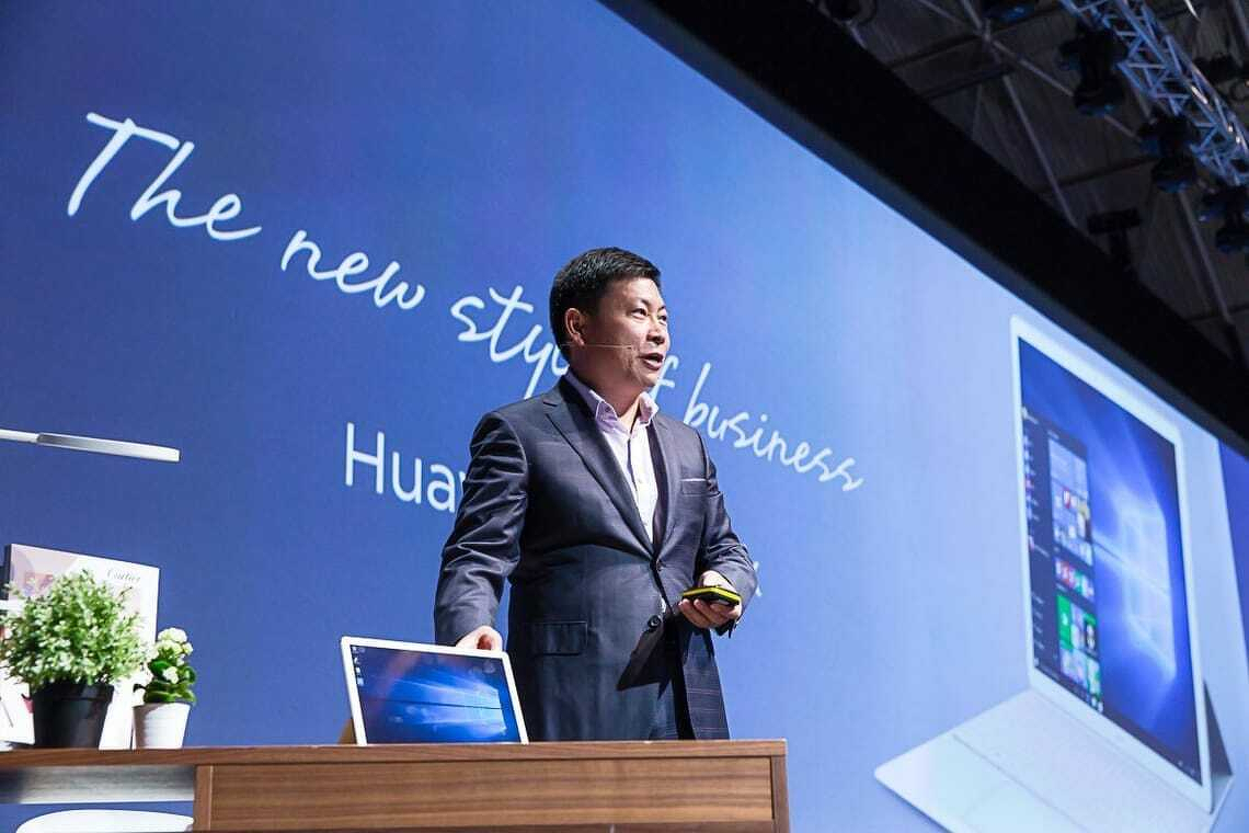
Huawei’s MateBook line sets out to challenge premium laptops, taking aim at Apple’s MacBook Air and Microsoft’s Surface while targeting business users with a lower-cost, high-style alternative..
Richard Yu, chief executive of Huawei’s consumer division, at launch of Huawei Matebook in Barcelona.
Huawei pitched its 2020 Matebook 13 as an Apple MacBook Air alternative. That’s not my words, it is a direct quote from Huawei consumer chief executive Richard Yu, who made the comparison at the product launch at Mobile World Congress in Barcelona.
Comparisons with Apple are a big deal at Huawei. The company wants to be China’s Apple.
While there are similarities between the Matebook and the MacBook Air, it’s not a direct comparison. Few people would choose directly between the two. Apart from anything else, Huawei runs Windows 10, while the MacBook Air runs macOS.
Switching between operating systems is not something you’d want to do every upgrade.
Individuals choose to buy Apples. Huawei’s strategy is to target enterprise buyers.
A more direct comparison is between the Matebook and Microsoft’s Surface line of computers and tablets. We’ll look at that later.
First, how does Huawei’s 2020 Matebook 13 compare with the Apple MacBook Air?
Matebook 13 versus MacBook Air
Huawei’s MateBook offers the most MacBook Air-like experience in a Windows laptop.
The Matebook 13 sells for NZ$2200. It has an Intel i7 processor. There are an Nvidia MX250 graphics processor, 16GB of Ram and 512GB of storage.
The nearest equivalent MacBook Air costs NZ$2350. It has the same 512GB of storage. You get 8GB of Ram and an i5 processor.
Given the specifications, it is no surprise the Matebook handles processor intensive work better than the MacBook Air. To be fair, Apple doesn’t pitch the Air as a computer for intensive work, the company points power hungry users at the MacBook Pro models.
In testing, the Matebook beat the Apple for video editing. Otherwise there was less difference that you might expect give the different processors and amounts of Ram.
Simple or complex?
If you use a laptop for simple tasks like, writing or answering emails, then the performance gap between the two is academic. You won’t notice which is faster. That changes as you throw more work at the computers. The more powerful Matebook 13 does a better job with, say, manipulating large Excel spreadsheets or complex calculations.
The MacBook hard drive is much faster than the Matebook 13’s drive. The MacBook Air stores files in about half the time it takes on the Matebook 13.
When it comes to graphics, the MacBook Air beats the Matebook 13. The 13.3 inch screen has 2560 by 1600 pixel resolution. The Matebook screen is a fraction smaller at 13 inches and has a 2160 by 1440 resolution. If you compare the two side by side, Apple’s display is far more impressive.
Apple wins by a long margin on battery life. You can work on a MacBook Air for ten hours between charges. In testing the Matebook 13 ran out of juice a few minutes before the six hour mark.
Portability
One strange point of comparison is with weight. Huawei’s specification sheet says 1.3kg. That’s as near as it can be to the MacBook Air which Apple’s tech sheet says weights 1.29kg.
When I picked the two computers up, the Matebook 13 felt heavier than the MacBook Air despite these specifications. I weighted them on kitchen scales. The MacBook Air was 1.3kg and the Matebook 13 was 1.4kg.
That goes part way to explaining the practical difference, but not the whole way. The Matebook 13 is smaller than the MacBook Air. It measures 286 by 211 by 14.9 mm. The Air is 304 by 212 by 16 mm. Which means the Huawei computer feels heavier because it is denser.
This could be nitpicking, until you put the two computers in bags and carry them around all day. Both are light and easy to carry. Yet you’ll notice the Matebook 13 a fraction more than you’ll notice the MacBook Air.
Small and neatly formed
Both Apple and Huawei take a pride in build quality. The Matebook 13 almost hits the MacBook Air standard.
There are two places where it fails. First, the power button which doubles as a fingerprint reader.
Apple’s square Touch ID sensor sits at the top right of the keyboard. It feels like any other key. Huawei’s round button sits north of the top right of the keyboard and doesn’t have the same solidity as Apple’s key. There’s a small amount of wobble. You can live with it, but it shows Huawei doesn’t achieve Apple levels of attention to detail.
A more obvious annoyance is the Huawei Share sticker on the keyboard’s bottom right. This is next to the as disfiguring and tacky Intel advertising sticker.
It’s amazing, computer makers go to extreme lengths to design sleek, beautiful hardware and then spoil the effect with stickers. Many are needless aesthetic wreckers, the Huawei Share sticker is not. It has a function.
Integration
Huawei Share lets you connect your Matebook 13 to a Huawei phone. The idea is loosely similar to the features that let Mac owners swap files and photos with iPhones or iPads. When you’re working with a Matebook, these Apple-Huawei comparisons are never far away.
Unlike Apple’s phone-computer integration, Huawei Share mirrors your phone’s screen on the laptop screen. I can’t think of why this might be useful, but you might find a purpose for it.
It has to be a Huawei phone. That’s an oddity right there. Huawei may be New Zealand’s third favourite phone brand, but it enjoys, at best, a ten percent market share. If you draw a Venn diagram of the New Zealanders who have both a Huawei laptop and phone, it’s unlikely the overlap would be more than a couple of hundred.
A few last comparisons that don’t fit elsewhere. On paper both the Matebook 13 and the MacBook Air have the same WiFi specifications. In practice, the MacBook’s WiF works better over longer distances. I connected both to remote servers via home WiFi and saw better speeds on the MacBook Air. I can speculate on why this is, but a proper answer is beyond the scope of this story.
Like Apple, maybe because of Apple, Huawei has gone for port minimalism. There are two USB-C ports and a 3.5mm headphone jack. You can only charge the computer using the left-hand USB-C port.
Huawei Matebook 13.
Matebook 13 versus MacBook Air verdict
You get more computer for less money with the Huawei MateBook 13. You’ll be hard-pressed to tell the performance apart despite the specifications. That is unless you run demanding apps. If that’s you, then you’ll appreciate the more powerful Matebook.
Apple’s MacBook looks and feels nicer; it has a better screen and way more battery life. Which means if you don’t need more processing grunt, it could be a smarter buy.
And yet few would choose between a Matebook 13 and a MacBook Air on these criteria. If you prefer Windows 10 or have to use it for work, the Matebook 13 gives you the most MacBook Air-like Windows laptop experience.
Matebook 13 compared with the Surface Pro
Microsoft’s Surface Pro has been the best Windows computer money can buy. Now it faces direct competition from Huawei.
Like the Surface, Huawei’s MateBook is a similar thin, light hybrid with a 12-inch display. It follows the same basic format as the Surface: A tablet with a theoretically separate keyboard that everyone is going to buy anyway.
Matebook comes with a similar range of processors and memory configurations. Like the Surface Pro, there’s a stylus, although Huawei’s also includes a laser pointer.
The Matebook even resembles a Surface although there is also a nod of the head to Apple’s iPad Pro design. One nice touch is the fake leather keyboard case.
Perhaps the most important feature is that the Matebook is priced at about 75 percent of Microsoft’s prices. That’s enough to make a difference.
This isn’t a direct comparison between the two, Microsoft’s Surface Pro has a 2736 x 1824 pixel screen. The Matebook has a lower resolution at 2160 x 1440 pixels, but it also has the same fingerprint sensor technology used on Huawei’s phones. Huawei says its Core m model runs faster than Microsoft’s Core m Surface Pro.
Huawei has followed Microsoft’s practice of charging extra for a keyboard, stylus and dock. A Huawei New Zealand representative told me that when it reaches the country the Matebook will probably be sold bundled with a keyboard.
To an untrained eye Huawei’s HarmonyOS looks like the Android phone operating system. Officially the company says it is not a copy of Android. But that’s not what your eyes will tell you if you give it try.
HarmonyOS is the company’s response to changed market conditions. Huawei aims to establish it as a third phone OS alongside iOS and Android. It hopes HarmonyOS will reach beyond phones to tablets, watches and smart speakers.
Soon owners of recent Huawei phones including the Mate 40, P40 and Mate 30 models will be able to upgrade to HarmonyOS. The word upgrade needs to be taken with a pinch of salt. Few users will see much of an improvement.
Why is this happening?
It took 18 months for Huawei to go from the top rank of phone makers to become a distant runner up.
Two years ago the US government put sanctions on Huawei. It is no longer allowed to licence or otherwise use US technology. Most of all, it can’t use Google Mobile Services.
This is the glue that makes an Android phone useful. Among other things it gives users access to Google’s cloud, to the Play Store and to Gmail. Google Maps and YouTube are off limits. Users can’t buy things with Google Pay.
Between them, Apple and Samsung account for 17 phones in 20. The rest are rats and mice.
At its peak Huawei was close to a quarter of the New Zealand phone market.
In 2019, Huawei was in third place both in New Zealand and worldwide. There were quarters when it shipped more units than Apple. Mind you, a lot of those units were low-end devices.
Huawei pivots
In recent months Huawei’s New Zealand business has turned to selling solar power technology and headphones where it once sold premium phones and mobile network hardware.
At Ars Technica, Ron Amado takes an in-depth look at HarmonyOS. He had to jump through ridiculous hoops to get a copy of the software.
His conclusion is that it is an Android fork. Or to be more accurate, he says: “It’s Android but slower”.
There’s a lot of technical material in the story. It’s something of a treat for a certain kind of Android fan. Amado concludes by saying HarmonyOS is potentially China’s version of Android.
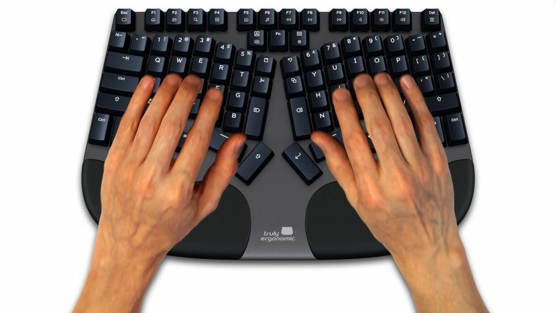
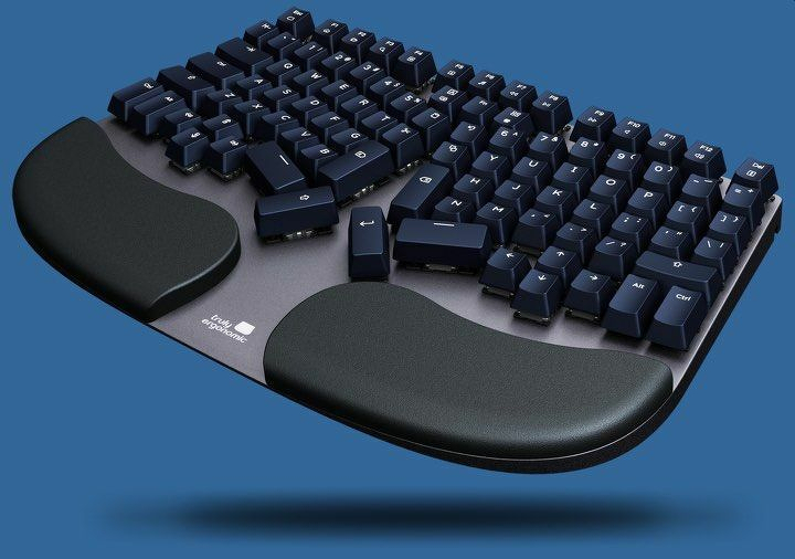
Truly Ergonomic’s marketing claims the Cleave is the most comfortable keyboard on the planet and will improve your productivity. The claim is far from ridiculous, but there should be a few qualifiers in there. You may see a benefit, but don’t bank on it.
Truly Ergonomic Cleave keyboard at a glance
| | |
|—|—|
| FOR | Well built, solid key action with feedback, can stop you from getting a painful injury |
| AGAINST | Does not include number pad, expensive. It’s not easily portable. |
| MAYBE | Could be hard to learn but worth the effort if you persist. No wireless connection. |
| VERDICT | If you find typing painful, you need to consider the Cleave keyboard. |
| RATING | 4 out of 5 |
| PRICE | US$330 – with cheaper options – see below. |
| WEB | Truly Ergonomic |
The Truly Ergonomic Cleave Keyboard looks like no other computer keyboard. It is narrower and deeper. The keys rise higher out of the backplate and, unlike traditional typewriter styles keyboards there’s no offset between the rows.
This, says, Truly Ergonomic is all deliberate. The design will reduce your risk of carpal tunnel syndrome.
Carpel tunnel syndrome
Carpel tunnel syndrome is as nasty as a it sounds. You can get it from spending hours typing with a poorly designed keyboard. It is a painful infliction and hard to treat.
If you get it, you may not be able to type again for weeks or months. For many people it can mean looking for a new job away from computers and keyboards.
Anything that stops carpel tunnel syndrome is welcome.
Sturdy design
The keyboard is sturdy and heavy by modern standards. You can carry it with a laptop in a backpack, but it’s not for mobile computing as we know it.
It has a solid aluminium backplate. At the front there are padded, but firm, wrist rests on both sides. While the keyboard is smaller than many Windows computer keyboards, it is massive next to the Apple Magic Keyboard.
Compared to a standard desktop keyboard it is narrow. There are no number keys. Truly Ergonomic says a narrow keyboard means less reaching for the mouse, which is, bad for your hands and wrist.
Key layout
Keys are laid out symmetrically with a small split down the centre. Letter keys are arranged in the familiar Qwerty pattern. in rows and columns.
Back in the first paragraph of this review it says: …”there’s no offset between the rows”. This needs an explanation.
Traditional mechanical typewriter keyboards were designed to stop keys jamming. Part of that meant the keys in each row are offset by a few millimetres from the keys in the row above. The A key is the first key on the second row. It sits below and slightly to the right of the Q key which is the first key on the top row.
The Cleave keyboard doesn’t have this offset. Each key sits directly below the key in the row above. This means a grid-like pattern of columns and rows.
The photo should make this clear.
The remaining keys
Truly Ergonomic has moved certain other keys from where you might expect to find them.
A row of function keys sits across the top in the usual manner. There are left and right return keys and two space keys instead of a bar. There is also a set of arrow keys on both halves of the keyboard.
The backspace key sits near the centre, again there are left and right versions. The function key is here too.
This arrangement says Truly Ergonomic keeps your wrists straight. And that is how you can avoid carpal tunnel syndrome.
In practice it takes a lot of time to adjust to the alternative key positions.
Construction
The keyboard construction is solid, bordering on rugged. It’s heavier than many of the cheaper ergonomic keyboards, but that’s down to the robustness. You’ll get more years out of this keyboard than a cheaper ergonomic alternative.
It’s not a pretty keyboard. Although ergonomic keyboards never are. You can have comfort and health or looks. Pick one.
Truly Ergonomic doesn’t use Bluetooth. You’ll have to connect it to a computer using an old style USB 2.0 port with a metre long cable. That can be a problem with, say, a modern laptop where there is a limited selection of USB C ports. In that case you’ll need to buy an adaptor.
A smart move would be for Truly Ergonomic to switch to using USB-C like the rest of the world and include an adaptor in the box for people who need an older connector.
Clicky
The review keyboard came with the “clicky” key option. It gives a satisfying noise when you hit a key along with tactile feedback. It’s a welcome reminder of when all keyboards were made this way. There are options for a silent keyboard without the tactile feedback and silent with the feedback.
Truly Ergonomic says the keys are waterproof and dust proof. It wasn’t practical to test this during the review, but the opened out design does make it easy to clean up crumbs if you get them between the keys.
One important upgrade from the earlier Truly Ergonomic keyboard is backlighting.
How does the keyboard work in practice? The simple answer is that it can mean a significant adjustment on your part. Retraining those mental and physical muscles is far from trivial.
Hard work for a touch typist
It is 40 years since I learnt to touch type on a manual typewriter. If my fingers can find the home keys on a keyboard I can type without looking at what my hands are doing. There are fumbles, but it works. My speeds aren’t great but they are good.
What’s more, I now “think with my fingers”. By that I mean there’s no barrier between my thoughts and seeing words appear on the screen. My typing is unconscious.
That was not the case when I tested the Cleave. My typing speed slowed right down. I needed to look at the keyboard all the time and returned to two finger typing. My fingers could no longer automatically find the keys. The result was my flow was ruined. I can’t use this keyboard.
Hunt and peck typing is different
It’s not all about me. You may not have years of touch typing drilled into your brain.
The Cleave could be a perfect fit for you, but what I can’t tell you is that it improved anything for me. I couldn’t use it long enough to be sure. After a couple of days of not being productive, I gave up.
The words you are reading here were not typed on the Cleave. I’ve gone back to my old, standard not even remotely ergonomic Apple keyboard.
Same product, range of prices
The Cleave’s official list price is US$330 and, frankly, the price structure is odd. There is an option of paying US$249. The cheaper price means a two year guarantee and a 60 day trial instead of three years and 90 days.
At the time of writing there is a limited time offer of US$199 with a one year guarantee and a 30 day trial period. With each option you get exactly the same keyboard.
While the price is expensive by everyday keyboard standards, the amount Truly Ergonomic asks for is reasonable if it delivers a clear benefit. US$330 is a bargain if it keeps you out of surgery. And anyway, the price is in line with other upmarket ergonomic keyboards with mechanical switches.
Verdict: Truly Ergonomic Cleave keyboard
If you find typing painful, the Cleave has to be on your list.
As the experience outlined above shows, Cleave doesn’t work for everyone. Yet it could be the answer for you.
The biggest barrier to buying the keyboard, is that you won’t know if it is right until you’ve used it for a while. Truly Ergonomic offers options with a trial period, which makes a lot of sense to customers in North America. It may be harder to manage those trial options if you live elsewhere in the world.
There are alternative keyboards, the best known is the cheaper Microsoft Ergonomic keyboard which is widely available in retail stores and costs about half the price of the Cleave. The Microsoft keyboard can help, but the Cleave is much better for people with serious carpel tunnel symptoms. If you’ve tried the Microsoft keyboard and not seen an effect, then you should consider the Cleave.
Typora is a great Markdown editor that brings distraction-free writing to Windows and Linux.
.
There’s a full smorgasbord of Markdown editors for Apple users. Windows and Linux users who want to simplify writing have fewer options. Typora changes that.
It’s possible to run Typora on a Chromebook. While there are no versions for Android or iOS, that may change.
Markdown editors are stripped-back distraction-free writing apps. If you want to focus on getting your words onto the virtual page and nothing else, they are your best option.
With Markdown editors you can enter formatting codes directly into your text. A pair of * symbols tells Markdown the next few characters are in bold type and so on.
Keep it out of sight
Other Markdown editors tend to keep these codes in sight. You type onto a blank pages and can see your markup codes. You can then switch to a second screen to see how they look after formatting.
Typora doesn’t do that. In normal use, it styles the text as you type. This takes us back to an acronym that we don’t hear much these days: wysiwyg – what you see is what you get.
There is an option to choose a view with pure Markdown codes. Yet, for the most part, Typora keeps this out of sight.
I’m not convinced this is an improvement, but you may feel otherwise.
Themes
The other departure from standard Markdown editors is that Typora offers a series of themes. Many allow you to switch from dark text on a light background to light on dark, or perhaps, format the output in different ways.
Typora takes themes further than that. There is a theme gallery, you can download more themes If you are handy with CSS, you can create your own custom themes.
While this is neat, it is a form of distraction. Instead of procrastinating over font choices and layout options when using Microsoft Word, you can now waste valuable writing time looking at these themes.
Document format
There are Markdown editors that store files in a proprietary format. Thankfully, Typora does not do this. Proprietary formats are a backward step.
The files store as .md documents that you can open with other Markdown editors and applications or services that accept Markdown input. This can be handy if, say, you have a WordPress blog.
You can save direct to Word format if you need to stay compatible with colleagues. Typora has HTML and PDF output too.
Typora verdict
If you already use a Markdown editor, Typora can make sense if being able to see formatted text as you type appeals. I find it doesn’t help, but it doesn’t do any harm.
Typora is the best Markdown editor I’ve seen for Windows and Linux systems. If you want to simplify your writing and you use one of these, it is the smartest option.
If you are a Mac user, take advantage of the free trial period to see if Typora suits better than the other Markdown options.
Typora costs a one-off US$15. There is no cheeky annual subscription to worry about. I couldn’t find it in app stores, you can buy direct from the Typora site.
It’s easy to sceptical about the current wave of AI euphoria. There is a lot of hype to navigate. Every tech company has an AI story to tell: worthwhile or not. Failure to tick the AI box makes it hard for start-ups to raise money.
Yet unlike, say, crypto, there is substance behind AI. True, it enables plagiarism on an industrial scale. But it is capable of turning in impressive results.
This is especially true in a sector like medicine. We’re seeing results that underline how important and radical AI can be.
The AI helped narrow down thousands of potential chemicals to a handful that could be tested in the laboratory.
The result was a potent, experimental antibiotic called abaucin, which will need further tests before being used.
The researchers in Canada and the US say AI has the power to massively accelerate the discovery of new drugs.
It is the latest example of how the tools of artificial intelligence can be a revolutionary force in science and medicine.
An example from closer to home could prove as important.
Auckland ophthalmologist Dr David Squirrell has used AI to help screen patients for diabetic retinopathy - a complication of the diabetes epidemic which is a huge problem for New Zealand’s Pasifika communities. Without screening people can have serious visual problems and, in cases, irreversible damage.
Sifting through data to spot patients who need further treatment is slow, difficult work. Using AI speeds up testing, making it more accessible to a demographic that can struggle to get the right medical treatment. More importantly, Squirrell found the AI approach is more accurate than the manual process. It picks up things a human might miss.
Two years ago Toku Eyes, a start-up established to develop the software raised $3.6 million to develop the software. Earlier this year it raised a further $13 million in the US.
Eventually it will be able to install cameras in accessible places like shopping malls and test eyes early enough to catch problems and deal with a preventable, but devastating condition.
Charles Handy spent his early working life as a Shell International executive.
He had a philosophical bent, but much of the material in his book, The Age of Unreason, is practical.
Handy looked forward to a world where telecommuting was an everyday reality. One where people no longer regard marriage – or any other aspect of their lives – as being forever. He predicted organisations would no longer hire vast numbers of full-time workers, they are either employed on a temporary basis or hired as consultants.
The Age of Unreason predicted the gig economy
Handy anticipated today’s job market: The gig economy.
While Handy suggests answers, he asks readers to think in new and radical ways about a changing world.
Handy explores the contradiction that employers want to hire staff who have both knowledge and experience even though it is impossible to gain experience without first getting a job.
He says there are professions where young people move through the ranks to the point where they can switch careers. Journalism is an example. Young journalists have huge amounts of responsibility early in their careers.
Another idea is people now have shorter careers in the past, but that they work harder so over the length of their working life they work as many hours as earlier generations.
Handy says people spend longer in education so they start working later. Yet employers encourage them to leave work at an earlier age.
So a career in, say, international banking might last from the age of 25 to 50; that’s 25 years. In earlier generations, the same career might have lasted almost 50 years from 18 to 68.
Handy missed one twist on this, today’s employees work longer hours.
An earlier version of this post was originally written in 2016..
Originally a digital meeting place for professionals and a handy contact book for journalists, LinkedIn’s value proposition has shifted significantly since its 2016 acquisition by Microsoft. What began as an efficient tool for maintaining work networks has evolved into a site defined by aggressive data harvesting and heightened security concerns.
Linkedin’s declining usefulness
In its early years, LinkedIn was a high-functioning, self-updating contact book. For industries with high turnover, such as technology and telecommunications, it automated the task of tracking people’s movements. Features like Microsoft Outlook synchronisation and the business-card-to-digital-contact app CardMunch positioned it as a helpful, though still often annoying, tool.
For journalists, it was a fact-checking database. It provided up to date job title information and made it easier to find subject-matter experts. However, this usefulness eroded as users became slower at updating profiles, the information was hidden deeper in profiles and Linkedin prioritised internal “walled garden” communication over direct contact.
Friction as a business model
LinkedIn’s shift toward a “pay-to-play” model turned a once-open network into a brokered marketplace. Direct contact information—once readily available—is now largely hidden, in part to prevent scraping by spammers. In its place is an internal messaging system where response rates are notoriously low, often dismissed by recipients as noise. None of this worked at the speed of news deadlines.
With premium subscriptions starting at US$60 per month, the cost of breaking through these barriers is steep. This has led to a landscape where users are frequently bombarded with intrusive, irrelevant connection requests from industries like real estate and vehicle sales, further diluting the platform’s professional rigour.
You are the product
The core of LinkedIn’s business model relies on a massive, user-generated database. Every field a user completes increases the profile’s market value. When Microsoft acquired LinkedIn for roughly US$26.2 billion, it effectively paid US$60 per user profile.
Critics argue that Linkedin’s “social contract” is unbalanced. While the site makes a fortune selling data to recruiters and advertisers, the average user receives diminishing returns. In many regions, the platform maintains a job-market monopoly, forcing professionals to maintain “well-crafted” profiles even if the site provides no tangible daily value.
Integration or intrusion?
The Microsoft acquisition raised concerns regarding market dominance and user experience. CEO Satya Nadella’s vision of “delightful” integrations—such as Microsoft Word suggesting LinkedIn experts to contact while writing—was met with skepticism. To many, these features represent an unwelcome intrusion into the workflow rather than a productivity boost.
Security worries
Linkedin’s handling of security has also faced scrutiny. A 2012 breach, which compromised approximately 100 million emails and passwords, was not fully acknowledged by the company until 2016. For many, this delay highlighted a lack of transparency regarding user welfare.
When balanced against the risks of data exposure and the annoyance of persistent notifications, the “ROI” of a LinkedIn profile is increasingly difficult to justify. For those not actively seeking work through its specific channels, the platform often functions as little more than a security risk and a source of digital clutter.
Why I left and, reluctantly rejoined
By 2016, Linkedin had no value for a New Zealand journalist beyond fact-checking up-to-date job titles and, at the time, that could be done using Google without ever opening the Linkedin site. It made sense to cut through the noise and leave. Much of the other useful functionality, the status updates and so on could be found on Twitter, now X, where responses were many times faster. I closed my Linkedin account and for the next five or six years did not look back.
However, soon after Elon Musk acquired Twitter at the end of 2022 and tinkered with its algorithms, it became harder to curate the service in ways that help journalists stay in touch with contacts. At this point, despite being flawed and even more annoying than before, Linkedin was once again the best place to stay in touch with industry players.
IA Writer is a text editor. A stripped back, race-tuned greyhound of a writing app. There’s nothing fancy or complicated. That is its attraction.
You can start putting words together within minutes of installing the software.
It is the most productive writing tool I’ve used since learning to type on manual typewriters. Like those old machines, iA Writer lets you focus on words without distractions—though as Robin Williams taught Mac users decades ago, computers aren’t typewriters and follow different typography rules. iA Writer could be the software you are looking for.
You can keep your fancy, feature-rich word processors. They have their place, but they are not always the most productive tools.
I keep a copy of Microsoft Word on my Mac to stay compatible with clients and co-workers. That way there’s no chance of anything slipping between the cracks in a complex editing job.
iA Writer first
Yet when it comes to writing a newspaper feature, a blog post or commercial copy, Writer is my first choice. Every time.
That’s because iA Writer’s minimalist approach gets out of the way. There’s no temptation to mess around choosing the right font for this communication. You won’t wonder if the crosshead typeface you’ve chosen is a good fit with the body.
You don’t have choices. There’s nothing to tinker with. Or, at least, not much.
Instead you can focus on your words.
Over the years the software has evolved. It does more today than it did when I started using it about five years ago. Yet you couldn’t accuse it of feature bloat. It remains simple.
Works everywhere you do
One advantage of keeping the software simple is that you get a near-identical experience whether you are writing on a large screen desktop Mac, an iPad or an iPhone.
For years iA Writer was an Apple experience. Today you can get versions for Windows or Android. The cross platform experience is almost as smooth as staying in Apple’s walled garden. This makes it an excellent choice for people moving between Apple, Microsoft and Android.
Text editors in general tend to be a form of lowest common denominator. IA Writer has this to a T.
iA Writer 5.4
Earlier this year iA Writer moved to version 5.4. That added features such as local storage, new export options and context menus.
If this was an ordinary product review, at this point I’d run through how these feature work in practice. But I won’t because I find I never use them all. My understanding of them is abstract. I’ve tested them and seen they work as advertised, but they don’t get a second glance in the heat of battle.
You can do something complex with blocks of copy, which you can insert as content blocksin your document. Again, I’ve tested, but never needed this. It may be the feature you’ve been looking for.
Writing experience made for cloud
The new feature that I do use is the ability to make local copies. In normal use Writer stores documents in your iCloud account. Because each document is tiny, files are tiny. You won’t chew through iCloud storage the way you might with word processor documents.
For a while iCloud integration was buggy. At times you couldn’t be sure they document was where it should be. Having local backups meant you never faced losing an afternoon’s writing brilliance.
In May iA Writer moved to version 5.5. In part the upgrade brought the software in line with the new features in iPadOS. You can now use a trackpad or mouse with the software on an iPad. Not that I’d want to do that.
Markdown
We’re 600 words into this post and there has not yet been any mention of Markdown. This is a simple markup language that lets you format your text. Type a * symbol either side of a word and it will show up in italics. Put two * around a word and it is in bold.
There are a handful of Markdown commands to memorise. It doesn’t take long and it means you can keep your hands on the keys without reaching for the mouse or trackpad.
That way you can type faster. It’s more efficient. As a bonus, you are less likely to get a repetitive strain injury. The commands soon become hardwired in your fingertips. Yet I must confess there are times I have to look up the more obscure ones.
In version 5.5, there’s a new Markdown code. Two equals signs around a word will highlight it. That’s like the yellow marker you find in word processors. It’s hard to miss.
You’re either going to love Markdown or hate it. It works for me. I recommend giving it a try before deciding. There are free trial versions of iA Writer 5.6.
PDF viewer
The other 5.5 upgrade was the addition of a PDF viewer. When I write for my website I can publish text direct to WordPress. All the formatting comes with the words. If I work for a client who needs a Word document, yes that is almost every client, I can save my iA Writer document in a docx format.
Adding the ability to save in PDF format takes this further. Yet, like many new features, I don’t use it. Or, more accurately, I haven’t used it yet.
That’s not the point. Each feature upgrade expands the software’s reach to users who need more than basic text editing but not as much as a word processor. IA Writer rolls out a few new features every year, but you couldn’t say the software is bloated or even on the road to bloated.
iA Writer 5.6
We’re now at iA Writer 5.6. It’s been around now for a month. The latest version adds a style checker. It could help improve your writing. The checker looks for cliches, fillers and redundancies. When they appear in your text, they are grey.
You can choose to edit them if you wish.
I don’t always agree with the software style decisions. Journalism relies on short simple language. While that can get hackneyed, it’s a way of getting a message over fast.
And there are words iA Writer 5.6 doesn’t approve of, like also or too, that are useful for journalism.
Good housekeeping
The remaining updates in 5.6 are all background housekeeping changes that developers make and casual users may not notice. Files now open faster, but that was never an issue for me. The noticeable background update is that huge files don’t slow down.
IA Writer’s price has climbed over the years. When I first bought the software I paid NZ$3. It was a promotional price. Today the software costs US$30 for the Mac and $9 for the iPad or iPhone. You can get it from the relevant app store. There are free trial versions.
You have to buy both if you plan to use the software on a Mac and an iOS device. I don’t begrudge it.
Compared with the alternatives it’s a bargain. You have to pay roughly four times that amount every year to use Microsoft Word.
Other word processors can cost more. This is important. Journalists and others who write for a living get paid in ways that make it hard to budget for a regular subscription. A flat one-off fee is better. You know where you are and you know for certain there will never be a month where you face not paying the software subscription or skipping a meal.
Critics
You’ll see critics complain that iA Writer doesn’t have collaboration tools. In part that’s because the idea of collaboration doesn’t sit well with distraction-free writing. Nothing is more distracting than someone jumping it with an annoying, pedantic edit while you are crafting your next perfect piece of prose.
Collaboration is important. It is not the be all and end all of working with others.
The upside is that it’s easy for iA Writer to work in with collaboration tools. At times when I’m asked to work with, say, Google Docs, I will write first in iA Writer, then load the text into a shared Doc for the editing party to begin. I’ve been known to pull paragraphs or sections from the shared document, paste them into iA Writer, make my edits and return the text.
IA Writer isn’t for everyone. Many people feel they need the handholding they get from a product like Word. Or they feel comfortable using the same thing as everyone else. There are companies, clients and individual managers who will insist you use Word.
When I was thinking about this idea earlier, it occurred to me there is an analogy with music. IA Writer is to a word processor what, say, a fretless string instrument is to a guitar or keyboard. If you are on top of your writing game and confident, you can get better results without the guiding baggage. If that’s not you, then fine. You have alternatives.
Left to my own devices I prefer to use iA Writer over any other writing tool. It’s been my main word processor for the past seven years.
This might sound odd because iA Writer isn’t a word processor. It is a simple text editor app that runs on both iOS and MacOS. I have installed it on my MacBook, iPad and iPhone.
Late last year the software was updated to version 5.2. While iA Writer was already my favourite writing tool, the newest version makes for a better experience.
That’s because the update addresses the one aspect of the software I wasn’t comfortable with.
Stripped down
Unlike word processors and other fancy writing tools, iA Writer has a stripped down interface. I’m using it now to write this post on my Mac.
All I can see on the display is the Mac’s built-in menu bar across the top. A blank screen that I’m filling with my words and a small status bar at the bottom of the display. It’s the nearest digital equivalent to writing with a manual typewriter on a blank sheet of paper.
If that’s too much, you can enter a full screen mode and the menu bar disappears from sight. There’s also a focus mode that can hide everything except the paragraph or sentence you are working on.
No fiddling with iA Writer
This simplicity allows me to focus on writing. There’s a wonderful passage of text written by The Hitchhiker’s Guide to the Galaxy author Douglas Adams where he describes the creative ways he prevaricates with his work. It involves tinkering with fonts, type sizes, widths and so on.
The mere presence of all those options can be a distraction. iA Writer does away with it. As every long-term Apple user understands, restricting your options can boost productivity.
While, on one level, this iA Writer approach has always worked well for me, it has, at times been a problem. In the earlier versions of the software those choices were too restrictive. The text size was fixed and there was a strict monospace Courier-like typewriter typeface.
Legibility
Good in theory, but in practice we reached a point where I was struggling to read my text on the screen.
I have an eye problem and every so often have restricted vision, to get around it I need larger, clearer typefaces. When that wasn’t an option with iA Writer I found myself using different writing tools. The, now apparently defunct or neglected Byword was a solid alternative with variable fonts and text sizes.
iA Writer addressed these issues with the last two releases of the software. Version 5.2 builds on version 5. There are now three typeface choices: Mono, Duo and Quattro. As the names suggest the first is monospaced, the second uses up to two spaces and the third can use as many as four.
There’s a lot of nerdy material on the iA Writer website about fonts. It all boils down to the newer options making it much easier to read your words on the screen.
Uno, Duo… Quattro
The most recent typeface, Quattro combines the benefits of fixed and proportional spaced fonts. It is particularly easy on my eyes. Better still, it is legible if I need to read or write on a smaller screen, say an iPhone.
iA Writer has always done a good job of exporting to Microsoft Word. The latest version improves this. If you want you can write documents with footnotes, tables or even inline images and convert them to Word .docx format. This is essential for my work as almost every client expects to see a Word document.
The software also integrates with other services. The only one I use all the time is the post to WordPress option. This was sometimes a little tricky with earlier versions of iA Writer but has been good since version four.
Sharing an iA Writer strength
You can also save documents as HTML, which is powerful when fixing web copy.
As you might expect with a made-for-Apple app, iA Writer deals brilliantly with the internal Apple sharing functionality. This work well with the iOS Files app and on both operating systems with iCloud. One neat aspect of this is that I can draft a post on my Mac and then edit on an iPad or iPhone later. You can also link them both to Dropbox.
When I first purchased iA Writer for iOS, the price was, from memory, US$3. That was an introductory deal. It later moved to $5. Today it is US$9. The MacOS version has increased more in price, today it is US$29. Get it from the app store. You have to buy the app again when there’s a major upgrade, but the price is low enough for this to not be a deal breaker.
There is a US$20 Windows app and a free one for Android. There are trial versions at the iA Writer web site.
One last thing. iA Writer stores documents as plain text, but it uses Markdown formatting. This is a simple way of adding headers, bold, italics, hyperlinks and so on to you text. These show up in the text editor as punctuation marks. You can then create a preview to show how the document looks after converting it to HTML, Word format or whatever. It might sound off-putting, but in practice it’s easy to use.
Is iA Writer 5 a text editor? Or is it a minimal word processor? The software is both and neither at the same time. It’s an elegant stripped down writing tool that’s perfect for 2018.
iA Writer starts from the premise that some writers focus on their words, not how they look on a page.
There are no distractions. The software has almost no moving parts. Words on a screen, that’s it. iA Writer feels the nearest thing to using paper in a typewriter and yet it is as modern as the iPhone X.
If you like your writing software flashy and complex go elsewhere. If you need to do tricky typographic work or lay out pages, this is not for you. It is a writer’s tool, pure and simple.
MacOS and iOS
There are versions of iA Writer for iOS, MacOS and Android. It works best with Apple kit. If you don’t use Apple hardware, the software is a good reason to change. If you have an iPad Pro, this would be a good time to invest in a keyboard, although iA Writer is fine if you write on a glass keyboard.
That’s because cloud is central to the software. You can store documents locally on a Mac, iPhone or iPad, but why would you when you can save them the cloud and have them sync between devices.
This works so well that you can type away on, say, a MacBook, race out the door and pick up from where you left off on an iPhone.
The app-OS-hardware integration has only improved with Apple’s recent move to iOS 11.
iA Writer a breeze compared to Word, Pages
Of course you can do much the same with, say, Microsoft Word or Apple Pages. Up to a point.
Word is a hefty MacOS app. It rarely starts without checking to see if there is a software update — usually once a week. Often you’ll need to wait 15 minutes or so before working while Microsoft handles the latest updates to all the Office apps.
Even when there are no updates Word is not instant on. iA Writer is ready immediately. Often a Word work session starts with something other than jumping straight into writing. Maybe you need to find the right fonts or styles. There are always things to fuss over.
With iA Writer you are ready to go almost from the moment you click the app’s icon. There is nothing to fuss over. Almost no possible choices to make.
Focus
The idea behind iA Writer isn’t new. A decade ago there were minimalist word processors and writing tools for Macs and PCs. You may recall WriteRoom or Q10.
There were others. And if you didn’t want a special app, there were the basic text editors shipped with operating systems and tools derived from the Linux or Unix text editors. Even the MS-Dos versions of Word Perfect were minimal in this way. So were older programs like WordStar.
All of them attempted to keep out of your way. In place of a fancy user interface and menus full of esoteric commands, they relied on the user learning a few standard codes. These were embedded among the words to handle things like bold text, heads and so on.
There is a WordPress OSX app that aims to simplify writing blog posts on a Mac. In practice I’ve found sticking with iA writer and integrating with WordPress is much more efficient.
Markdown
iA Writer uses Markdown to do this. Markdown is simple and keeps out of the way. Type a single hash # character at the start of the line for a top level head, two hashes means second level head and so on. It takes seconds to learn, days to master.
One key difference between iA Writer and earlier simple writing tools is the beautiful integration with the hardware, software and cloud services.
It’s as if the the software developers digested the entire Apple less-is-more credo and spat it out as a perfect writing application. Perfect is not too strong a word here. Although this style of perfection may not be to your taste.
iA Writer 5 rival
Only one other application comes close to iA Writer’s elegance and simplicity. The excellent Byword has its own minimalist aesthetic. It too is lightweight, simple and stays out of the way.
Unlike iA Writer which offers next to zero choices, Byword gives you some options. You can change a few things.
This may sound like a cop-out. It isn’t. I have a medical condition which means my eyes sometimes don’t work well. When I’m having bad eyesight days, I can’t adjust the iA Writer type to a bigger size, I can’t alter the font or screen colour to make reading easier. With Byword you can make these changes.
Subtle difference
The result is the two similar minimal writing tools have distinct personalities. They work for different types of use. iA Writer is all about the writing and precious little else. You can use it for complex writing jobs, but it works best for blog posts, putting down thoughts and things like journalism.
Byword is a touch more sophisticated. You can write a book or a 3000 long-form feature in either app. If you want something more, Byword is the first stop on the road from iA Writer to more complex tools like Apple Pages or Microsoft Word.
Efficient
There’s something else important about iA Writer and Byword. The two apps have an impact on the way you write. I find I can sit at a Mac or iPad and zip through a thousand words or so in quick time. This blog post will take less than an hour to write.
Between the minimal software and the Markdown editing language there is almost no reason to move your hands from the keyboard. That’s when you have one on a Mac or say with your iOS device.
With, say, Word, the composition part of the writing process takes longer. There’s more scrolling up and down the page. More distraction. Sure, you can make the words look pretty as you go, but that’s a barrier to getting the right words written efficiently.
iA Writer 5
In November iA Writer reached version 5. It was a free upgrade to those who had earlier versions. There are changes. First the iOS version now works with the new iOS file system.
There are other changes which added functionality without adding complexity. One is that it is now easier to create tables in text.
iA Writer’s other big change is there is a new duospace font. Since the software first arrived there has been no choice other than a standard monospace, typewriter-style font. Now you can choose monospace or duospace.
This sounds like a big deal. In many ways it is. And yet, you’d hardly notice it. I knew I had set the new font in my preferences after downloading the update, but had to go back a moment ago to check I was using it. That’s how subtle it is.
Indeed, while typing away you hardly notice any of the improvements in the last seven years and five versions of iA Writer. That’s the whole point of a minimalist application.
Editor’s note: This 2014 questioning of the Productivity Commission’s push for offshore cloud remains relevant today even though the Productivity Commission has gone. If anything the debate over cloud sovereignty, data residency and supporting local tech providers has intensified since then—particularly after global supply chain disruptions and increased focus on digital sovereignty.
The government should lead the way to cheaper cloud computing services by using offshore providers rather than just New Zealand firms, the Productivity Commission says in its final report on improving productivity in the services industries.
The report goes on to say:
By favouring domestic cloud services, which are significantly more expensive than similar overseas services, the government has missed opportunities for cost savings and technology demonstrations.
More expensive
Offshore cloud providers certainly economies of scale not possible in New Zealand.
This can mean lower prices. In some cases much lower prices. One cloud customer told me a local supplier charges 11 times as much for storage as Amazon Web Services.
It’s not that simple. The company has to buy reserved international bandwidth to access overseas data centres. That changes the price equation.
Even taking that into account, local cloud services can cost more than using overseas suppliers.
Cloud storage and processing costs are often only a fraction of the cost of a computing project. Often they can be tiny compared to other costs.
Paying less for storage may not change the total cost by much. It won’t help much if the human costs of dealing with remote service providers are high.
And there is risk.
At the time of writing a single submarine cable company links New Zealand to the rest of the world. It has two connections. The risk of both legs of the Southern Cross Cable Network failing at once is small. It is not zero. Hopefully this will change.
Technology cultural cringe
The Productivity Commission report reads like an overseas cloud services provider wrote it. That’s not entirely surprising.
Multinationals like Google and Microsoft pay government affairs professionals in Wellington to lobby politicians and get the company’s position in front of organisations like the Productivity Commission.
They spend millions on lobbying. Local cloud companies have nothing like their budgets. It sounds as if the Productivity Commission hasn’t listened to the locals.
The problem here could be ‘The wise men from the east” syndrome. Government employees and organisations like the Productivity Commission think when it comes to technology, people who speak with American accents know more than those who speak with New Zealand accents.
Google’s Chromebook Pixel broke new ground when it launched in 2013. It featured a 12.85-inch, 2560×1700 touchscreen, an Intel Core i5 processor, 4 GB of RAM and a 32 GB solid-state drive. The premium build quality and high-resolution display were well ahead of most Chromebooks at the time.
Much of the Pixel’s extra cost went into that display, which rivalled the Retina screens appearing on Apple’s laptops. Yet the machine still ran Chrome OS, a browser-centric system that relied heavily on cloud applications and had limited support for offline work.
Pretty, pricey and polarising
While the Pixel was praised for its technical ambition, reviews were divided on its value. Lifehacker Australia described it as “pretty, pretty pricey, pretty pointless”, arguing that only people working for Google or reselling its products might find a real use for it.
The review noted that laptops with similar performance running the same operating system were available for less than 20 percent of the Pixel’s price. To many observers it was more adornment than a tool.
A New Zealand technology executive once described Compaq computers as “just high-tech jewellery”—expensive products that existed mainly to make their owners look good. The same description fits the Chromebook Pixel.
Despite the criticisms, the Chromebook Pixel served a purpose for Google. It demonstrated that Chromebooks could be more than bargain-basement machines and helped lift the profile of Chrome OS. In that sense it worked as a halo product, even if sales were limited.
A boundary-pushing but impractical device
The Pixel pushed the Chromebook concept into premium territory, showcasing what the hardware could do and setting a design benchmark. But for most buyers it was less a practical work machine and more a statement piece—an example of high-tech jewellery in laptop form.
Updated and edited February 2026 to put the 2013 story into historic context.
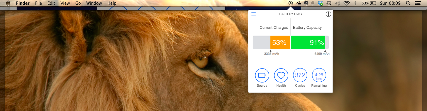
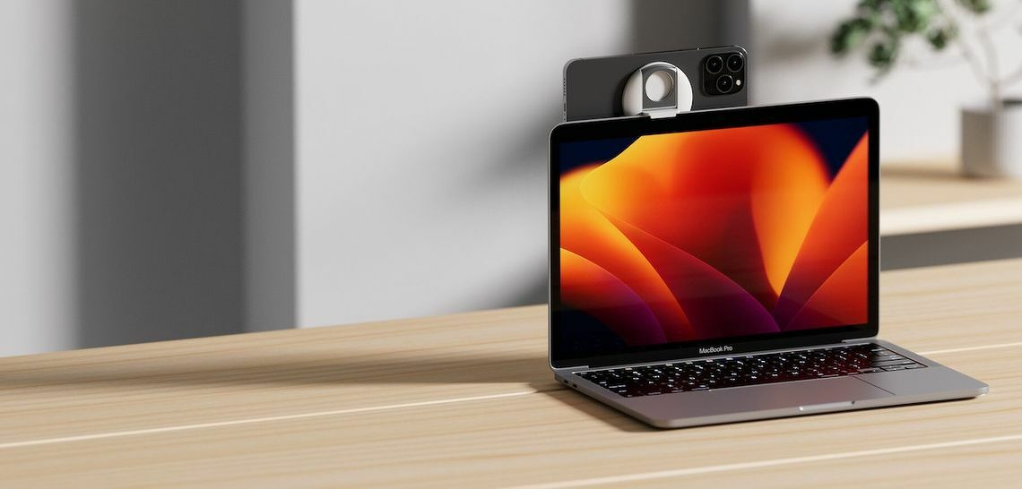
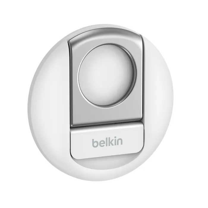
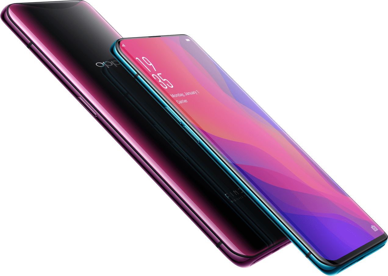
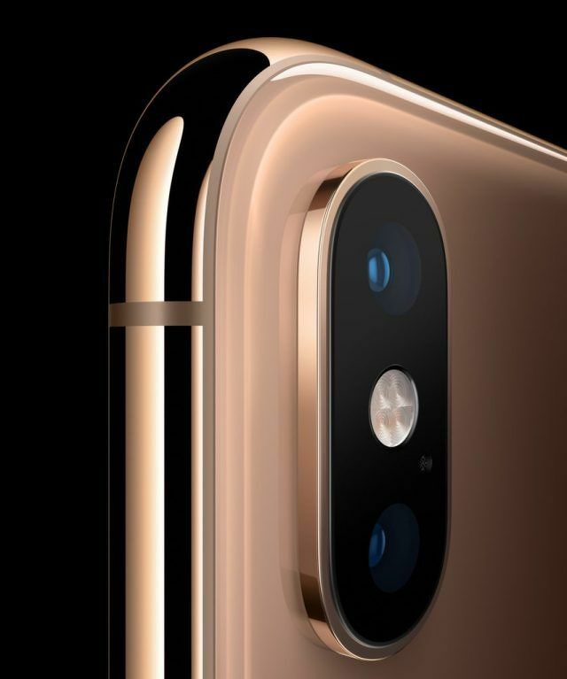 Phone camera close up.
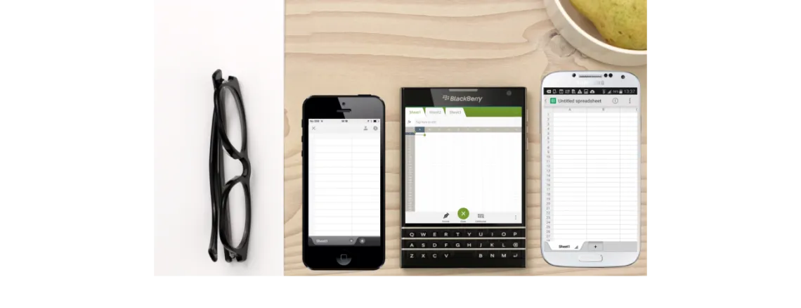
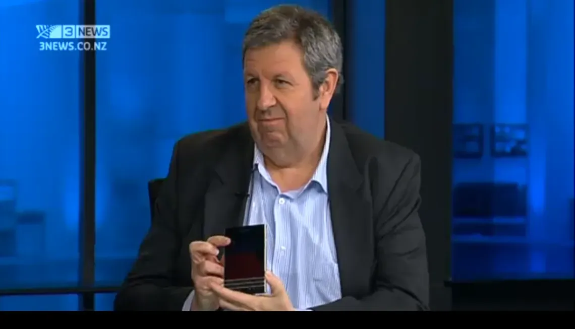 I went on TV3 Firstline to talk about the BlackBerry Passport with Sacha McNeil and Michael Wilson.