The last time I wore an Apple Watch it made me ill. It turns out I have a rare fluoroelastomer allergy. The Apple Watch Series 2 models do not. This post was written in October 2016.
Apple’s Watch Series 2 has been on my wrist for almost a month without causing any problems.
You may be thinking: “So what. Isn’t that normal”?
My skin itched, I developed a rash and at one point my hand swelled to almost double normal size. It wasn’t toothache painful, but it wasn’t comfortable. A surgeon saw this and told me to take it off immediately or face serious illness.
Danger Will Robinson
The metallic back of the first Watch could have been the cause. Or it may have been the watch band. Given the dire warning, I wasn’t prepared to experiment to find out.
There has been no reaction of any description this time around. Whatever caused the reaction is not present in the new Watch.
The most likely problem with the earlier watch was the strap. Apple calls it a band.
Fluoroelastomer allergy
My review Watch was a 42mm Sports model that came with a black Sport Band. According to Apple it is made from a custom high-performance fluoroelastomer. This is a fluorocarbon-based synthetic rubber.
In theory, a fluoroelastomer is less likely to cause an allergic reaction than latex. Note the word: less. There are reports of people getting contact dermatitis from fluoroelastomer, but my reaction went way beyond that.
The other possibility was the nickel in the metal on the back of the original Apple Watch. Nickel is known to trouble some people. Of course, I could have been reacting to both. I have had a known rubber allergy for a long time.
Either way, the reaction was serious. It took weeks for my skin to return to normal.
Once bitten twice shy
Apple swapped my original review watch for a different model with a leather band. I proceeded with caution. Make that extreme caution. The surgeon warned me not to risk it after discussing the likely fluoroelastomer allergy.
By now my skin and hand were back to normal.
At first, I only wore the second Watch for a few minutes. No visible reaction. The next day I tried it for an hour. There may have been a reaction, I’m not sure. After all, it could have been a psychological response given the earlier rash.
I tried the Watch a few more times and even wore it for a few hours one morning. The experiments were inconclusive. There could have been a rash where the metal touched my wrist, but I wasn’t getting the extreme swelling.
Apple Watch Series 2 material
The new Apple Watch Series 2 on my wrist has a dark grey aluminium case with a ceramic back. That’s about as chemically inert as possible. The band is made of woven nylon so it breaths. None of this bothers my skin.
So, for the first time, I’m getting to give an Apple Watch a proper long term test. Look out for my month-long road test of the Apple Watch Series 2 later this week.
The last time I wore an Apple Watch it made me ill. The Apple Watch Series 2 models do not.
Apple’s Watch Series 2 has been on my wrist for almost a month without causing any problems.
You may be thinking: “So what. Isn’t that normal”?
It depends on your definition of normal. I had a severe allergic reaction to something in Apple’s first Watch.
My skin itched, I developed a rash and at one point my hand swelled to almost double normal size. It wasn’t toothache painful, but it wasn’t comfortable. A surgeon saw this and told me to take it off immediately or face serious illness.
Danger Will Robinson
The metallic back of the first Watch could have been the cause. Or it may have been the watch band. Given the dire warning, I wasn’t prepared to experiment to find out.
There has been no reaction of any description this time around. Whatever caused the reaction is not present in the new Watch.
The most likely problem with the earlier watch was the strap. Apple calls it a band.
Rubber allergy
My review Watch was a 42mm Sports model that came with a black Sport Band. According to Apple it is made from a custom high-performance fluoroelastomer. This is a fluorocarbon-based synthetic rubber.
In theory, a fluoroelastomer is less likely to cause an allergic reaction than latex. Note the word: less. There are reports of people getting contact dermatitis from fluoroelastomer, but my reaction went way beyond that.
The other possibility was the nickel in the metal on the back of the original Apple Watch. Nickel is known to trouble some people. Of course, I could have been reacting to both.
Either way, the reaction was serious. It took weeks for my skin to return to normal.
Once bitten twice shy
Apple swapped my original review watch for a different model with a leather band. I proceeded with caution. Make that extreme caution. The surgeon warned me not to risk it.
By now my skin and hand were back to normal.
At first, I only wore the second Watch for a few minutes. No visible reaction. The next day I tried it for an hour. There may have been a reaction, I’m not sure. After all, it could have been a psychological response given the earlier rash.
I tried the Watch a few more times and even wore it for a few hours one morning. The experiments were inconclusive. There could have been a rash where the metal touched my wrist, but I wasn’t getting the extreme swelling.
Apple Watch Series 2 material
The new Apple Watch Series 2 on my wrist has a dark grey aluminium case with a ceramic back. That’s about as chemically inert as possible. The band is made of woven nylon so it breaths. None of this bothers my skin.
So, for the first time, I’m getting to give an Apple Watch a proper long term test. Look out for my month-long road test of the Apple Watch Series 2 later this week.
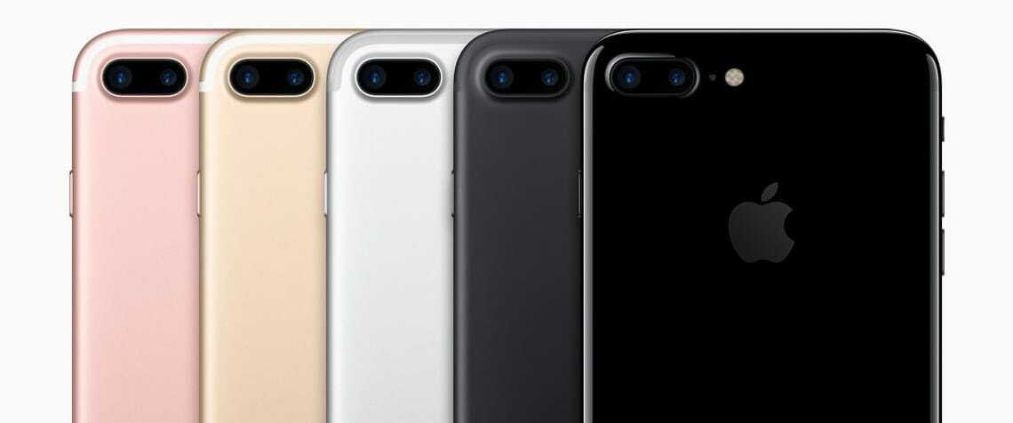
Forget all the nonsense you’ve read about the missing headphone jack. It isn’t important. The key to the iPhone 7 Plus is that it carries a second camera with a telephoto lens. This post was written in September 2016.
Every new iPhone comes with a camera that is better than the last iPhone. Apple has been relentless when it comes to increasing camera speed, pixel numbers and camera performance.
This time both the iPhone 7 and 7 Plus have a 12-megapixel camera with the means to collect a wider range of colours. It also has optical image stabilisation.
New everything
Apple upgraded everything in the camera. There’s a new lens system, updated sensors.
The flash is brighter and delivers a wider range of colours. All this adds up to better pictures than you can get from earlier iPhones. The camera performs better in daylight and in poor light conditions. You’ll get better skin tones and more realistic colours all round.
While these tweaks are a step forward, they are only incremental changes from last year.
Second camera
The big difference is on the iPhone 7 Plus. Here Apple added a second camera with a zoom lens and half the field of view of the first camera. In effect, you get two different looks at the same image.
This gives you 2X optical zoom. That’s a useful hardware addition. It brings the camera experience closer to what you might find on mid-price standalone digital cameras. Being able to zoom like this means the iPhone can do something other phone cameras are unable to do. At least for now.
Digital zoom is often disappointing. On the iPhone 7 Plus images from the two lenses combine so that you can get up to 10X digital zoom. The processing all happens in software. The effect is closer to what you might expect from optical zoom.
The iPhone 7 Plus 2X optical zoom appears as a button at the bottom of the screen when taking photos. If you press and hold this button you can crank up the digital zoom.
Portraits, close-ups
Two lenses mean you get better quality portraits and close-ups. That’s something other phone cameras struggle with.
Software updates are in the pipeline that will extend the dual lens camera. Apple says an iOS update later this year will do this.
Example photos taken with the camera and the new software show a bokeh effect. The subject in the foreground is in sharp focus while the background is a blur.
Apple isn’t the only phone maker to add a second lens. The Huawei P9 features a dual camera that is co-engineered with Leica.
Unlike Apple, Huawei uses one lens for colour and the other for monochrome. This works to improve shots in low-light conditions.
Until now you needed to buy a mid-range or better digital camera to get this kind of photographic effect. A bigger physical camera with a larger lens and more depth between lens and the sensors can still take better photos. Yet, having a good camera in your pocket all the time trumps having a great camera in a cupboard. There’s something else too.
Turning point
With the iPhone 7 Plus we are at a turning point. Earlier waves of camera phones wiped out the digital point and click camera market leaving only the enthusiast DSLR segment that the iPhone 7 Plus now begins to threaten.
Since then some consumers have bought digital SLRs because they can get better pictures than phones. Despite the sophistication of dSLRs, most people never get much beyond the automatic settings. They want to take better pictures. That’s all.
There will always be demand for digital SLR cameras from professionals and enthusiasts. Yet most everyday photographers now have all they want from a camera in the iPhone 7 Plus. Expect more devastation in the camera market.
To use a camera well, you need a good quality display. It’s subtle, but the iPhone 7 Plus has a better screen than earlier iPhones. You have to see two iPhones side by side to notice how much better the display is on the 7 Plus.
The difference is most noticeable indoors. It’s brighter. Colours look more saturated. The effect isn’t as eye-catching as on a phone with an OLED display. In particular, blacks don’t look quite as black.
Other changes
While the headline says the iPhone 7 Plus is all about the camera, there are other important changes.
Some folk are going to miss the headphone jack. In the long-term we’ll all get over this. It’ll be like getting rid of floppy discs or optical disc drives on Macs.
For now there will be holdouts who will either hang onto old iPhones longer or buy another brand of phone.
Apple demonstrated AirPods to journalists at a product briefing. They are far more impressive than you might assume and have a whiff of magic about them. Bluetooth pairing is better than normal. Apple has tweaked standard Bluetooth to make it work better at this task.
Their small case is about the size of a TicTac packet. It carries about 20 hours of charge. The AirPods themselves have about five hours charge. So on, say, a long flight, you can recharge them enough to listen all the way to Europe.
Magic
When you take an AirPod out of your ear, perhaps because someone wants to talk, the audio track pauses. This, again, feels a little like magic. Built-in microphones at the bottom of the AirPods mean you can make phone calls.
A lot of people are critical of AirPods and the way they look. There is something nerdy about them. Yet this is Apple, they are not going to become unacceptable like, say, Google Glass. This time next year people will be wearing them on buses and trains like it is no big deal.
Apple hasn’t made a lot of noise about the iPhone 7 Plus processor. It’s not something that will make or break the buying decision for most users. Yet, the processing power inside the phone is off the scale. Throw what you like at it and it will cope. More than cope.
Elsewhere the new home button design with haptic touch is big step forward in phone usability. While the button doesn’t move, it feels like it does. When you put pressure on the button, there’s a kick as the phone vibrates. You get these haptic feedback kicks all over the place. At first it feels odd, within an hour or so phones without haptic feedback feel odder.
Should you buy the iPhone 7 Plus?
If you’re an iPhone fan looking to upgrade, you’ll get a lot moving straight to the iPhone 7 or 7 Plus. If you like smaller phones, the iPhone SE remains a better choice — a phone I reviewed by writing the entire review on it."
Most Android fans won’t like the iPhone 7, but you wouldn’t expect them to. Someone switching to an iPhone 7 from Android might find not being able to tinker with every aspect of the phone frustrating. Android users who prefer not to fiddle will find a slick alternative. Once they’ve adjusted, is easier to master and be productive on.
The question of iPhone 7 or 7 Plus is down to the screen size. Both are big phones, but the Plus model is giant-sized. This something I already tested over six months with the 6 Plus.
Some Apple critics have described the iPhone 7 Plus as boring or lacking creativity. If that’s the case, you could say the same about every new phone in 2016. Putting the camera aside, it’s a steady-as-she-goes upgrade. You should get at least two years of value from the iPhone 7 Plus. It won’t look tired or jaded in 2018.
Apple is now the world’s second-largest watchmaker by revenue. That’s a remarkable result for a product line introduced less than two years ago. By any commercial measure, the Apple Watch is a success.
Rolex remains number one and will likely stay there for now.
In Apple’s Q1 financial report, Tim Cook said the Watch had its best-ever quarter, adding that demand outstripped supply.
A market going nowhere
Beyond Apple, the so-called smartwatch market has stalled.
Android Wear makers have been slow to refresh their models. Lenovo has exited the category. Pebble sold its watch business.
You’ll sometimes hear that the smartwatch market is dead. That’s not true for Apple—but it’s not far off everywhere else.
Living with Apple Watch
My own experience hasn’t matched the sales success.
I stopped wearing the first Apple Watch after a rocky start. More recently I’ve tried newer models with different bands—Apple’s term for straps—including nylon and leather options.
Whenever I write about smartwatches, I hear from enthusiasts who swear by them. I’m not one of them.
For the most part, I find them intrusive and hard to live with. They don’t improve my productivity or make life more enjoyable.
Notifications: feature or flaw?
Fans often point to notifications as the killer feature. For me, they’re the biggest drawback.
Constant taps and alerts on the wrist break concentration. They fragment attention. You can turn notifications off—or filter them—but that raises a bigger question: if you disable the core feature, what’s the point of wearing a smartwatch?
That trade-off doesn’t work for me, although others clearly feel differently.
Battery life and friction
Then there’s charging.
An Apple Watch lasts about a day, which means nightly charging. On more than one occasion I’ve put it on the charger incorrectly and woken to a flat battery.
When I’ve left the Watch at home, I’ve barely noticed.
Where it shines: fitness
The exception is fitness tracking.
Here the Apple Watch excels. Hourly reminders to stand nudged me out of my chair. Closing the activity rings became a daily goal. I walked more and paid closer attention to exercise.
It works—and for many people, that alone justifies the device.
Why I’m not buying one
Even so, I’m not planning to buy an Apple Watch.
Most days I wear an old Swatch. It’s battered, needs a new strap and does nothing beyond telling the time.
Strictly speaking, I don’t need it. My phone is always within reach. But after 50 years, checking the time on my wrist is second nature.
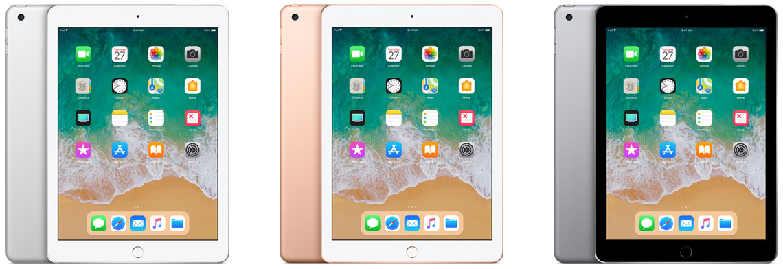
Apple’s sixth generation 2018 iPad is a bargain. In New Zealand it costs NZ$540. For many people it is all the computer they will ever need.
Sure, there will be people who consider it dull next to the swept-up iPad Pro. It doesn’t have as many features. Yet it does one important thing that, until now, only the Pro model iPad could handle. The 2018 iPad works with Apple Pencil.
That’s great if you want to use an iPad to create art or jot quick notes without adding a keyboard or dealing with the device’s glass keyboard. This, coupled with the price should open up the iPad to new audience.
It’s a solid, reliable alternative to buying a low-cost computer. Some geeks will hate me writing that.
With this iPad, Apple is doubling down on the strategy that made the recent iPhone SE so compelling; by pairing a powerful, current-generation processor with a tried-and-true physical design, Apple created a entry point into its world that doesn’t break the bank. It will pull new customers to the iPad.
Half the price of an iPad Pro
While the 2018 iPad doesn’t have all the features you’d find in an iPad Pro, it’s close to half the price of the cheapest Pro. The basic model $540 2018 iPad Pro comes with 32GB of storage. In contrast, the cheapest iPad Pro model costs NZ$1100 and has 64GB of storage.
There’s a NZ$700 version of the 2018 iPad with 128GB. If you can find the extra $160 it’s worth it. If you have a large library of music, videos or photographs you’ll soon bump up against the limits of 32GB. With a 128GB you won’t need to continually swap out files to a back-up device or the cloud.
What you get with both models is the classic 9.7-inch iPad Retina display. There are not as many pixels as you’ll find on the 10.5-inch iPad Pro, but the resolution is much the same. It has 2048 by 1536 pixels compared with the Pro’s 2224 by 1668. The 2018 iPad weighs exactly the same amount as the 10.5-inch iPad Pro; around 480 grams.
At 7.5mm, the 2018 iPad is a sliver thicker than the Pro which is just 6.1mm. That’s enough to notice, but not much of a compromise. It’s about 10mm shorter and 5mm less wide. This means you can’t swap covers or keyboards between the two devices. Not that many people will be doing that.
Adding a keyboard
And anyway, the 2018 iPad doesn’t have the Smart Connectors found on iPad Pro models. These make it easier to use a keyboard without resorting to Bluetooth. If you want to run a keyboard with the 2018 iPad there are dozens of options, many are excellent.
It’s a fine tablet for writing on.
The speakers are not as loud or as clear as you’ll find on an iPad Pro.
Another difference between the Pro and the 2018 iPad is that you only get a first generation Touch ID button. It’s a little slower than the newer version and more prone to stumble when you use a fingerprint to sign-in. This is noticeable in practice if you’re stepping down from a newer iPad Pro or have an iPhone 7 or 8.
There’s a software difference too. The 2018 iPad only allows two apps to appear on screen at any time. While the Pro models allow three, this is something I never use on my tablet. I doubt many others will miss it.
The 2018 iPad uses Apple’s A10 Fusion chip, it’s similar, but not as powerful as the A10x Fusion chip in the Pro model. In theory it doesn’t run as fast, you could probably prove this by running benchmarks. In practice, you won’t notice. I didn’t find any lag on the 2018 model, it doesn’t feel slower. In fact, when it comes to speed, it feels almost exactly the same as my first generation 9.7-inch iPad Pro.
Where the 2018 iPad fits
Apple launched the 2018 iPad with an emphasis on education. It’s a great choice for students. Apple critics will tell you the iOS operating system is a walled garden and restrictive. Although there is some truth in this, in practice iOS is as open to the rest of the computing world as all the alternatives. Chromebook, Android and Windows are all as flawed in their own ways – possibly more flawed given their business models.
I’ve spent much of the last year using a 12.9-inch iPad Pro as my main mobile computer. It doesn’t do everything I need, but for most purposes it is more than enough computer. It has travelled overseas and out-of-town with me several times. For the most part the limitations of the 2018 iPad would be the same. If you’re on a tight budget and don’t need a lot of fancy features it could be all the computer you need. It’s a great device for creativity, just don’t expect to edit movies on its 9.7-inch screen.
The key to the 2018 iPad is that you get a lot of computer for not much money. You can buy cheaper Chromebooks, Android tablets and, at a pinch, Windows PCs. Unless you’re looking for an app that doesn’t appear in Apple’s store, this beats all those devices for most people who have light computing needs.
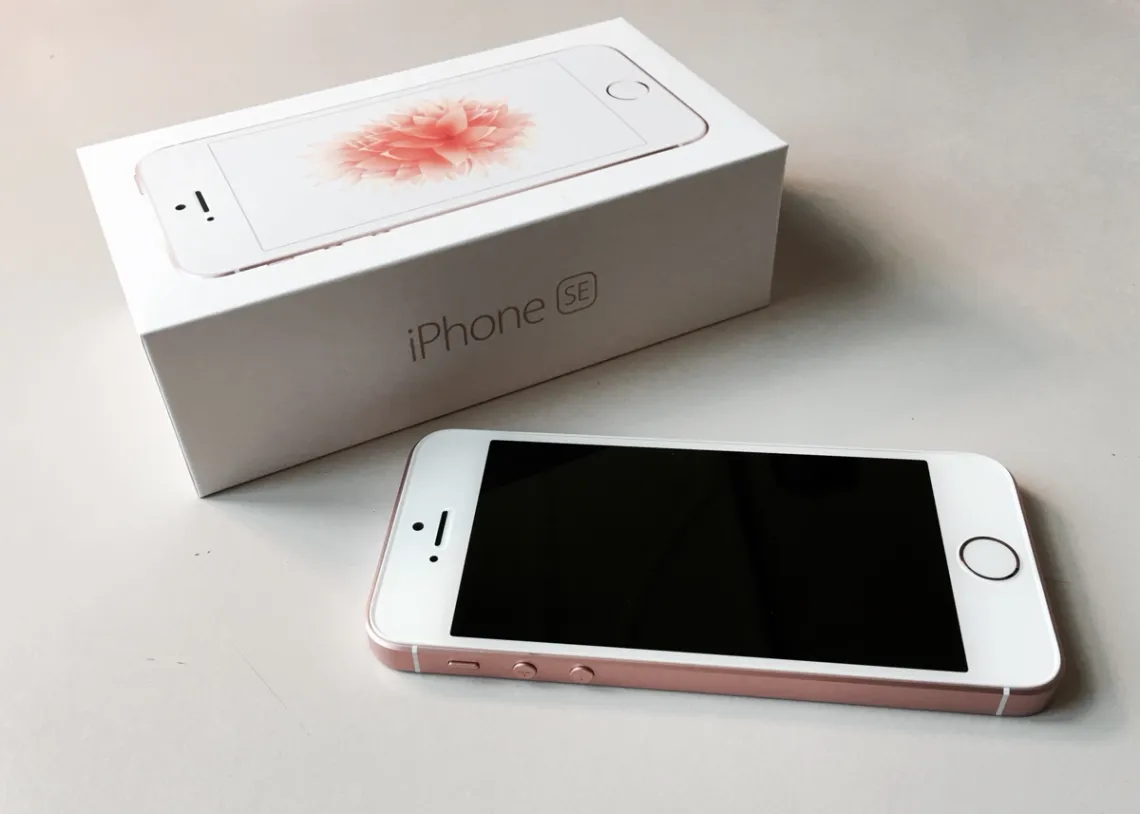
You know how, as an adult, you visit the place you grew up and everything seems smaller than it did at the time? That’s what the iPhone SE feels like after 18 months with bigger iPhones. This post was written in April 2016.
There is no better way of getting to grips with a device than using it to write about the product.
In the interest of science I’m typing this iPhone SE review on the phone. I’m using Byword, a great iOS Markdown writing app.
Writing a review on the device in question may be ironic, postmodern and meta, but it’s also practical and powerful. By the time I finish this post, I’ll understand the iPhone SE’s practical advantages and flaws.
A classic iPhone design
Apple’s iPhone SE gives small phone seeking consumers most of the power of the latest iPhone 6S in an updated iPhone 5S case.
The 12th iPhone to hit the streets uses a classic design that stretches back to the iPhone 4. If you used iPhones before they grew big with iPhone 6, you’ll know what to expect.
New Zealand prices start at NZ$750 for The 16GB model. A 64GB model is NZ$950. The prices are NZ$250 less than iPhone 6 models with the same amount of storage.
The iPhone SE weighs around 115 g. It measures 124 by 57 mm and is about 7.5 mm deep.
At first sight it seems tiny next to the iPhone 6S Plus, that’s not necessarily a bad thing. By the way, that’s a 13-inch iPad Pro next to the iPhone SE in the picture at the top of the page.
Holding it one-handed doesn’t stress my little finger, something I dislike about the heavier, bigger iPhone 6S Plus.
If you come to the iPhone SE from a 5 or 5S you’ll feel at home from day one. You will revel in the extra power and take delight in the new capabilities. The screen will feel normal.
Going back home
If, like me, you find yourself back with a four-inch iPhone after time with a five or 5.7-inch display it’s like visiting the home you grew up in.
It’s familiar and cosy, but you’ve moved on. While you can live there again, you quickly remember why you don’t live there any more.
Then after a while, you’ll wonder if moving out was such a smart step.
When it comes to reading, bigger iPhone screens are better. That’s obvious and, for the most part, doesn’t need explaining. But that better screen comes at a financial and practical cost.
Small screen
Where screen size matters is in the context of tasks like writing this blog post. I notice I’m squinting more than normal. It’s hard to navigate the page on a small display. I can see less, so I’ve less feel for the flow of my words and for the entire text. I can’t easily tell if my narrative jumps about.
Writing on a small screen is difficult, proof reading is harder again. Proofing your own writing is always difficult. It’s tougher on the small screen because the brain is using up so much of its processing power just reading the words and navigating the text.
Even getting the cursor to the right spot in the text to make an edit is a challenge with the small screen.
On a positive note. iOS auto-correct does a sterling job fixing up the mistyped words and other minor errors. I don’t normally depend on this tool, with the iPhone SE it takes on a new importance.
Typing
Typing on the iPhone SE’s tiny on-screen keyboard is challenging. I’m used to typing on the 6S Plus screen. While not the best tool for feature writing, it can cope at a pinch.
The iPhone SE belongs to a higher difficulty level. It took five tries to type the first capital S in that last sentence. My pudgy fingers kept hitting the A key. Writing speed is glacial.
Finding the shift key is not easy, switching to the number keyboard is tricky. Even typing a full stop requires more effort than on bigger phones.
All this is a wake up call to revisit voice recognition. My 35 years as a journalist mean I think with my fingertips when writing, that may need re-examining. I’ll look at voice recognition on the iPhone SE, if I find anything interesting I’ll report back.
Less productivity than a big iPhone
If I was writing this review on the iPhone 6S Plus, a laptop or a tablet, I would have finished a long ago. When it comes to serious productivity, the small iPhone SE lags behind the 6S or the 6S Plus.
It’s not the right tool for the job. At least not for me.
And yet, there’s something delightful about the iPhone SE that transcends things like productivity: This phone feels right.
My hand is comfortable holding the iPhone SE in a way that it is not with bigger phones.
Many readers will see this as a subjective view. Perhaps it is. But that’s the main thrust of this review: The iPhone SE excels as a small, pocketable iPhone, but unlike the bigger iPhones it doesn’t rate as a practical PC replacement.
The sound of one hand typing
Despite the productivity gap, I typed this and the last three or four paragraphs one-handed using my left hand. My thumb reaches all the way across the keyboard. I don’t need to do the iPhone 6 trick of double hitting the Touch ID button to move the top of the screen down.
Writing long-form posts one-handed on the iPhone SE is not comfortable. Nor is it fast. But it works. If I had to, I could compose stories while standing on a commuter bus or train. Typing on a bigger iPhone needs both hands and more elbow room.
Because the iPhone SE is a touch thicker it is more comfortable to hold. It feels easier to grip. Less likely to fall from my hands.
Flat
I like the flat sides — you can stand the phone on a table if necessary. I also like the small volume control buttons.
Apple has put the power button back at the top like on earlier phones. It’s a better, more logical position.
One of the nicest physical aspects of the iPhone SE is that the thicker body means there’s no need for the ugly camera bump now turning up in iPhones and iPads. The back of the phone is flat and elegant.
Another benefit of a smaller screen is longer battery life. I set up the review phone 24 hours ago straight from the box. It hasn’t seen a charger since I got it from Apple and yet there is still 27 percent in the tank. I got to the end of this post without charging.
Given the phone didn’t arrive with 100 percent charge, this hints at two days use. That’s a big plus. Either way it looks to have better battery life than the iPhone 6S, about the same as the 6S Plus.
Storage
iPhone SE storage tops out at 64GB with the $950 model. When I first transferred my data from the iPhone 6S Plus last night I found there was 22Gb that didn’t make the trip. Almost all of that was music files.
That is a likely deal-breaker for some potential buyers.
If you choose the 16GB iPhone SE you’ll need discipline managing the storage. Even 64GB is a challenge when you have a large collection of digital music. I recommend you choose 64GB unless you are certain you’ll not be shooting video, carrying photo collections and listening to stored audio.
Not just storage
There are other possible shortcoming to watch out for. None of them are deal-breakers, but collectively they may add up to a reason not to buy the iPhone SE.
The iPhone SE uses an older version of Apple’s Touch ID sensor. In practice this doesn’t amount to much of a compromise. It just works a fraction slower. Some may find this a blessing, at times the newer Touch ID sensor is a little too quick for comfort.
If you’ve used an iPhone 6S or 6S Plus you may miss the 3D Touch feature where you can press harder on the screen to fire up secondary commands. I found myself trying to use it on the SE even though I knew it wasn’t there.
This is not likely to worry anyone who is coming to the SE from an older iPhone, but if you use 3D Touch a lot, you may be frustrated by its absence.
Apple has used an older front facing camera on the SE. If you make lots of FaceTime calls or use similar video conferencing, this may bother you, but, on its own, this is not a reason to dig deeper and spend on a more expensive iPhone.
Likewise the display doesn’t have as much contrast as the 6S and 6S Plus. I did a side-by-side comparison and its clear that photos have better contrast on the bigger iPhones, but again, this is not a deal-breaker.
Is it worth buying?
There are two questions to consider before choosing the iPhone SE.
First, can you get away with 64GB of local storage? Given that many buy iPhone 6S and 6S Plus models with 64GB, that’s down to how you use your phone and what you want from it.
While most of us can live with this, especially if we store audio, photo and video files in the cloud, some users will find this limit too restricting.
Which brings us to the most obvious question: is the smaller display going to work for you? The larger screen shows much more text or graphics at the same time. Or, you can use the extra screen size to zoom out making text easier to read and picture detail easier to view.
As I found when writing this review on the iPhone SE this aspect of the larger iPhones is a big deal in terms of productivity.
If you don’t use your phone for heavy-duty apps, writing or to read large amounts of material, you’ll probably be happy with the iPhone SE’s trade-off between screen size, pocketability and being able to control it one-handed.
The eyes have it…
In my case the killer deciding factor is eyesight. Until recently I had good eyes and found a four-inch screen more than adequate. That changed when I found I had macular degeneration. This is kept under control with drugs, but for a while I struggled to see a small screen. Many, many people also have eye problems and need a bigger display.
The flip side is that I only need a big screen iPhone some of the time. There are Macs, tablets and PCs at home with all the screen real estate I need.
Some of the time the convience of a small, one-hand device trumps the productivity benefit of a bigger iPhone. And it is much more portable. It fits into short trousers and shirt pockets — bigger iPhones have trouble with both.
Well, that’s the theory. You’ll need to decide on these matters for yourself, as far as I’m concerned, I’ll stick with the larger screen iPhone 6S Plus because on the occasions when I need iPhone productivity, I can’t compromise. And on the days my eyes are bad I’d struggle to read the small display.
… And yet that little iPhone SE feels so right in my hand.
Why is there an iPhone SE?
Apple says it made the iPhone SE because of customer demand for a smaller iPhone.
This isn’t a marketing hunch. It is a hard-nosed decision backed by powerful evidence. Last year 30 million people bought the iPhone 5S.
Which is a good place to start. The iPhone SE has the same four-inch screen as the 5S. The case is the same size and physically similar.
Looks are deceptive
While the outside looks like the iPhone 5S, under the skin it is an iPhone 6S.
This is a marketing challenge for Apple.
Conspicuous consumers — let’s not pretend they don’t exist — want to be seen and noticed with the latest glamorous hardware. The iPhone SE looks like an old iPhone. Few casual observers would see it as anything else.
In the case of the review model in my hands, the only clue that it isn’t an iPhone 5S is that it has a Rose Gold finish. You’d have to be intimate with Apple’s product range to know that colour wasn’t available on the 5 series iPhones.
Footnote: Writing the iPhone SE review on the phone
I composed, wrote, fact-checked and otherwise researched almost all the text in this post on the iPhone SE. The post took about half as long again to write as it would have taken on a Mac or iPad Pro. That’s maybe 25 percent slower than writing the same story on a large screen iPhone.
In the end I couldn’t do everything from the phone. I had to open the document on my Mac to give it a last proof-read and polish.
If I was writing a story to send to another editor to proof-read, I would have gone straight from the phone, but found my eyes were starting to feel the strain of dealing with over 2000 words on a tiny screen.
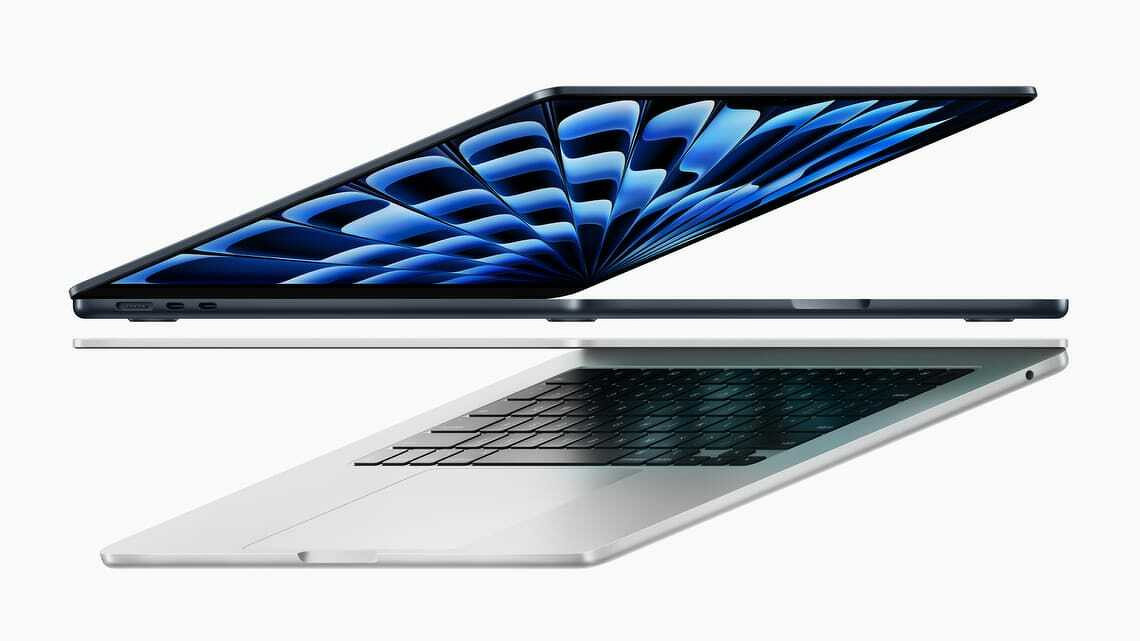
Posted in May 2024. From the outside, Apple’s latest MacBook Air appears identical to its 2022 counterpart. It has the same ports, a great screen, terrific keyboard and the best trackpad you’ll find on any laptop. It is still thin and light.
From the outside, Apple’s latest MacBook Air appears identical to its 2022 counterpart. It has the same ports, a great screen, terrific keyboard and the best trackpad you’ll find on any laptop. It is still thin and light.
Despite two years of hefty inflation, the M3 MacBook Air’s NZ$2050 starting price is unchanged. You could view that as a de facto price cut. Apple still offers the 2022 model with prices starting at NZ$1800.
The main change is the switch from the M2 to M3 chip. This brings a significant bump in power, depending on the application the laptop is anywhere from 15 to 20 per cent faster than its immediate ancestor. It’s a huge leap up from the M1 or Intel MacBooks.
Better WiFI
Other changes include a welcome upgrade to WiFi 6E. If your router supports WiFi 6E you’ll notice a huge jump in data speeds. My gigabit connection gives me more than 600 mbps direct to my home office.
Apple has also reconfigured the external monitor hardware so you can run two external screens from the M3 MacBook Air.
Beefing up the processor does not take a toll on the computer’s battery life, you can still get more than 16 hours use before needing a recharge.
You can be forgiven for thinking that a 15 to 20 per cent increase in power does not amount to much. Nothing could be further from the truth. For many years now Intel-based laptops have only managed low single digit increases in computing power between generations. Apple continues to squeeze performance from its chips.
The performance jump is immediately noticeable when moving between MacBook Air models. It is even more noticeable when moving from an Intel Windows laptop to the Air.
M3 MacBook Air closes gap with MacBook Pro
In practice it means the new MacBook Air can run apps that might previously have required a MacBook Pro. In the meantime the MacBook Pro has moved up to the point where it outperforms many “workstation class” Windows laptops.
For the past month the 13-inch M3 MacBook Air has been my main computer. During that time, I haven’t heard the fan switch on once. Indeed, I had to check to see if there is a fan in the case.
Apple says you can get 18 hours from a single battery charge. That may be true, but I need to have a brighter screen and find I can work for around 16 hours without needing to use the MagSafe cable. On a recent two-day trip away from home I took the wrong power cable and power anxiety only kicked in late on the second day.
Price
Prices for the M3 MacBook Air start at NZ$2050. That buys a computer with 8GB of memory and 256GB of storage.
It’s adequate if you never run lots of apps at the same time and mainly use your laptop for the web, basic office applications and video calls.
Otherwise you’d need to look higher up the range. More demanding applications and practical multitasking require 16GB of memory. That takes the price to $2400. There’s also a 24GB option. You need to make the right call when you buy as the memory is not upgradable.
Storage
The base model’s 256GB storage is modest by 2024 standards. You could live with this if you don’t store many media files your computer. More likely you will need to buy more storage at the time of purchase. Like memory, this is not upgradable.
There are options with external drives, network drives and cloud services but these are clumsy compared with getting a bigger drive in the first place. I find 512GB is essential.
Adding 16GB memory and 512GB storage to an M3 MacBook Air lifts the price to NZ$2750. Apple sent a review model with 16 GB of memory and a terabyte of storage. This configuration costs NZ$3100.
There is a 15-inch model with prices starting at NZ$2500.
Premium laptop
These prices place the M3 MacBook Air firmly in the premium laptop bracket. That’s fine, it is more than competitive with rival premium laptops from the likes of HP or Dell.
People tend to think of Microsoft’s Surface Laptop as a direct competitor to the MacBook Air. Prices are similar. The base model Microsoft Surface Laptop 5 is NZ$2000 for a model with 8GB of memory and 256GB of storage.
The M3 MacBook Air is considerably more powerful than the Surface Laptop 5 which feels like it is at least a generation behind Apple’s laptop.
M3 MacBook Air verdict
For now Apple’s M3 MacBook Air is the best all-round laptop in the world and certainly the best option in its price range. You won’t find a better blend of features, functionality and performance anywhere else. You’ll power through your daily work with ease.
Unless you work for an employer who insists on Windows, this would be a good time to think about jumping ship to MacOS.
Apple either beats or equals every rival when it comes to the laptop’s keyboard, trackpad and the physical case. You won’t find a better screen or better speakers and its webcam is top class.
They don’t get much attention but Apple’s Touch ID and the WiFi 6E modem are also huge plus points. There is an attention to detail that rival laptop makers rarely match.
That said, it’s not cheap and it might be overkill for some readers. If your needs are not demanding and want to spend less, the M2 version costs NZ$250 less and has almost everything.
In 2021 Apple moved ahead of the laptop pack with its M1-powered MacBook Pro. That model set new standards for processing power and battery life. This report from 2023 looks at how the M2 MacBook Pro takes performance and battery life further. It's not cheap, but the most demanding users will see it as a wise investment.
Apple MacBook Pro M2 and M2 Max
16-inch MacBook Pro at a glance
For:
High performance, very long battery life, miniLED ProMotion screen, excellent speakers and great design. MagSafe.
Against:
Expensive. Can’t upgrade Ram after purchase. No Ethernet port.
Maybe:
Not compatible with Windows Boot Camp can run Parallels desktop. Webcam is excellent, but doesn’t feature Centre Stage.
Verdict:
Every aspect is best in class. It’s an outstanding laptop for people who need power, but it comes with a hefty price tag.
Price:
From NZ$4600. Review model costs NZ$6350.
At first sight Apple’s 2023 MacBook Pro looks identical to the 2021 model. Externally, little has changed and that’s no bad thing.
The 16-inch model has a full-size backlit keyboard (280mm by 115mm). It’s the best I’ve used on a laptop, with a precise, comfortable feel. A Touch ID key handles security, making logins and payments quick and painless.
The trackpad is large (160 × 100mm) and superbly responsive—again, the best I’ve seen on any laptop.
Apple’s Liquid Retina XDR display is stunning. It refreshes at up to 120Hz, with sharp text, vivid images and, if needed, searing brightness. Apple quotes a 1,000,000:1 contrast ratio. On the review unit the 16.2-inch screen delivers 254 pixels per inch.
There’s also an SDXC card slot. In testing, file transfers from an older camera card were effectively instantaneous.
Raw computing power
The review unit has a 12-core M2 CPU: eight performance cores and four efficiency cores. The 2021 model’s M1 Pro had 10 cores, so the newer chip adds two efficiency cores.
In practice, this MacBook Pro is about 20 percent faster than its predecessor. That’s noticeable, though probably not enough to tempt 2021 owners to upgrade. Anyone coming from an Intel MacBook will see a huge leap.
Benchmarks only tell part of the story, so I focused on real-world tasks. Using HandBrake to encode a library of DVDs for Apple TV, the MacBook Pro completed the job in less than a quarter of the time taken by my 2020 Intel MacBook Air.
It’s not a gaming laptop, but it handles demanding graphics work with ease. Rendering lossless audio from a digital audio workstation took a fraction of the time compared with the MacBook Air.
Beyond that, I struggled to find anything in my workflow that could push the M2 to its limits.
Outstanding battery life
The 100Wh battery combined with Apple Silicon’s efficiency delivers extraordinary endurance.
Apple claims up to 22 hours of video playback. In a controlled test, with WiFi and Bluetooth off, moderate brightness, video looping, the MacBook Pro ran for 27 hours, comfortably exceeding that figure.
In everyday use, writing, browsing, light photo work and background encoding, I saw around 16 hours. That’s roughly two full working days on a single charge.
Long battery life changes how you use a laptop. You stop thinking about chargers, power points or rationing screen time. It feels closer to using a phone.
It’s also enough to cover most of a New Zealand–Europe flight, assuming you sleep part of the way.
Fast charging
Apple’s 140W power adapter delivers a 50 percent charge in about 30 minutes, with a full charge taking roughly 90 minutes.
MagSafe has returned, which means a stray foot won’t send your laptop crashing to the floor. You can still charge via USB-C if needed.
Video camera
Laptop webcams are often poor, but not here. The MacBook Pro has a 1080p camera with a four-element lens. In video calls, others consistently reported clearer images.
That clarity can cut both ways: during one call, someone spotted a competitor’s product on a distant desk.
Like modern phone cameras, it uses computational video powered by the M2’s neural engine to improve exposure, colour and noise. You can’t easily judge that from your own feed, but the results are obvious to others.
macOS Ventura also lets you use an iPhone as a webcam. On this machine, the built-in camera is good enough that the feature feels redundant.
Speakerbox
Laptop audio is usually an afterthought. Here, it’s a highlight.
While testing FL Studio, I accidentally switched from headphones to the built-in speakers. The difference was striking: full, balanced sound with real bass, that’s something laptop speakers rarely deliver.
The six-speaker system (four woofers, two tweeters) handles music and video calls with clarity and volume, with little distortion even at higher levels.
Apple also supports spatial audio. With compatible content, the effect is impressive. It won’t replace a hi-fi, but it’s ahead of any laptop I’ve used.
WiFi 6E and Bluetooth 5.3
WiFi performance is strong. With WiFi 6E support, you can use the less congested 6GHz band, assuming you have a compatible router.
In testing, downloads peaked at over 920 Mbps on a gigabit fibre connection, matching wired Ethernet speeds.
Weaknesses?
There’s a good selection of ports, but no built-in Ethernet. That’s usually fine, but I still needed a dongle to connect directly to a network drive.
Memory and storage aren’t user-upgradable. While repairs are possible, unofficial upgrades may run into restrictions.
Running Microsoft Windows
Apple Silicon Macs can’t use Boot Camp. Instead, I used Parallels Desktop to run Windows. It works well, but it’s expensive and comes with licensing complexity.
VirtualBox is a free alternative, but the Apple Silicon version remains unstable at the time of writing.
Talking points
You can spend far more on a laptop. Workstation-class machines like HP’s ZBook Studio cost considerably more in some configurations, yet the MacBook Pro often outperforms them.
Apple says a third of the machine uses recycled materials. Its environmental report is worth reading if sustainability matters.
macOS Ventura is close enough to Windows to feel familiar, while offering useful extras like using an iPad as a second display.
The display notch is easy to ignore, though not everyone will like it.
Even under sustained heavy workloads, the MacBook Pro stays cool and quiet.
There’s no Face ID. An odd omission given how well Face ID works on iPhone and iPad. Apple sticks with Touch ID.
Despite its size, the 16-inch model remains portable and well balanced—never clumsy.
Apple’s annual update cycle is also a marked improvement on the long gaps seen in the Intel era.
Verdict: 16-inch MacBook Pro
Apple’s 2023 16-inch MacBook Pro is an outstanding high-end laptop. It delivers immense performance and class-leading battery life, with few meaningful weaknesses.
It’s expensive. Prices start at NZ$4600 for a model with 16GB memory and 512GB storage. The reviewed configuration (32GB, 2TB) costs NZ$6350, while fully loaded versions climb far higher.
Even so, pricing is competitive with workstation-class PCs. If anything, Apple has the edge in performance per dollar.
This unconventional review of the M1 MacBook Air, written February 2021, is about the experience. Think of it as a glimpse into a possible mobile computing future
At first sight there’s little to tell the new M1 MacBook Air from the most recent MacBook Air model. From the outside they are peas in a pod.
The only physical difference are the small icons printed on the F4, F5 and F6 function keys. You have to look to notice. They show controls for MacOS’s Spotlight search, dictation and Siri features.
A globe printed on the function key at the bottom left of the keyboard tells you this can open an emoji picker.
Clues
There are a few more clues to help distinguish the two MacBooks. The M1 model is much faster. We’ll come to that in a moment.
The battery goes for hours longer between charges. We’ll look at that in more depth later.
Apple’s M1 MacBook Air is cooler and quieter. There is no cooling fan. It doesn’t need one. Mind you, the fan on the older MacBook Air doesn’t kick in until you push the hardware. With my writing work, that’s not common.
I’m a journalist. I spend the bulk of my MacBook time writing. I prefer lightweight writing apps over the big, sprawling word processors. Yet there are jobs where I have to use Microsoft Word. In normal use none of the writing apps in my toolbox draw on enough resources for the cooling fan to kick in.
Goodbye humming fan
To get the fan humming I’d need to run a media creation app or do a demanding spreadsheet or database task. It also hums when playing games.
That said, the old MacBook Air can still warm up during a lengthy work session. After two months with the M1 model, I’ve yet to detect the merest hint of processor heat.
Given that I spend the bulk of my MacBook time writing, I didn’t expect to get much of a performance kick from the M1. After all, it doesn’t help me type faster.
Processor intensive
Yet, in practice there are dozens of small processor intensive tasks that now work faster. I rarely used dictation on my Mac. It wasn’t great. It is now. The new MacBook Air shows how much processor speed changes that experience.
Likewise Siri. Because I’ve been a touch typist for years I tend to use keyboard commands others might prefer speech.
Movies load faster. Complex web pages perform better. On the odd occasion where I need to edit a photo, clip audio files or chew through a lot of data it all happens at speed.
I’ve never had a problem waiting for a MacBook Air to wake-up when I open the lid. It happens in a few seconds. With the M1 model, it happens in fewer seconds. That’s not a big deal, but I like it.
Pushing Safari
The other effect is more subtle than that. I’ve learned not to have more than a handful of apps open at any given moment and to not push Safari by opening lots of tabs. That could test my old MacBook Air. These restrictions have gone. when. testing this, I got bored opening new apps and tabs long before the new Air began to struggle with the workload.
You can benchmark the new Macs to get interesting looking figures. These numbers may mean something to certain people. Yet I’d argue everyday use matters more: The new Macs offer a much improved experience. It feels more fluid, more natural, there’s less of a gap between what you might want from a computer and what you get.
One aspect of the M1 Macs that worried users was the 16GB limit for system Ram. The MacBook Air never had more Ram, but MacBook Pro models could have 32GB. Desktop Macs could have 64GB.
In the event, it’s not an issue. M1 Macs have a design that does more with less Ram.
To my surprise I found I ended up more excited and enthusiastic about the new M1 MacBook Air than expected.
The new normal
The problem with performance boosts is that higher speeds soon become normal. As an acid test, I fired up the old MacBook Air. I wanted to know different the new experience was. The test confirmed it, the M1 MacBook is much better.
There’s a link between a fast processor like the M1 in the new MacBook Air and gigabit fibre or Fibre Max as the Commerce Commission prefers us to call it.
Few, if any, everyday applications that push a gigabit fibre connection to the limit. Yet having plenty of headroom means you’re never going hit a speed barrier. Likewise, even if you have modest computer needs, there are times when headroom is useful.
Say you’ve spent months working from home on gigabit fibre. Then, say, you return to the office and a more modest connection speed. That connection now feels laggy and flat, even though it may be fast by accepted standards.
That’s how the M1 MacBook Air feels after using the Intel model.
Battery
One reason I switched from Windows to a MacBook Air seven years ago was the improved battery life. I could get more than ten hours from the MacBook. The Windows machine it replaced struggled to do three hours.
At that time I had a job working part-time in an office. I’d take my MacBook on the bus and work a full nine-hour day without hunting for a power outlet. Two years later the MacBook could still last the entire working day. It changed how I worked.
The Air had enough battery life for a long-haul flight. Enough to work in the Koru lounge and for the trip to, say, Singapore with a few hours of down time for naps or meals.
Apple’s M1 MacBook Air almost doubles that time. I won’t be taking any long-haul flights soon, but, if I did, it would get me to Barcelona or Paris.
Working from home, I can go a couple of days without charging.
This is the start
It’s interesting to realise that Apple used its new processors first in low-end models. There are M1 models of the MacBook Air, the entry-level 13-inch MacBook Pro and the Mac Mini. The message isn’t that subtle. If Apple’s low-cost laptops are this fast, what can we expect from more expensive models?
Which leaves us with another question. How is this going to affect the Windows laptop and PC market? At the time of writing, Apple’s low-end Macs are at least a generation ahead of Windows computers. When Apple releases its Pro model computers that gap could be wider.
Let’s stop and qualify that last paragraph. The NZ$2200 eight core M1 MacBook outperforms almost every Intel-based laptop. This includes models costing twice as much. There may be faster Windows laptops out there. Good luck finding one.
Fanless
Intel can’t build a fast fanless Windows laptop. The Air is silent. If that matters to you, that’s an Apple advantage its rivals can’t match.
When I first switched back to Macs from Windows, I configured my MacBook to dual boot Windows and MacOS. I stopped doing that years ago. If there’s a spare Windows licence in my home, I can no longer find it.
Reports suggest a MacBook Air runs Windows faster than native Windows laptops. That has to rattle Intel.
Last week Intel responded with its own set of cherry-picked benchmarks in an attempt to prove… well, it’s not clear what that goal was other than to muddy the waters.
From a user point of view, you now need a powerful reason to choose a Windows laptop over a MacBook.
If you use a Mac or an iPad, Apple’s Pages 12 could be the only word processor you need. It’s free, easy to master and, unless you are a lawyer or an academic it includes everything you are likely to need.
Pages 12 at a glance
For:
Free, great for layout, all the features most people need.
Against:
Native file format, fewer features than Microsoft Word.
Maybe:
Collaboration with other iWorks users, iCloud app.
Verdict:
Good looking, easy to use. Pages is great option for Apple users who don’t plan to do complex word processing
You may already have Pages 12. Apple installs the software on new Mac computers. It doesn’t come preinstalled on new iPads or iPhones, but you can download it for free from the App Store.
There is a web version of Pages on iCloud that anyone can use, you don’t have to be an Apple customer. The web version works fine with Windows, ChromeOS or Android. You will need to sign up for a free iCloud account that comes with 5GB of storage.
Where iWork fits in the bigger picture
Pages 12 is part of iWork, Apple’s office productivity suite. It sits alongside Numbers, a spreadsheet and Keynote, a presentation app. The three are made to be used with each other and share many common ideas and controls. Learn to use one and you have learned them all.
For many Apple users Pages will be the only word processor you ever need. It integrates brilliantly across the various Apple devices and to iCloud. You can move from device to device and get the same user experience, Pages works much the same way everywhere.
The main alternatives to Pages are Microsoft Word, which is part of Microsoft Office and Google Docs which is part of GSuite.
Office and GSuite are not free, although there are free options. You may not find these free options enough for serious work. If you prefer free software there is LibreOffice.
Microsoft Office and LibreOffice offer more features, but many of these are not essential for everyday word-processing.
Is Pages as good as Microsoft Word?
The simple answer to this question is that it depends on what you want to do and who you work with.
Pages, Word and Google Docs each have a different central focus. Pages is all about putting words and pictures onto a printed or online page.
Its strength lies in layout.
You could produce an advertisement, a newsletter or a pamphlet faster with Pages than with, say, Microsoft Word and a layout app.
You might choose Pages as a low cost alternative to a professional design application like Adobe Indesign.
Compare Pages with Word
In comparison, Word has every conceivable word processor feature including many that you may never use. This makes it popular with large companies and professional users, such as lawyers.
It is a sprawling, complex comprehensive application. That makes it versatile, but it takes a long time to learn how to get the best from it. In comparison Pages is lighter and quicker to master.
Apple built Pages to work with its computers, tablets and phones. If you are familiar with these products, Pages will feel familiar. Microsoft developed Word for Windows computers. These days the Mac versions are far better than in the past, but there are times when that Windows heritage can confuse Mac users.
Is Pages better than Google Docs
Again, it depends what you want to do and who you work with.
Google Docs’s strength is in collaboration. Pages is great for collaboration if you only work with colleagues who use Macs. Otherwise it is not as good as Google Docs. Nor is Microsoft Word.
While Google Docs is good on a desktop or on a ChromeOS device, it is far from the best choice on a tablet or a phone. Google’s mobile apps are inferior to Pages or Microsoft Word. Pages works far better on Apple tablets and phones.
Likewise Pages is a long way ahead of Google Docs for layout and complex documents. In terms of features it sits between Google Docs and Word.
Using Pages 12
You can use Pages on multiple levels. Need to knock up a document fast? Pages can do this, it will guide you through adding typography and inserting images. You can power through the tasks in no time.
There are templates to help you get started. Pages has the best range of templates of any popular word processor and there are many more you can download from Apple and third parties.
When you first open Pages you’ll see a main window and a right-hand sidebar. This sidebar shows formatting and layout controls. If you want to focus on words, it is easy to hide the side-bar.
A second, optional left-hand sidebar can show comments and features like a table on contents.
Unlike other word processors, there isn’t a draft view. This can be annoying at first because, as the name suggests, Pages is organised around pages. And like every other word processor, that means it sees the world from a printed document perspective.
No matter what you are working on, there can be headers and footers to navigate, even if you plan to build a single online-only document.
Working with others
Pages can opening and write documents for other word processor formats but has its own native format. Some features, largely to do with layout, don’t necessarily make it when converting to other document formats. And nothing else reads native format Pages documents.
This isn’t a problem in practice as long as you remember which features don’t translate. You can’t send a native Pages document to a colleague using Microsoft Windows and expect them to open it. There is a workaround, but it involves them signing up for an iCloud account and opening the document in the online version of Pages.
Life is far easier if you remember to save your Pages document in Word before sending. You can choose to send as PDF, text or RTF. Don’t expect your formatting to stay unchanged if you make a round trip where a colleague edits and returns the document.
The software picks up almost everything from other formats. You could, say, open a Microsoft Word document that has review comments and mark-up, then work through these in Pages.
Pages collaboration works fine if you work on the same document as a colleague using either Pages or the web app.
Pages for Mac, iPhone, iPad
Pages for Mac works really well. Yet Pages can shine on an iPhone or iPad, especially if you use one of them with a Mac. You’ll see a simplified view of the app, but all the desktop features are there. You may have to dig around to find them.
On the iPhone you can use a screen view designed to make editing easier. It hides the images and fancy features allowing you to focus on the text.
Apple has a feature on its operating systems called Continuity. It means that if you have Bluetooth switched on and both devices are on the same Wi-Fi network, you can move seamlessly from editing a Pages document on one device to another.
Another feature called Handoff means you can pick up on another device where you left off.
It feels like magic to work on a desktop document at home and continue to edit the same document on your iPhone while riding on a train or bus to work.
If Pages 12 has a weakness it is dealing with long documents. It’s fine if you are writing anything up to a few thousand words, say a long essay, magazine feature or book chapter. Things break down when documents get bigger than this.
Reviewer’s notes
The iPhone and iPad versions of Pages have a useful Presenter Mode which can turn your device into a teleprompter or autocue. Words appear in big text without any images or distractions and you can make it automatically scroll down.
A recent update adds support for Apple’s Shortcuts automation tool.
Pages has support for language translation on the fly.
You can use Apple’s Scribble software with Pages on an iPad. It works with the Apple Pencil to turn handwritten notes into typed text. This feature is powerful if you want to add text to a document while you are standing up.
Pages is a good option if you plan to produce Apple Books.
Pages 12 verdict
If you live and work exclusively with Apple devices Pages 12 is potentially the best word processor for your needs. There are simpler alternatives, Markdown editors are a good choice if you crave simplicity and minimalism. And there are more complex alternatives, Word had more features.
Yet for many users Pages 12 is a solid choice and it is free.
_This is an excerpt from an Apple Pages 5 review that was published July 8, 2014.
_
Many long-term Pages users were not impressed when Apple updated its iWork word processor from Pages ’09 to Pages 5 in late 2013.
People who invested time and effort learning and mastering the earlier Pages ’09 version of the software found key features were missing. If they had written scripts, many stopped working.
In time the features returned. Apple drip-fed updates restoring much of what was missing in the first version of Pages 5.
Pages: the name tells the story
Pages is not a standard word processor. The name is a giveaway. It is a page design tool first and a word processor second. It was first built to make works look pretty on the printed page. Later the focus shifted to creating good looking online documents.
It does this well. Pages is a low cost alternative to Adobe Indesign for people who need to make words and pictures look good, but who don’t need professional tools and don’t want to pay a lot for them.
It can deliver great looking designs. You don’t need to be an expert to get results.
As a word processor?
Apple talks about Pages as a word-processor. It is part of iWork along with the Numbers spreadsheet and the Keynote presentation manager.
Like it or not that puts it up against Microsoft Word, Excel and Powerpoint or Google Docs, Sheets and Slides.
Pages 5 does not feature collaboration tools like Google Docs. Nor does it have the heavy duty tools you’ll find in Microsoft Word. It’s more basic in these departments.
Writing space
You get a clean writing space and easy access to the controls needed for adding styles. It’s productive and trouble free.
You can work with documents that come from Word or Google Docs and you can send Pages documents back to these apps. You’ll even see many of the review marks from the other applications – although not all. There are few, if any, problems converting between document formats.
Tracking changes
It’s not the best tool for jobs where you need to track changes with clients, but it can cope.
Pages 5 is the best tool if you want to share and edit documents across a Mac, an iPhone and an iPad. There are apps for all three devices and they work much the same in each.
The big change in the move from Pages ’09 to Pages 5 is iCloud. You can choose to store documents on your Mac’s hard drive or to iCloud. This means you could start writing a document on an iPad at home. Pick up the document from iCloud on your phone while riding the train to work, then finish it off on your desktop Mac in your office.
Pages 5 verdict
Apple Pages 5 is free for Apple users. You can’t argue with the value. It is more than good enough for everyday writing jobs, can handle many, but not all, more difficult tasks and massively outperforms Word or Google Docs if you need to create a good looking layout.
If you are committed to Microsoft Word or Google Docs you may not want to switch, but the option is there should you need it.
A few days after first wearing the Apple Watch I found myself scratching my irritated wrist. I took a break from wearing it and my wrist got better.
For a while I fell into a pattern of only wearing the watch when I worked away from home. At home, I’d leave it off. This runs counter to the idea of wearable devices, but it worked for me.
At least I thought it did. I was getting a mild rash and would find myself scratching my wrist and the area around it. But things seemed under control.
It turns out they weren’t.
Discomfort
There was still some discomfort. I took to loosening the band in case the problem was to do with it being too tight. My skin didn’t improve. In fact the problem got worse. I found the area where my thumb meets my hand was red and itchy.
At home, Johanna says she noticed swelling around my wrist, across the lower part of my hand and thumb. We compared my right and left hands. I wear the watch on the left hand, but am right-handed for most things. The left hand is clearly swollen in comparison with the right.
My instinct was to wear the Watch even less and keep an eye open for more symptoms.
Warning Will Robinson
Ten days ago I visited a medical specialist needing treatment for another medical problem. Like a lot of people he noticed my Apple Watch. I thought he was interested in the technology. He wasn’t. Instead he took a closer look at my rash and told me to take the watch off.
He told me I had an allergic reaction to the material. It could be the strap — my Watch has a black Sports Band. Or it could be the watch itself.
The medical specialist asked if my reaction had worsened over the weeks I’ve been wearing the watch. I couldn’t be certain, there’s a boiling frog aspect, you don’t notice a slowly worsening skin reaction creeping up on you.
After some thought, I realised it was getting worse.
Potentially serious
He said this could be serious. It turns out some allergic skin reactions have a cumulative effect. They can go on getting worse and reach a point where it is hard to recover. In extreme cases it can lead to anaphylactic shock.
Now, this was the doctor’s reaction after seeing the rash. I wasn’t there for this condition and we didn’t take things further. It wasn’t a formal diagnosis, just some friendly, informed advice.
It says: “A great deal of care and research go into choosing materials for all our devices. A small number of people will experience reactions to certain materials.
“This can be due to allergies, environmental factors, extended exposure to irritants like soap or sweat, and other causes.
“If you know you have allergies or other sensitivities, be aware that Apple Watch and some of its bands contain nickel and methacrylate.’
Apple suggests people who have problems should talk to a doctor before wearing or returning to wearing the Watch. I’ve done that and for me, the long-term review is over.
The best thing about the Apple Watch is that has made me more aware of my health. Some irony there.
In form and function the MacBook Air is just a few shades short of the perfect traditional laptop. If you don’t want a more modern convertible, you’ll struggle to find a better consumer machine than this.
The keyboard is finally as great as the trackpad, the battery lasts long enough for a work day, it’s light but strong and the screen is beautiful, while the little things such as Touch ID work great. You also get two Thunderbolt 3 ports and a long support life.
Sure, the screen could have smaller bezels and the webcam could be better – why Apple hasn’t put its excellent Face ID into its laptops I have no idea. You can’t upgrade the RAM or storage after purchase, there’s no wifi 6 support, nor SD card slot or USB-A port, but by now most will have enough USB-C cables and accessories, and if not, now is the time to buy them.
As the headline suggests, this is a positive review. The pluses are big, niggles are minor. It squares with my long-term MacBook Air experience.
I’ve used MacBook Airs for the past six years. I’m on my second one. Every member of my family now has one. They are by far the best laptop for writing and other light computing tasks. There is more than enough power for everyday users.
Price and productivity
When I write about Apple products there are always readers who complain about the price. It’s not only Apple, people say similar things about any premium hardware product.
That misses a lot of context. You’re not just buying the hardware, you are buying into a different way of using computers.
Macs come with a suite of productivity software that costs extra if you buy a Windows computer.
They also come with a complete, fully realised, this is a word I hesitate to use, ecosystem.
Apple’s world is not necessarily better or worse than what you’d get with Windows or for that matter with Android or a Chromebook.
But if it suits the way you work and think, the relatively small margin you pay for an Apple will pay off immediately in terms of improved productivity.
My freelance writing business quite literally took off when I switched back to Macs from Windows.
You may experience something similar. You may also experience the same kind of improvement moving from MacOs to Windows or from anything to Linux or any other operating system. This is not a one-size-fits-all world.
What my experience says does not work, is attempting to do things on the cheap. Skimping saves you dozens or maybe hundreds of dollars. Being unable to work productively will cost you thousands.
On the outside the 2016 MacBook has changed little since last year. On the inside it is much improved.
If the song remains the same, it now plays longer and faster. Apple uses newer Intel Core M processors, delivering a speed boost and at least an extra hour of battery life.
Apple Core
The review model has a 1.1GHz Intel Core m3 processor. It is the entry model and costs NZ$2400.
Pay NZ$2900 and you step up to a 1.2GHz Intel Core m5. Built-to-order adds a 1.3GHz Core m7 at NZ$3170.
That top option may not be the best way to buy more mobile power. You wouldn’t choose a MacBook for grunt. Reports say Apple will launch a new Retina MacBook Pro later this year, likely more compact than existing models.
More than a speed bump
The new Intel chips are more than a simple upgrade. My review MacBook was noticeably faster than last year’s model, with some applications running 25 percent quicker.
That matters. The 2015 MacBook handled office tasks with ease but could feel sluggish under heavier creative workloads. I didn’t find that a major problem, although it struggled with games. I’m no gamer, but even casual use could lag. The 2016 model fixes that. The difference is night and day.
Computer power is a curious thing. For years upgrades were essential as software outpaced hardware. That hasn’t been true for over a decade, yet many still think they need more power.
Often they don’t. Most of the time we browse, answer mail, write, listen to music, watch video and use cloud apps. Only a small minority push limits with tasks like video rendering. Unless you know you need that, the 2016 MacBook will meet your needs.
Gimme just a little more time
For mobile workers battery life matters more than processor power. Here the Intel upgrade counts.
My older MacBook Air still manages a full working day away from home. Even now it delivers around nine hours.
The 2015 MacBook struggled to reach eight. By mid-afternoon I’d see battery alerts, giving about 7.5 hours of real use.
The 2016 MacBook adds at least another hour. In testing it ran close to nine hours before warnings appeared. I’d be heading home before needing a charger.
An extra 90 minutes and 25 percent more processing power make a big difference.
This follows Apple’s pattern: a new product appears, then a year later it gets a performance boost.
A rose by any other name
The only other change is cosmetic. The 2016 MacBook comes in Apple’s ‘rose gold’ finish.
Otherwise it remains the same tapered aluminium slab. Closed, it looks like a tablet. The body is 13mm at its thickest point and about the size of an A4 sheet. It weighs 900 grams.
Apple sticks with the 12-inch Retina display. It may look small beside other laptops, but the 2304 by 1440 resolution is excellent. Photos show fine detail and text is crisp, even at small sizes.
Can you feel the force?
The Force Touch trackpad feels great, although few applications make full use of it.
The keyboard divides opinion. It is shallow with little travel and takes time to adjust.
Here’s the odd thing. When using the MacBook, it feels fine. No alarm bells, normal typing speed, perhaps a few extra typos.
Yet returning to my MacBook Air felt like settling into a comfortable chair. I didn’t notice a step down before, but I did notice the step back.
Oddities for now
Many reviewers complain about the lack of ports. You get a headphone jack and a single USB-C port for power and peripherals.
Critics say you need an adaptor to connect a drive or monitor while charging. It looks clumsy and jars with the minimalist design.
That’s true, but in practice I rarely needed it. I don’t use an external screen with the MacBook. Back-ups happen over wireless networks, and I use Bluetooth speakers.
The MacBook pushed me to update old habits. My external USB drive is now a third-level backup behind a NAS and a wireless drive. The adaptor spends most of its time in a drawer.
The future MacBook
In some ways the MacBook is ahead of its time. Users in tightly managed corporate environments may feel constrained. I find it liberating.
For me mobility, simplicity and all-day battery life matter most. One day most laptops will look like this.
Apple 2015 MacBook - photo: Rüdiger Müller - CC BY-SA 4.0
This post was written in April 2015.
Apple’s newest lightweight laptop isn’t a MacBook Air. It’s simply called MacBook — a pared-down name for a pared-down computer.
It draws on ideas Apple developed for the iPhone and iPad. The result is a mobile computer as elegant, compact and polished as anything you can buy in 2015.
The new MacBook is thinner, smaller and lighter than any other laptop.
Not laptop, nor tablet, nor hybrid
In some ways it isn’t a laptop, at least not a traditional one. Nor is it a replacement for the MacBook Air.
It sits between the Air and an iPad with a Bluetooth keyboard running OS X. It’s laptop-like and tablet-like, but not a hybrid. Think of it as a new class of device for people who need more than an iPad and less than a full-blown laptop.
Built for mobile work
This isn’t a computer for everyone. The MacBook comes with compromises many won’t accept.
But it suits anyone who needs reasonable power on the move, say, a journalist working away from home. I took one to Wellington earlier this month to cover a conference.
Journalists were among the first laptop users. If you’ve ever carried a portable typewriter on a plane, you’ll understand why. On the road we value three things above all: portability, a good keyboard and enough power to run essential apps.
The MacBook ticks all three.
Portable
Apple designed the MacBook for portability above all else. Some reviewers worry about the keyboard. I’m fussy, yet had no trouble with it.
If there’s a weak point, it’s the processor. It’s fine for my work, but may not suit yours.
Small and light
It never occurred to me I’d want a laptop smaller or lighter than a MacBook Air. Then I met the MacBook.
My 2013 13-inch MacBook Air has travelled everywhere with me. It never felt heavy or burdensome. The MacBook doesn’t either — but it is lighter.
At 900g, it’s about a third lighter than the Air’s 1.35kg. On paper that’s significant. In a travel bag, less so.
You notice the difference more when carrying a backpack all day or using a briefcase. There the reduced weight means less strain — and, more than once, I found myself checking the bag to make sure the MacBook was still there. It really is that light.
You notice it immediately when holding the machine. The Air can be held one-handed, but not for long. The MacBook is easier to carry that way.
It’s also remarkably small. Despite the 12-inch screen, it has a smaller footprint than the 11-inch Air and is only a little larger than an iPad. At 13mm thick, Apple has effectively built a full laptop in something close to tablet size.
Built to travel
There’s more to portability than size and weight. The MacBook is beautifully made, with Apple’s usual attention to detail.
The anodised aluminium unibody feels solid and durable — important for a machine that spends its life on the move. It inspires confidence.
Battery life
Battery life is part of portability. My MacBook Air once ran all day — 12 or 13 hours — on a charge.
The MacBook doesn’t quite match that, but it gets close. On my Wellington trip it handled around 10 hours of solid work with charge to spare, including some time using cellular data after the venue WiFi timed out.
That’s good enough.
Keyboard
Typing is my trade. I write thousands of words a day and have done so since the days of manual typewriters.
So I pay attention to keyboards.
Despite criticism elsewhere, I had no problems with the MacBook keyboard after two weeks and around 10,000 words.
Apple says it designed the keyboard first and built the computer around it. That feels right.
The keys are larger, flatter and backlit individually. They travel less than traditional keys, which some dislike. I didn’t notice the difference.
There’s a short adjustment period — muscle memory takes time — but that’s true of any new keyboard. My typing speed didn’t suffer. If anything, it may have improved.
Trackpad
Until now, the MacBook Air had the best trackpad around. The MacBook’s Force Touch trackpad is better.
It responds to pressure as well as movement. A light press selects; a deeper press triggers extra functions like dictionary lookups.
It takes a day to learn, then becomes second nature.
Retina display
I’d seen Apple’s Retina displays before, but not used one for everyday work.
What surprised me wasn’t the sharpness, but how it changed the way I work. On the Air I tend to use full-screen apps. On the MacBook, the higher resolution makes it easier to juggle multiple windows on a small screen.
USB-C
The most controversial feature is the single USB-C port, which also handles charging.
It’s more versatile than older ports, but there’s only one. Apple expects you to rely on wireless connections and use adapters when needed.
So far, that works for me. My storage is mostly wireless. The only awkward moments come when connecting an iPhone or iPad — something I’ll deal with when necessary.
I do miss MagSafe. It was reassuring to know a power cable trip wouldn’t send the laptop crashing to the floor.
Reasons not to buy
This is not a mainstream laptop.
If you need power, look elsewhere. It will struggle with heavy tasks like video editing or large-scale image work.
If you rely on ports, the single USB-C connection may frustrate you.
And it isn’t cheap. At around NZ$2000, it carries a premium.
But “better specs” depend on what you value. If portability matters most, the MacBook delivers.
Should you buy one?
Maybe. It depends on your needs.
If you travel often, don’t need much processing power and can live without plugging in devices, it makes sense. Few laptops are this mobile.
If you were thinking of replacing a laptop with a tablet and keyboard, the MacBook is a compelling alternative.
Otherwise, stick with the MacBook Air or Pro.
For my work, the Air remains the better fit — but if I spent more time on the move, I’d choose the MacBook.
Last June I switched from a Windows 8 desktop, without a touch screen, to an Apple MacBook Air.
Four reasons prompted the move:
I needed portability and my older Windows laptop was too long in the tooth, not portable enough.
After looking at and test-driving Windows UltraBooks I saw Apple’s 2013 MacBook Air cost the same as a comparable Windows 8 PC. In the event I picked up a 13-inch Apple MacBook Air with a 256 GB solid state drive for NZ$1700.
I’d been using an Apple iPad for a year and an iPhone for a few months. It was clear Apple’s technology stack suits the way I work.
The MacBook Air’s thin, light design was important but more than anything I couldn’t go past its claimed 12-hour battery life
How did it work out?
Portability
Although I didn’t work away from home as often as expected, when I did, the MacBook Air’s thin, light design was everything I hoped for. It did service at four or five away from home conferences and many client offices around Auckland. I also used it on planes and in cafes.
Because I’m a journalist, I need a decent keyboard and a good, readable screen. While on paper Windows UltraBooks offer similar hardware, to date no-one has improved on the six-year-old MacBook Air format.
MacBook Air all-day battery
Battery life isn’t what it was. A year ago I could work more than ten hours on a single charge. Today there’s still enough juice to last a whole day away from home. I get about eight hours out of the MacBook Air now.
I rarely feel the need to pack a power supply when I’m working in someone’s office which means I can slip the computer into a neat leather case.
In part the shorter time is because battery life declines over time. However, I’ve changed the settings and now crank up the screen brightness which drains power faster. I also tend to leave Bluetooth and Wi-Fi on even when I’m not using them.
Even so, I’d say Apple more than delivered on its battery life promise.
Keyboard, screen
I worried about ergonomic problems when I moved from a Windows desktop with full keyboard to the MacBook Air. There were none. Even when I ran into serious eye problems earlier this year, the MacBook and its ability to zoom was just fine.
Some complain the MacBook Air doesn’t have the high-resolution Retina display found on the iPad Air or the MacBook Pro. Presumably a big increase in pixels would push the battery harder — I prefer to stick with the existing display.
One other point, the MacBook Air’s 3:4 format screen is better for writing than the thinner postbox-shaped displays found elsewhere.
OS X, applications
Moving from Windows to OS X didn’t present any serious problems. A year on I still have to look up how to do obscure, rarely performed tasks on the Macintosh operating system. But I didn’t experience any hiccups. OS X is stable, I can go a long time between reboots and I’m not always sure they are necessary anyway.
Microsoft makes it easy to switch from Windows to OS X. My Office 365 subscription means I have to put up with out-of-date Office apps.
When I wrote Two months with the MacBook Air I said:
The 2011 Mac version of Microsoft Office is a disappointment after the 2013 Windows version. I find myself using it less and less preferring other tools. Unless Microsoft fixes this, I won’t renew my Office 365 subscription when it lapses early next year.
That didn’t happen because my Office 365 licence is shared with the other computers at home and my iPad, iPhone and Windows Phone. Damn it, Office 365 is too good a deal. And anyway Microsoft says a refresh is due soon. Maybe. In the meantime, I’ve been using Apple’s iWorks software.
What happened since buying the MacBook Air?
Microsoft’s first generation Surface devices were on sale when I bought my MacBook Air. I passed over these because the original RT Surface was underpowered and the first generation Surface Pro was both a touch underpowered and overpriced.
Although Chromebooks are not ideal tools for journalists and professional writers, their throwaway price and ridiculously low management overheads make them worth thinking about. OK. I’ve stopped thinking about them. The keyboards, screens and writing software are not up to the job. Let’s move on.
To me the Surface sits somewhere between the MacBook Air and the iPad. It’s a tablet, but the letter box-shaped Window means it’s not so comfortable switching between portrait and landscape modes. It’s a tablet, but I bet few Surface owners choose not to buy the optional keyboard.
Microsoft Surface
In practice Surface feels more like a touch screen laptop. I’ve nothing against touch screens. They have their place, but when you bang out words for a living, you don’t want to move your fingers too often from the keyboard to the screen. When I spent time with a Surface I ended up with horrible wrist pains from that action.
Despite all that, second generation Surface devices — and more recently the Surface Pro 3 — are fine alternatives to the MacBook Air. Surface would be my second choice behind a new MacBook Air.
Three things give the MacBook Air an edge:
A better, squarer display is important for writing. I need to see more lines of text and not a greater width of text. Incidentally, it’s harder to proofread across a wide measure. And the 13-inch screen makes for better writing productivity.
Microsoft’s newer Type Cover 2 keyboards are better than most tablet add-ons, but they are not as good for my kind of bashing out words typing style as the MacBook’s keyboard. Also, having the keyboard as an add-on means there’s something that conceivably could get left behind. I can’t risk that.
Microsoft’s Surface makes the MacBook Air look inexpensive. A 2014 MacBook Air with 13-inch screen and 256GB storage costs NZ$1650. A Surface Pro 3 with the same storage and a typewriter style keyboard is 25 percent more expensive at NZ$2077.
One year on
So far I’ve not mentioned what is perhaps the most important aspect of owning any work computer: productivity.
Life with the MacBook Air is more straightforward than my time with Windows. I doubt I’ve spent more than an hour or two doing anything resembling maintenance since I got the computer. In contrast I spent a couple of hours last week fixing a minor problem on my daughter’s Windows laptop.
The hours I’ve regained are more than worth the price of the computer.
At the same time, OS X does better at getting out-of-the-way than Windows. There’s a better focus on the user interface and that leads to greater productivity. On the flip side, there’s less flexibility, but that’s not what I look for in a work tool.
After one year I’m still convinced I made the right decision with the MacBook Air. I’d certainly buy another, perhaps after the next refresh or the one after that.
Apple had my money at thin, light, beautifully designed and with batteries that run all day. After two months I’m still happy with the 2013 13-inch MacBook Air. That buyer’s remorse moment never happened, here’s why:
**Thin and light **are essential for my work. I’m a journalist so I often have to run around town finding somewhere, usually in a café, to quickly write stories between appointments.The MacBook Air is no more trouble to carry than a tablet, but the built-in keyboard and extra computing grunt make filing news items and working the WordPress back-end much easier.
All day battery means I never have to hunt for a power socket while on the move. It sips electricity and instant on and off stretches things further. Apple says the batteries last for 12 hours. I find I get around 10.5 hours, but then I have WiFi permanently on which might take the edge off things a little.
Great keyboard and trackpad when I first wrote about the MacBook Air I worried there might be a difficult transition to its keyboard and trackpad. A few days after I wrote those comments I was fully on top of the user interface. My only concern is that my touch typing misses occasionally and I hit either Caps Lock or the Off button. Both happen less now.
OS X switching back to an Apple operating system after more than a decade of using Windows was less difficult than I expected. There are odd quirks which catch me out and one or two minor annoyances – especially when moving files between folders – but it has worked well.
Software The 2011 Mac version of Microsoft Office is a disappointment after the 2013 Windows version. I find myself using it less and less preferring other tools. Unless Microsoft fixes this, I won’t renew my Office 365 subscription when it lapses early next year.
OS X standard apps like Mail, Calendar and Contacts work more smoothly and feel better integrated than Windows software. I particularly like being able to click on times in an email and automatically saving them to the Calendar. And Facetime is as brilliant on OS X as it is on my iPad.
Great alternative apps I’ve found some great alternative apps through the Mac app store. One difference with OS X is that you often pay for small utility programs that would often be freeware in the Windows world. I’m OK with that, generally paid-for software has been through quality control or testing.
**Safari **is a perfectly fine browser, it’s now my standard. Its weakness – not being able to run Flash – is also a strength. I find I’m increasingly irritated by sites that insist on using Flash. Having to move back to Chrome when avoiding Flash isn’t an option is tiresome.
Goodbye Windows 8. One of the first things I did after opening the MacBook Air box was set it to dual-boot into Windows 8. The next thing I did was check that was working. I haven’t switched back to Windows once since then, despite having some great Windows-only apps that I thought I couldn’t live without. Apart from my Scrooge-like angst over the money spent on unused apps, I have no regrets. None whatsoever.
Minor gripes: It sometimes takes a moment or two for the MacBook to recover fully from sleep, which means my first attempt at entering the password usually fails. A small thing, but annoying. I’ve had real trouble connecting to a Seagate NAS unit, which could be an Apple thing or could be a Seagate thing. That’s all the bad stuff.
Price. It’s not cheap at the thick end of $2000 for the unit with 256GB of storage. Mind you I got 10 percent off at the now-closed Britomart YooBee store. At a shade over $1700 I’d say it’s worth the money.
My goal was to get a portable computer with enough power for my work, lots of battery life and the minimum of trouble. As you can see, overall I’m happy with the MacBook Air. I can definitely recommend it. Sure there are nice Ultrabooks out there, but this suits me fine.
I bought one of the first 128K Macs in London during the winter of 1984. It cost more than a new car. I know because we bought a Citron 2CV at the same time.
Macs were my first choice until we decided to spend less money on computers and pay school fees for our children instead. Since then I mainly worked with Windows PCs. That has not always been a happy experience.
13-inch MacBook Air
On Friday I picked up a 13 inch MacBook Air from the YooBee store in Britomart.
Apple’s MacBook Air is a beautiful piece of engineering. And it is a delight to use.
Physically it is spot on, although I still find the keyboard and trackpad unfamiliar. There are moments when I’m not certain about the Mac way of doing things: simple things like moving the cursor to the end of a line of text.
No doubt command-right arrow will become natural with time. And I guess I learn to stop hitting the Caps Lock key.
All day battery life made the decision easy
One reason I chose the new MacBook Air: battery life.
Apple says you get 12 hours from a single charge. While I suspect you couldn’t watch video non-stop for 12 hours, the claim is not ridiculous. I charged the MacBook on Friday after I got home, did a ton of work over the weekend and didn’t need to plug it in again until Monday lunch time.
At a guess I’d say that was close 16 hours of work in total. Or slightly better than I get from my iPad when I use it as a typewriter.
The key to this performance is the new Intel Haswell processor. Apple slowed the processor down to help it maximise battery life. The chip is smart at closing down when the computer is not in use.
In practice this liberates you from power worries. If I take this computer out to work, I won’t need to carry a power cable. There’s no need to schedule things around places with power outlets.
iA Presenter is a new tool for building presentations or slide decks. It launches today. For now it is Mac-only.
It is in the same space as PowerPoint1, Keynote and Google Slides, but distinct from its rivals.
As you might expect from the company behind iA Writer, the software is elegant and, when compared with other presentation creation tools, minimalist. A compatibility mode lets you export to PowerPoint. That format will work as easily with Keynote and Google Slides.
You write out your thoughts using Markdown. This means working in text.
iA Presenter removes clutter, gives you focus
The idea is that it keeps all the unnecessary elements out of the way and lets you create your slides without being distracted by other parts of the process. iA’s marketing pitch says this lets you concentrate on telling your story, not building fancy slides.
If you are familiar with iA Writer, that app does much the same thing letting you focus on your writing.
iA has an interesting price model for Presenter. The company discusses pricing for iA Presenter at length on its blog. You can pay US$4.952 for a month, $49.50 for a year or $99 to purchase the software outright. There are discounts for students and bulk prices for companies buying multiple licences.
If you need to charge a handful of devices at the same time and in a hurry, Satechi has the answer.
The product’s name, Satechi 165W USB-C 4-Port PD GaN Charger, spells out what it does and how.
From the top: There’s 165 Watts of power. That’s a lot. In comparison the 2023 16-inch MacBook Pro includes a 140W charger which is considered a lot by modern laptop standards.
More power means faster charging or charging more things at once. We’ll get back to that in a moment.
USB-C means it works with almost every modern device. Today’s laptops, tablets and Android phones use USB-C. Apple’s' iPhone is one notable exception although reports suggest it will switch with the next generation.
Not that it matters in this case, because the iPhone’s current Lightning connector cable has a USB-C port at the end that plugs into a charger. My Apple Watch is harder to accommodate. It has a USB 3.0 plug. There are compatible USB-C cables, but in my case I used a USB 3.0 to USB-C adaptor.
The review Satechi charger has four ports which means you can charge your laptop, tablet, phone and smart watch at the same time. It automatically configures the power output depending on what is connected and can use one of these schemes:
100W, 100W/60W, 60W/60W/45W or 100W/30W/30W, 60W/45W/30W/30W, up to a total of 165W.
Satechi uses Gallium Nitride (GaN) technology which replaces silicon-based semiconductors. This is used to make blue LEDs, there’s one on the case to drive this point home.
Gallium Nitride can work at higher temperatures and higher voltages than traditional power semiconductors. In practice the charger doesn’t tend to heat up as much as conventional chargers, even when it is working at full capacity.
Satechi’s marketing is understandably geared towards selling the 165W charger on the back of its fast charging and power efficiency. As we’ve seen, it delivers in both departments.
There’s another less obvious benefit. Peek under the desk in many home offices and there will be a rats' nest of cables, charging plugs and distribution boards. They can be the worst places for collecting dust and quickly become unsightly and unhealthy.
The Satechi four port charging hub can replace more than four traditional cables. You can rationalise your cables and chargers, sweep away the distribution boards and simplify the home office.
Talking points:
Apple and a handful of other manufacturers no longer include chargers with phones, which means a third-party charger capable of doing more can be a smart purchase.
It takes about 90 minutes to charge a 16-inch MacBook Pro from zero to full using the Satechi charger. That’s roughly the same time as Apple’s charger. I found an iPhone charges much faster than with the official charger. (The next two times it gets to empty I’ll benchmark that).
It is handy to take when travelling as hotels, motels or Air BnBs rarely have multiple spare sockets for charging devices.
If you go overseas it can automatically adapt to voltages between 100 and 240V.
The list price is NZ$185, but while writing this review I noticed local retailers selling it for $150.
This review of the Technics EAH-A800 Bluetooth headphones was published in March 2022. The headphones offer superb sound quality, great noise cancelling and a long 50 hour battery life.
Headphones and earbud sales were picking up steam before many of us were sent home to work or study when the Covid pandemic first arrived.
The mini-boom started five years ago with Apple’s first AirPods, then ticked up as people working from home found they needed a private audio space either to work or entertain themselves.
Technics first showed up on my radar late last year with the excellent EAH-AZ60 and AZ40 earbuds. Now Technics is back with the EAH-A800 over-ear headphones.
Mouth watering specification
On paper the EAH-A800 has a mouth watering specification. In practice the headphones live up to their promise in every department except one, and that department is far from a failure.
Let’s start with the best feature: sound quality. I can’t find anything bad to say about it. The sound is realistic and perfectly balanced. The headphones are a solid argument to swap out your entire digital audio collection for lossless tracks.
With the EAH-A800 I could notice flaws in music or recording that might be glossed over with desktop speakers or earbuds.
I keep a set of flat-response wired monitor headphones to listen to the music I make myself. They show the EAH-A800 delivers a near perfect sound. You could probably use them for the same task.
Sparkling sound
The bass is deep and under control all the time, the highs can be bright without any jarring effect.
Yet the best is in the middle, you’ll get all the detail. Piano-based jazz is my go-to for testing headphones, with the EAH-A800 it can be like sitting in a small intimate jazz club metres away from the band.
Each ear cup has eight microphones to pick up ambient noise. The can capture your voice if you make a call on a connected device. And when you do, there are chambers and holes to restrict wind noise.
The company’s marketing talks about combining analogue and digital active noise cancelling techniques. In practice the results are solid, not outstanding.
I tested the EAH-A800 headphones while watching a football match on Spark Sport in the house while a contractor was mowing the lawn a few metres away. The headphones did not eliminate all the noise, but enough to make the commentary easy to hear.
For a follow up test I listened to music while a loud fan was pushing air around the room. Even before the first note played, the fan sound reduced to the barest whisper. Once the band got started you couldn’t hear any external sound.
EAH-A800 noise cancelling
Other recently tested over-ear headphones do a better noise cancelling job than the EAH-A800. The Technics headphones are not best-in-class for noise cancellation, but they are good. If you’ve not experienced active noise cancelling before, you will be impressed.
Tiny earbuds leave little room for batteries. You’ll be lucky to get a few hours listening before reaching for the charging case. With the EAH-A800 Technics says you get 50 hours between charges. I can’t verify that because I’ve not been able to listen long enough to check the claim, but it seems plausible.
A few other things need mentioning. Technics has a terrific build quality. My Sony MDR-1000X noise cancelling headphones are five years old. They have been around the world twice and on half a dozen long haul flights.
Which means they have seen a lot of travel and a lot of use, but now they are battered and worn. About a year ago the plastic holding the ear cups in place crumbled. Sure, five years and thousands of hours of listening is not bad. Yet I suspect the Technics headphones will last longer. Remind me to let you know in 2027.
Comfort is important if you spend a lot of time with headphones. I found the EAH-A800 to be among the more comfortable headphones I’ve tested in the past two years. Likewise the controls work fine for me.
Verdict – Technics EAH-A800
The world is awash in wireless headphones, earbuds and similar technology. It’s technology that has leapt forward in recent years. Technics EAH-A800 is up there with the best, the only flaw is that the noise cancelling is a tad behind the best-in-class. Otherwise all the features you need are there and the sound quality is excellent.
One last note: When researching this review I looked online for up-to-date price information and found a confusing range of deals. You could pay anywhere from NZ$300 to $500 for the EAH-A800. At the bottom of that range they are a bargain. You’ll be hard pressed to find anything of similar quality at that price.
Originally posted in April 2023, the Sony WH-CH520 are a pair of decent sounding headphones from a known brand at a low price. While there are few features, you won’t find better headphones for under NZ$100.
If you are on a tight budget and looking for decent Bluetooth sounds, the NZ$89 Sony WH-CH520 headphones are hard to walk past.
That money won’t get you active noise cancelling or fancy features. It does buy up to 50 hours of battery life, Sony’s Digital Sound Enhancement Engine1 and Bluetooth Multipoint which eases the handover as you move between devices.
There is voice control and the WH-CH520 will work with Sony’s Headphones Connect app.
You can buy the WH-CH520 headphones in four colours. There’s black, white and beige. Sony sent a blue pair for testing.
Surprisingly good sound
The sound is surprisingly good. You’d need to spend three or four times as much as you pay for the WH-CH520 to get a noticeably better sound.
You’ll be more than satisfied using the headphones to listen to voice calls or Zoom calls. The built-in microphone is average. You may be better off using your phone, tablet or laptop mic.
Headphone and earbud makers have a habit of boosting the bass and treble, occasionally pushing headphone speakers beyond their natural range and introducing distortion. Sony hasn’t fallen into this trap.
Balanced
Instead you’ll hear a pleasing well balanced sound. It’s not as natural as you might get from more expensive headphones and there’s a lot of audible compression, but you’d expect that in this price range.
You’ll be happiest if you listen to pop music or the less bass-heavy EDM. Mainstream rock works well, although prog rock fans might hit against the headphones’ limits if the music ventures into classical territory.
Classical music is less satisfying. If you are a fan then you would be better off spending more on headphones. Likewise, if you want lossless digital music or spatial audio, you should shop elsewhere.
Sony’s DSEE is optional. You can select it from the headphones app. Sony says it puts back the detail that is lost when music is compressed. In testing this was, at best, marginal.
This could be down to the specific tracks tested, despite running through a range of styles. What you do get from DSEE is a fraction more warmth. It’s nicer with DSEE than without, but the feature doesn’t take the headphones up a class.
DSEE Engine, is a Sony technology that improves the sound quality of compressed audio files. It restores the high-range sounds removed by compression.
Sony WH-CH520 headphones look good
The WH-CH520 headphones may be cheap, but they don’t look it. At least not at first. They may get scruffy with use, but from new they look classier than $89 suggests.
At the same time they are more comfortable than alternatives in this price range. They have decent cushioning and fit well on a standard head. If you have previously used more expensive headphones you’ll notice a difference. If you are new to Bluetooth over ear headphones it won’t bother you. Once again, you’d need to spend a fair bit more to get a better feel.
One area where the cheapness shows is the on-off and volume controls. There are trickier to use than those on more expensive headphones, at times you can press the buttons and nothing happens. Other times you can overcompensate and blast your ears with sound.
Verdict: Sony WH-CH520
These are decent sounding headphones from a known brand at a low price. While there aren’t many features, you won’t find better headphones for under NZ$100. A safe, affordable choice.
Originally posted August 2021, JBL’s Live 660NC noise cancelling headphones sound good and cost less than rivals. The compromise is they are slightly uncomfortable.
JBL Live 660NC at a glance
For:
Long battery life, noise cancelling, decent sound quality, low price
Against:
Uncomfortable. Optional, but more advanced, features are unreliable.
Maybe:
Bass-heavy sound which may not suit some music styles. Lots to fiddle with which can be a blessing or a curse.
Verdict:
Solid, but not outstanding sound and noise cancelling performance at a good price.
Rating:
4 out of 5
Price:
NZ$270
JBL’s Live 660NC are noise-cancelling traditional wireless headphones with padded over the ear speakers. They have active noise cancelling or ANC.
At $270, they are about two-thirds the price of popular ANC headphones from brands like Sony. That means they’ll get a lot of interest from people wanting ANC. How do they compare?
You’ll notice immediately the build quality is good, but not as good as more expensive ANC headphones.
The Live 660NC headphones are plastic, the review pair is matt black. The ear cups are covered with fake leather padding. There’s mesh fabric covering the headband.
JBL doesn’t say if the headphones are dust or waterproof which means they are not. That said, while they can survive a downpour, you may run into problems in a dust storm.
In practice, they’ll stay in place on your head for now. Experience says that over time, the headband loses springiness and the fit becomes looser.
Not comfortable
The downside is they are uncomfortable. This is a subjective observation, you may not have a problem. I found it unpleasant to wear them for long sessions. This is in stark contrast to my ageing Sony ANC wireless headphones which are comfortable enough to take you from Auckland to Singapore on a long-haul flight.
And that’s the other minor negative about the Live 660NC. There wasn’t an opportunity to fly long-haul during the review period, but a visit from a lawn-mowing contractor was a chance to compare the ANC with alternatives.
They worked up to a point, yet headphones could not block out the mower sound as well as the now ageing Sony MDR-1000X. Nor were they as effective as the Apple AirPods Pro or the Sony WF-1000XM4 ear buds.
To check this, I put all four through their paces on an Auckland Transport double decker bus. Same result.
That’s not a scientific sample, but enough to tell you JBL’s ANC is less effective.
Noise annoys
It’s telling that, with ANC switched off, the tight ear cups are doing a lot of passive external noise reduction. The ANC effect is noticeable, but not as strong as with other headphones.
Back to our theoretical long-haul flight for a moment. The battery on the JBL Live 660NC outlasts all the other headphones tested to date on this site.
JBL says 40 hours, that’s a pushing things. In practice you’ll get more than 24 hours with ANC switched on, longer without ANC, but under 30 hours. That’s good by any standard and it’s way longer than the headphones remain comfortable.
Sound quality is good, again not up to Sony’s standards, but more than adequate. You won’t be disappointed. I referenced the headphones against the others mentioned above and a pair of flat response monitor headphones used for mixing music.
When you first get the JBL headphones there’s extra punch in the low to mid-bass. That works fine for popular or rock music, it’s not great if, say, you listen to classical guitar. I could hear a hint of distortion in high-end vocals and high hat sounds. Yet for $270 headphones the sound is better than you might expect.
It’s possible to change the equalisation settings with the companion phone app. And that brings up to something you will either love or hate: JBL gives you a lot of controls with the Live 660NC.
If you like to tinker
If you like tinkering, you’ll love this. There’s the app, but there are also buttons and touch controls which you can fiddle with for hours.
There’s a voice assistant, which requires far more user intervention than many of us have time for. In two weeks I never got it working reliably.
If you are that way inclined, you could use Google Assistant, Alexa or Siri with the headphones. Again, this requires work on your part. Not my thing, but many readers love all this.
One last test. The Live 660NC work well with Zoom or Teams calls if you work from home in a noisy house. You don’t really need ANC for video calls, but if you are thinking of buying working from home headphones, having a pair that also offers ANC is a smart move.
JBL Live 660NC verdict
JBL offers a good price, decent, but not outstanding performance and more features than you will ever need. That makes the Live 660NC a great value choice for people who want noise cancelling without spending a lot.
If you spend more you could find headphones with a more comfortable fit and better noise cancelling. That said, the Live 660NC headphones are a good compromise.
From April 2023 price information has not been updated: Apple’s iPhone 14 Pro Max and Samsung’s Galaxy S23 Ultra are feature-packed premium phones with fast processing speeds, excellent displays, long battery life and great cameras. Both claim to offer 2023’s most complete large, premium phone experience. Is one right for you?
iPhone 14 Pro Max.
Almost everyone planning to buy a premium phone this year will stick with what they know: iOS or Android.
Phone buyers rarely flip between iOS and Android. Nine time out of ten, people will pick one, learn how to make the most of their choice and stay in their lane.
If you are considering moving out of your phone comfort zone, this will help. If you’re not, treat this comparison as an opportunity to learn if the grass is greener on the other side of the iOS-Android fence.
Sky high prices
Inflation, currency movements and more features mean premium phone prices continue to rise. The iPhone 14 Pro Max and Galaxy S23 Ultra are the two most expensive non-folding phones available.
Prices and the relative price differences between phone models can change considerably from country to country.
T
his comparison is written in New Zealand where the two phones are close in price.
Apple’s iPhone 14 Pro Max starts at NZ$2200 for a phone with 128GB of storage. A phone with 256GB costs $2400 and the 512GB model is $2800. At the top of the range $3200 will buy an iPhone Pro Max with a terabyte of storage.
Samsung skips the 128GB model. Its Galaxy S23 Ultra range starts at NZ$2300 for a phone with 256GB and 8GB of Ram. There’s a version with 512GB and 12GB of Ram for $2650 while $3100 will buy you a phone with a terabyte of storage and 12GB of Ram.
Price and storage comparison
iPhone 14 Pro Max
Galaxy S23 Ultra
128 GB
$2200
-
256 GB
$2400
$2300
512 GB
$2800
$2650
1 TB
$3200
$3100
Apple doesn’t talk about the amount of Ram in its phones. The iPhone 14 Pro Max comes with less Ram: 6GB, but don’t get get hung up on this, unless you run a lot of multitasking apps on your phone, 6GB is plenty.
_Samsung Galaxy S23 Ultra camera cluster. _
First impressions
From the outside, you’d be hard pressed to tell the difference between Samsung’s Galaxy S23 Ultra and the earlier S22 model. Both have a super-bright full screen display that shows crisp text and lush photos or movies. There’s the same aluminium case with smooth edges.
While Apple’s iPhone 14 Pro Max looks a lot like iPhone 13 models, there’s a different selection of case covers, the review model is ‘deep purple’. The rear camera cluster is different, but few casual observers would be able to tell which is which.
Display comparison
iPhone 14 Pro Max
Galaxy S23 Ultra
Screen size
6.7 in
6.8 in
Pixels
1290 x 2796
1440 x 3088
Despite the S32 Ultra having a marginally larger screen and more pixels, Apple’s display looks better although this is, up to a point, a subjective comparison.
The iPhone Pro Max display has a peak brightness of 2000 nits, which is a huge increase on the iPhone 13 Pro Max’s display brightness. It is noticeably brighter than the Samsung display and does a better job of showing highlights. See the recent news story about how and why phone screens are getting brighter. A bright screen is important when you are outside on a sunny day.
Apple’s supports Dolby Vision, HDR10 and HLG formats of HDR. It can chew power, more about that later. There’s an always-on screen feature where the refresh rate drops to keep power consumption to a minimum. Always on means you can always see the clock and any on screen notifications even when the phone is locked.
In isolation the S23 Ultra screen appears to be first rate. It is bright and has great contrast. However, when placed next to the iPhone Pro Max display, it is obvious the S23 Ultra fails to meet Apple’s quality in every noticeable department. The Pro Max colours are more natural, the picture balance is better and, although there are fewer pixels, it manages to do a better job showing fine detail. Videos appear crisper on the Apple phone.
Dynamic Island
One area where this year’s iPhone differs from its predecessors and from the competition is the Dynamic Island at the top of the display. This replaces the notch that has been on iPhones since the iPhone X.
The Dynamic Island is less in-your-face than the notch. The camera is there. Apple uses it to show alerts, which means things that might otherwise get lost are easy to notice. For instance, you’ll get an indication there when your AirPods are connected. There are third-party apps that use Dynamic Island.
Samsung has taken a different approach, there’s what amounts to a hole punched through the display behind the glass covering the front of the phone. It’s smaller than Apple’s Dynamic Island. In practice you quickly get used to either approach and they aren’t a deal breaker.
Initial feel
Both phones are an all screen front with a solid back containing a cluster of lenses. Both have Sim card slots. Apple uses the Lightning power connector, Samsung has a USB-C port.
The iPhone 14 Pro Max has an on-off button and two more buttons that work to raise and lower the volume. Apple’s silent mode switch is on the left.
Samsung’s Galaxy S23 Ultra has an on-off button, a rocker button to control volume and a push-then-pull-out S Pen stylus. This feature is popular with long-time Samsung fans but otherwise is an acquired taste. Not everyone will use it. The phone includes productivity apps to make use of the styles.
Weight, size
Strictly speaking, Apple’s phone is heavier at 240g compared to Samsung’s 234g. You won’t notice this three per cent difference in use.
While you might, at a pinch notice the size difference, there’s equally little in it. At 163.4 x 78.1 x 8.9 mm, the S23 Ultra is a tad longer and thicker than Apple’s 160.7 x 77.6 x 7.9.
Both phones have exceptional build quality. They look and feel like premium devices. Both are large and heavy by modern phone standards: that’s the price of a big display. You need deep pockets in both sense to own one of these.
If you find the iPhone 14 Pro Max too much, there is always the smaller and lighter iPhone 14 Pro. You will sacrifice a few features. Likewise the Samsung Galaxy S23.
Processor
Apple uses an A16 Bionic chip on the iPhone Pro Max. It’s the fastest iPhone chip in Apple’s stable and another thoroughbred. Apple’s marketing material says the A16 is 20 per cent more power efficient than the A15. It is almost certainly more powerful than the processor in your laptop.
In practice there’s nothing you can throw at the A16 to cause the phone any problem. There’s plenty of headroom for every imaginable task.
The processor in the S23 Ultra is no slouch. Samsung uses a custom modified Qualcomm processor: the Snapdragon 8 Gen 2.
You can find comparison benchmarks elsewhere online. Suffice to say there that both phones feel fast, performance-wise they are worthy 2023 flagships for their ranges.
There’s not much in it. Apple’s iPhone Pro Max can run for more than three whole working days on a single charge. The marketing material claims 29 hours video playback, which, without sitting next to the phone with a stopwatch feels about right.
Samsung says its phone battery will last about 26 hours. In testing it didn’t quite make it to the end of the third day. Apple has the edge, but few users will worry about the battery performance difference between the two phones.
Sound
The iPhone 14 Pro Max speakers are loud. During testing the iPhone 14 Max accidentally started playing music during the middle of a function with a couple of hundred people in the room as the MC started speaking. Every single member of the audience would have been able to hear the sound.
Likewise, you can hear an incoming call from the bottom of the garden, 30 metres away, even when the phone is indoors. If you forget to turn the volume down and the phone rings when working at a desk, it’s a shock to the system.
Getting this much sound out of a small package is an impressive achievement. The sound is crisp and clean. Samsung’s speakers offer better sound quality, but you can’t crank them up to 11, they are noticeably quieter than the iPhone.
Apple has the edge over the S23 Ultra when it comes to listening to sound through earbuds. Coupled with AirPods, the iPhone offers a warm, rich detailed sound. Spatial audio works if you want it. It could be that the S23 Ultra doesn’t pair as well with AirPods, but the iPhone sounds noticeably nicer through third party over-ear headphones.
Camera
On paper Samsung’s 200 megapixel camera beats Apple’s 48 megapixel main camera by a fair distance. In use, Samsung remains the winner, but the gap isn’t what you might expect from looking at the specifications.
When you have that many pixels to play with, you capture far more detail, but unless you plan to show ultra-high resolution pictures on a big display, a lot of that detail is lost. On the other hand, there’s a lot of scope for zooming in and cropping those large images.
The Galaxy S23 Ultra can shoot at 12, 50 or 200 megapixels. You’ll see a far better dynamic range with the lower pixel counts as the phone uses the extra pixels to improve the images.
Samsung has added a special mode for shooting the sky at night, otherwise, there are huge improvements in night time photography. Both phones use a lot of artificial intelligence techniques to massage and improve shots.
Apple’s 48 megapixel main camera has optical image stabilisation, which means better results in low light. There’s a 12 MP ultra wide camera and two 12 MP telephotos, again with optical image stabilisation.
This is all backed up by Apple’s computational photography engine. You can delve into this and get impressive, professional results, but it requires patience, there’s a learning curve.
The more sophisticated photography software on both phones takes some getting used to. If that’s not what you want from a phone camera, Apple has a range of modes that do the hard work for you. Samsung does the same. Even if you consider yourself a camera dunce, you’ll be able to get stunning results with a little practice from either phone.
12 MP, f/2.2, 13mm, 120˚ (ultrawide), 1/2.55", 1.4µm, Dual Pixel PDAF, Super Steady video
Verdict: iPhone 14 Pro Max, Galaxy S23 Ultra
There’s no question the iPhone 14 Pro Max and the Galaxy S23 Ultra are the two best phones available today. They are expensive, but there’s a lot in these phones and buyers can expect both will be usable for years to come.
Samsung’s Galaxy S23 Ultra has the edge when it comes to photography, there are areas where it is either a tie or down to subjective taste, but beyond photography the iPhone 14 Pro Max is the winner in the majority of areas. It would be my choice, but that has much to do with being comfortable in iOS’s embrace. If I had spent most of the last seven years living with Android, I would have chosen the S23 Ultra.
There’s nothing compelling to win Android fans over to iOS or Apple fans over to Samsung. The iPhone 14 Pro Max and the Galaxy S23 Ultra are two different approaches to delivering a first class phone. As it says at the top of the story, few people move between Android and iOS. These models are not going to change that.
Last month The Document Foundation released LibreOffice version 7.0.1.
Taken at face value it is a free, open source office suite. It is interesting on many levels. You should consider downloading and investigating the software, it won’t cost you anything.
LibreOffice is not right for everyone. Yet it is an important alternative to Microsoft Office, Apple iWork and Google G suite.
There are versions of LibreOffice for Windows, MacOS, ChromeOS and Linux. Android and iOS uses can get versions from Collabora. This is also a paid Enterprise edition.
Free as a starting point
LibreOffice is free. There was a time when free was its main attraction.
The world needed a free alternative to Office because people found Microsoft expensive. Many still do.
The Document Foundation, the not-for-profit organisation behind LibreOffice, asks people to donate to help pay its bills. That’s fair enough, especially if you use LibreOffice in business.
Open source
These days open source is often more important than free.
The importance of this control was recognised early—back in 2000, Bob Bishop predicted that countries like Russia and China would embrace Linux specifically because being “open” mattered more than being free.
Open source means you can get the code and tinker with it if you wish. You may be able to improve it, add features or otherwise tweak it to do things the original developers did not.
Being open has broader advantages than being able to rewrite code. As Dave Koelmeyer pointed out after I looked at LibreOffice 5.2, it uses open standards throughout. You get full document interoperability.
LibreOffice won’t lock you out because of proprietary traps. Microsoft Office and other proprietary suites don’t trap you as much as in the past, but risks remain.
There is a security angle: Governments and many large companies can be wary of proprietary software. This is even more the case now that cloud computing plays a large role. They fear their data might find its way into a remote data silo and be vulnerable.
Microsoft has talked about Office being able to connect to Linkedin. Google can sift through data looking for advertising sales leads and so on.
With LibreOffice, open means everything is transparent.
When you don’t want clouds
Microsoft and Google want you to move everything to the cloud. That’s where they see the future. Google has never favoured the desktop. Microsoft now sees desktop versions of Office as a last resort.
There are cloud options for LibreOffice, but it is the last remaining cross platform old-style office suite that lives on your computer. No other office suite leaves you this much in control of your destiny.
More compatible than ever
Speaking of Microsoft Office, LibreOffice has boosted its compatibility with the popular commercial suite. The Document Foundation says it has better compatibility with docx, xlsx and pptx files.
Earlier versions of LibreOffice didn’t lag when it came to Microsoft compatibility.
The main difference this time is that you can save docx in native 2013, 2016 or 2019 formats. In the past the best option was the 2007 format.
Open Document Format
LibreOffice 7 now supports the 2019 Open Document Format. It uses this as its standard document format. You can add digital signatures and use document encryption.
Graphics are better supported in LibreOffice 7. There is Skia, an open source graphics library you can use to draw shapes. Vulkan is an addition to add graphics acceleration.
Although LibreOffice 7 has been around for a while, it is not the right version for everyone. Version 7, or even the version 7.0.1 that I downloaded last week, is somewhere between a beta and the finished product.
The Document Foundation says it is for the “technology enthusiast, early adopter or power user”. On the download page it recommends everyone else, including business users stick with LibreOffice 6.4.6 for now. The time for others to move will be when 7.1 arrives.
Historic criticism
In the past I’ve written about two aspect of LibreOffice that I don’t like. There has been a lack of polish and the software has felt cluttered and over complex.
Readers disagreed with both these criticism. The first is no longer the case. The software looks and feels as polished as anything in the proprietary world. The font support needs work, some typefaces don’t look as crisp as they should. But that’s a minor niggle.
As for the clutter: If you don’t want clutter and complexity you shouldn’t be looking at an office suite. This software category is all about complexity.
That’s why I don’t use an office suite for my writing. That said, I have to work with Word or Google Docs when collaborating with clients. For now, there’s an online LibreOffice for collaboration. It is not as developed as the proprietary alternatives.
It’s no accident that Office has become far cheaper since LibreOffice has been a viable alternative.
Long-time MacBook owners will remember MagSafe as the magnetic power connector that would snap apart if someone tripped over the cable. It could, and sometimes did, save laptops from an untimely death.
The MagSafe name returned in late 2020 with the arrival of the iPhone 12 and 12 Pro. The phones use a magnetic ring under the back cover for their wireless charging. The same magnet can be used in other ways. We’ve seen wireless mounts for car dashboards and there is Belkin’s clever MagSafe iPhone mount that upgrades a MacBook’s webcam.
MagSafe Wallet is another use. It’s a small leather wallet that attaches to the back of an iPhone 12, 13 or 14.
Real leather
Open the package and you can smell the leather. It looks good, is well made and feels like a premium accessory. At NZ$100 a pop, it needs to.
The review Wallet is a dark chocolate brown. There are lighter brown options, a couple of dark greens and, oddly, an orange version. These colours may or may not match your iPhone.
It can take two credit cards or similar-size cards. One card could be your New Zealand driving licence, another might be your library card or a stored value card.
In use the cards are secure enough, they won’t slip out. If necessary, you can pull the Wallet off the phone and use the hole on the back of the Wallet to ease out the cards as needed. In testing the Wallet never became detached from the iPhone, the magnets are more than strong enough.
Travel lighter
The idea is that you can leave your home carrying nothing but your phone and door keys. The Wallet delivers on this, but the rest of the world struggles to keep up.
Ideally all the cards you need to function in modern New Zealand could be loaded on your iPhone in a software Wallet. You can do this with bank cards.
Overseas you might be able to add your transport card. That’s not yet an option here. Likewise you can’t yet put your driving licence in the iOS wallet app.
Add to that the fact that a ridiculous number of retail outlets don’t accept Apple Pay or phone-based transactions: you may need to carry a physical bank card to buy a litre of milk at the dairy.
For everyday life in 2023 New Zealand, many of us need to carry more physical cards than the two spaces in the MagSafe Wallet can handle. Lovely as it is and as clever as the idea is, the MagSafe Wallet will have a limited local market.
Sony’s WF-1000XM4 noise cancelling ear buds are a revelation. There may be ear buds with better sound quality and noise cancellation. But I have yet to hear them.
Sound quality and excellent noise cancellation comes at a price. At NZ$500, they are expensive. That is NZ$50 more than the price of Apple’s AirPod Pro. It could be more than you’d pay for a phone. What do you get for $500?
Size, design
Sony’s ear buds are bigger than AirPod Pros and heavier. In use they feel bigger and heavier. This makes them less comfortable, but not to the point that becomes an issue.
The WF-1000XM4 weigh 7.3g. With the charging case the total is around 41g. This compares to the AirPod Pro at 5.4g for the ear buds and 46g for the case.
Sound quality
That extra bulk is put to good use. Inside the ear bud are 6mm drivers that handle a wide frequency range. Sony has coupled these with its integrated V1 processor, it handles the music in real time.
The result is outstanding sound quality. You’ll get plenty of detailed sound. It’s hard to fault the quality. But if you don’t like what you hear first time, you can adjust the sound to better fit your tastes.
On my first try, I tested the WF-1000XM4 on factory settings against a set of corded studio monitor headphones. These have a flat response. I was listening to melodic house music and indie rock on Apple Music.
Sound Colour
It sounded great, but I could tell the ear buds added a few dB at the bottom and the top of the range. This makes them good for listing to modern music. Your taste may differ, but it felt like there is too much colour for softer classical music or jazz.
To fix this I turned to Sony’s Headphone Connect app. You would need to download this from the Apple or Google Play App Store. Here you will find a ‘sound’ tab. This takes you to an equaliser.
There are a series of presets which cover various types of music and two slots for you to customise the sound. This can all get fussy and tricky. Yet the software does a fine job of learning your tastes and needs and adjusting things.
Loudness
With other headphones and ear buds you often need to push phone, tablet or computer sound output towards the higher volumes to get the best quality.
In practice the WF-1000XM4 work best at around two-thirds to three quarters on the dial. Go higher and you may run into distortion. Likewise, the sound leaks at high volumes.
Noise cancelling
To make the most of noise cancelling, you need the ear buds to have a tight fit. Sony provides three sizes of tips and an app to help you get the best fit. I didn’t fly anywhere during the testing period. If I do, I’ll write an addendum to this post.
Instead I travelled around Auckland on a series of buses to give the noise cancelling a workout. For extra testing I worked for an hour in a noisy downtown coffee shop. There I barely heard a whisper as the barista hissed the espresso machine and called out orders. There was nothing to fault.
They do a fine job. When I read the marketing blurb, I suspected Sony might be talking up its noise cancellation. In use, the ear buds live up to the promise.
AirPods Pro comparison
If you are a committed Apple user, you might not choose the WF-1000XM4 in preference to the AirPod Pros. There are far too many Apple ecosystem advantages from staying with the brand.
AirPods are lighter, more comfortable and have terrific noise cancelling. That said, there’s no question the newer WF-1000XM4 beat Apple’s 18-month-old AirPods Pro on sound quality. They could be a smidgeon ahead on noise cancelling.
AirPods handle transparency and, so long as you have an iPhone, do phone calls better. The technology is improving fast. It will be interesting to see what Apple can do if it updates the Pods.
Minor niggles
The WF-1000XM4 ear buds arrived in a box that is 350 x 120 x 70mm. That’s a lot of packaging for ear buds. This compares with 100 x 100 x 50mm for Apple’s AirPods Pro. This may be special review packaging with consumers getting a smaller box.
If there’s an area of weakness it is the microphone. Sure, it isn’t important to talk in high definition sound in a phone call, but Sony is a distance behind Apple in this department.
The technology does a good job of capturing your voice among all the background hubbub, but it can make you sound robotic. It could be too much compression. Whatever the reason, it’s a minor negative.
Unless you plan to use your ear buds to make live radio crosses back to the studio, you can dismiss this as a problem. WF-1000XM4 comes in a white version and a black version with copper coloured highlights. No-one would mistake either for AirPods.
Verdict – Sony WF-1000XM4
If you don’t live in Apple’s world and you’ve got the budget the WF-1000XM4 ear buds would have to top your list. They tick the important boxes: sound quality, noise cancelling and enough battery life for a flight from New Zealand to Europe.